From this tutorial on youtube… but different. Not what I had planned for today… but what I ended up doing through lack of supplies!


A 365 day art project… one drawing a day

From this tutorial on youtube… but different. Not what I had planned for today… but what I ended up doing through lack of supplies!

Yep, more watercolor practice! Not great, not awful, but lots of fun. 🙂

Punxsutawney Phil, what WERE you thinking? Just woke up cranky, maybe. Well, either way, winter or spring, (and it IS cold out there today!), the daffodils are awake.


Painted a nice big oversized card which I MEANT to be suitable for hanging, but forgot my paper is such an odd size and didn’t leave enough space to cut it down. Do they sell 10×14″ frames somewhere, cheap?? Anyone? Oh well. Next time I’ll remember to consider the size. 🙂 You can’t tell here but the gold paint is just the tiniest bit shimmery. Oh I do love those prima watercolor confections paint sets!!
So, happy anniversary, Mark! Thank you for everything you do, and everything you are, and everything you put up with just to spend time with me.

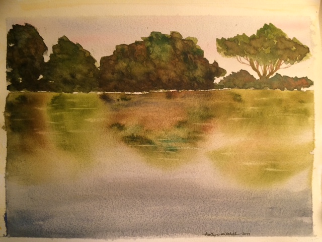
Love that Peter Sheeler!


A full month already!! I am 1/12th of the way to my goal. I’m amazed by how much I have learned in just a month. Mostly from youtube tutorials. And I’m back today with another two youtube studies… one watercolor ocean scene, and one water droplet pencil study. Definitely didn’t want to post the droplets, I even tried them three times. First with charcoal on toned paper. Then on pencil on white paper. Then pencil on toned (posted) Well, I’ll keep trying. And while the watercolor was fun to do, I’m not crazy about it either… but hey I can’t just post stuff I like, right?


Following a youtube tutorial about two toned edges, by Scarlett Damon, I practiced using two colors to create an edge without outlining. Each of these shapes was painted with just two straight washes, the second pushing the first outward.
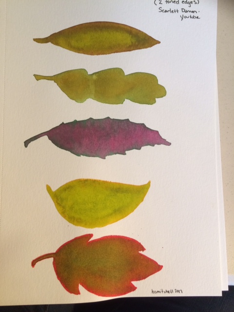
Using what I learned there, I tried to copy a leaf of my own, which I had found walking Emmett. (More about Emmett at Allthecrazyworld.blogspot.com) I had some problems with it, but am satisfied with my end result, and feel good about the technique.


I really like Peter Sheeler’s style… his quick loose sketches are exactly what watercolor is noted for AND exactly what I’m worst at (I think. I may not have found my worst yet) And I love the look. I’m going to continue to try his tutorials. There’s a lot I can learn from them. (I won’t do this every day, though… I’ll try to mix things up for you!)


I am finding that my lower grade paints and papers do not react the same way his artist grade supplies do. The end result is ok, but not the same. Some of this, I know, is skill, but since I am watching what happens as he applies the wet paint, I can see that some of it is materials. They simply act differently. I’m not prepared to drop several hundred dollars on paint. Or paper. Right now. But this is something I’ll need to adjust over time if I plan to pass a certain point, and maybe purchase even one or two colors at a time of some superior line. Regarding paper, some artists recommend purchasing student grade paper on which to learn and practice (that’s what I’ve done, and it made sense to me, since some of what I produce will be useless, and none of it will be “art” I plan to display.) Steeler suggests purchasing high quality paper from the beginning, and says you’ll have to relearn skills when upgrading from less expensive to professional paper because it feels and acts differently. This makes sense to me, too. I’ll think about it over the next few days.
These were sky studies.


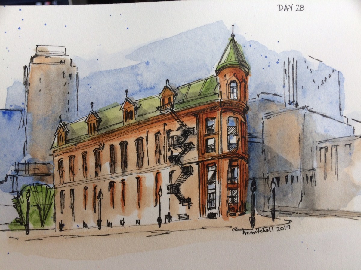
I’ve never thought myself able to paint things like this, and it’s very different from my usual style, so am pretty excited to post today’s art, courtesy of another Peter Sheeler tutorial. This is from a photo he took of the Gooderham Building in Toronto. If I take mine independently and don’t compare it to his, I’m very pleased.
Micron pen .005, Winsor and Newton ultramarine blue, burnt sienna, and sap green, Derwent water brush 2, on Arches hot pressed 140 lb paper.

Following a tutorial by Peter Sheeler, around 12:30 am I came up with this watercolor sketch. It isn’t perfect, but I learned several skills from it, and am pleased with the results.


