The Brooklyn Sketchbook Project

Anyone can submit a sketchbook to the Brooklyn Sketchbook Project… you simply go online to Brooklyn Art Library to view the sketchbook project information

Visit their page and find out more about it. You can order your sketchbook (it has to be purchased from them to be included) and can even have it digitized. Each participant is sent the same 5×7″ blank sketchbook to complete and return, and it will become part of the worlds largest collection of sketchbooks. Each book will also spend some time in the traveling bookmobile project (WHAT in the ENTIRE WORLD is more fun than a bookmobile??? NOTHING, that’s what! Except POSSIBLY a sketchbook bookmobile??)

So I’ve spent the past couple of week’s madly trying to complete this sketchbook so it could be included in the next tour… only to find out two days after I finish it that due to covid-19, tours are temporarily cancelled. But… the deadline got me moving, so it’s all good.

I’m having trouble parting with this book! So I’ve posted a sketchbook tour on my NEW YOUTUBE CHANNEL (shameless plug… could you go subscribe pleeeeeease??? This would be a super-thrill for me and would make my day/week/month. I may actually even post more videos sometime!) (click the left hand title in the video below for a subscribe link. Maybe. I think.)

So what do you think? I love it!! Except the cover, which I rushed just to be done. But it’s good enough. It’s a good feeling to start and complete a sketchbook so quickly. Thank you for sharing in the fun with me!

Episode? Art journal day? of “lockdown”. In which I walk to the mailbox, and Clara eats a bee.

But it survived. Aaaaaaand…. that is literally my most exciting news.

IMG_9133

As I am still healthy (yay!!!) and a serious homebody, I’m not minding “lockdown” at all. But the days DO blur into each other. Clara did eat said bee, but she dropped it when I told her to. So the natural balance is restored. Maybe?

IMG_9134

A school with no kids coming back (and it’s not summer break!) is sad. A tiny plastic horse waits for their return in the parking lot.

IMG_9135

Life moves on!

I entered a juried art exhibition!

These are the three pieces I entered. I’m not exactly sure why I chose the mermaid. I have a goldfish I like better.

This one is in a “floating” frame… clear glass around the print (that’s my floor tile showing through!) so, you’ll see whatever color the wall is behind the picture. I painted all of these just after I began using watercolor.

IMG_3269

This one is probably my favorite, I don’t know why. Just a tulip, using schmincke potters pink, which I love.

IMG_3279

This one… I THINK I painted it from a reference photo, but I am not completely sure… it was two years ago.

IMG_3271

So really, applying for entrance into a juried exhibition isn’t such a big deal… anyone can do it. But the point is I never have before, and wouldn’t have now, except my friend Mandy challenges me to not just SAY I want to do stuff, but to actually DO it. Watching her say she’s going to do something, and then actually DO IT is very inspiring. Check out Mandy’s blog here. She’s talented, you’ll like it.

Also… Mandy’s submission for the competition was chosen!! YAY MANDY!!!!!


Finally painting and sketching again! 3/8/2020

I’m not even sure what happened, but since the new year (and my heart incident!) I haven’t done much art. I’ve missed it, to be sure, but I have stayed busy with other things. But I’m trying to make it a habit again… plus… I have projects I’ve promised people that I need to get on with!

I used my “new” porcelain palette, FINALLY. New?? I got it this fall. A REALLY excellent price (I can’t remember where… I think Cheap Joe’s?? Like… under $20!! It’s big, with large wells, and a clear plastic cover to keep newfie hair out. -It tries, anyway) For some reason it just put me off. I think because it’s so large! (??) I had fun choosing colors, then never used it! Just stared at it on my drafting table as I did lots of other things. And watched old seasons of Survivor.

But this week I painted a birthday card for my sister, and made her a little heart origami bookmark, too (in JMU colors!)

I also had a “spring” swap due out (on swap-bot.com … if you enjoy crafting, arting, and pen pal-ing, check it out!) so I decorated this envelope:

(blocked out the addresses but you get the idea)

And finally, I started a project for a book illustration for my niece:

IMG_7927

I did NOT use only my large porcelain palette for this… I also used my new Roman Szmal watercolors! but…that’s the next post!


Daily Journal Entry 4/7/20 – Nature Stuff. And a mini paint palette. Of course.

“Stuff”… just bits I found on my walk yesterday… Getting out of this house during quarantine is nice… plus, my dr insists. 🙂 30 minutes of cardiac movement every(ish) day. Yesterday I noticed a big feather, the dying daffodils right by my door, and dandelions in different stages. It was nice to just walk, and breathe, and notice.

IMG_8984

I used a little paint tin my friend Shelley sent me for Christmas. It is actually decorated like a Ouija board, and held mints, but she sent it with a list of colors recommended by…. someone professional online artist she respects. But I forget who…

IMG_8994

Anywho….  the colors work really nicely together. So they were right. It is missing a few of my favorites go-to colors… but I didn’t need them, turns out. I’m listing the colors this other artist (I’m sorry I don’t have your name here) recommended, as well as what replacements I made in my set. I tried to match pigment numbers (which I googled for each brand) and actual colors as closely as possible.

IMG_8991

The recommended colors:

WN (Winsor & Newton) Permanent Rose

DS (Daniel Smith) Pyrrol Scarlet

SCH (Schmincke) Transparent Orange

DS New Gamboge

WN Winsor Yellow

WN Quinacridone Magenta

WN Burnt Sienna

WN Paynes Gray

WN Cerulean Blue

DS Phthalo Yellow Green

WN Winsor Violet

WN French Ultramarine

WN Winsor Blue GS (green shade)

DS Ultramarine Turquoise

WN Permanent Sap Green

IMG_8992

(I did this on the back of the swatch card, with the colors I ACTUALLY used. They don’t all look the same but are closer than you’d think, just some of my swatches are painted darker. I’m looking at you, Paynes Gray… I know mine is not neat and tidy like hers. She is a super pro at it)

I didn’t actually have exactly the colors and brands selected, but got as close as I could, because she had sent me a swatch card to match. Here’s what I changed out:

I used QoR Quin Magenta instead of WN Magenta

used a mixture of DS Burnt Sienna and Quin Burnt Orange for WN Burnt Sienna

used QoR Paynes Gray for WN Paynes Gray

used DS Cerulean Blue Chromium for WN Cerulean Blue

used a mixture of WN Ultramarine and QoR Quin Magenta for WN Winsor Violet

used DS Phthalo Blue GS instead of Winsor Blue GS

used a mixture of DS Ultramarine and DS Phthalo Green for DS Ultramarine Turquoise (the same way DS makes it)

used DS Sap Green for WN Permanent Sap Green.

(I had WN Permanent Rose, DS Pyrrole Scarlet, SCH Transparent Orange, DS New Gamboge, and WN Winsor Yellow)

I don’t generally use Paynes Gray… I use DS Bloodstone if I want a gray or black color and don’t want to mix one. I like its moodiness and granulation. I also include DS Buff Titanium, and DaVinci Red, and DS Green Apatite Genuine in most of my palettes. I’m going to keep this one the way it is for a while, and see if I miss them… I can always switch them out. Overall a very nice selection of colors, even if I did replace many.


IMG_8989

IMG_8990

(for the shadows i added a bit of the burnt sienna mix to the paynes gray… I like it)

Soooo…. how are you spending your quarantine?

Quarantine Art Journaling 3/24/2020

Over halfway through our self-quarantining in Virginia, and the Governor has added another 30 days. I’m ok with being home 30 days… but not happy about the businesses and individuals who will be losing huge sums of money. And the kids lost school year. My niece’s high school graduation!! (sigh) Anyway, it’s a great time to catch up on things! So, I’ve nearly finished cleaning and decluttering my studio! And I’m catching up on a few art projects I’ve promised out. We’ve also been recording some virtual Storytime sessions for Chick-fil-A Virginia Beach Blvd’s facebook page, that’s kinda fun. More work than I’d imagined because I don’t have the right equipment AND kinda stink at it. But… it’s still fun. And I hope to start my youtube channel soon… watch for it!

Meanwhile… the urban sketching group has set a daily sketching challenge… which I have ALREADY FAILED haha… but I’m going to participate on some days anyway. Day 1’s prompt was Hello, I am… (and sketch a selfie) So… here you go!

IMG_8540

I’m not sure how I managed to sketch myself looking both older AND FATTER than I am, plus SADDER. But, good enough, challenge accomplished.

Days 2-5 I skipped. Oops. I may go back for a couple. Fun journal prompts are always in demand. Day 6: “Do It Yourself”.

IMG_8537

Just a hammer I have in my studio. I also sat outside a while and reveled in the quiet beauty of our cherry trees in full bloom, the blossoms blowing all around me like snow. I didn’t capture the wonder and quiet, but it was nice taking the time to try:

IMG_8502

IMG_8538

You can’t see the blossoms falling, which is too bad. Each quiet breeze brought a fluttering bouquet all around. I should probably try again tomorrow and see what I can improve.

IMG_8504

I want to be sure to mention my friend’s new youtube channel,Linked HERE, (Mandy Lewis-Houston) with a fun simple painting tutorial the kids will all enjoy (and grown ups, too, actually, as I proved myself with a tiny sketch in today’s journal entry!) You CAN’T do it wrong… give it a try. Plus… she’s both talented and funny, and there’s no telling where her art videos will lead.  (I might even cameo in one or two, if invited 😉 (subtle hints…)

7B54E7E6-02CF-4A1A-A242-F37198B02033

This was my entry for last Wednesday. Mandy-of-above-mentioned-channel and I decided to do a little Bible journaling. I didn’t do it in a Bible, though. I will tell you it DID lower my anxiety level, as I kept turning this verse and what it means over and over in my mind as I created my page.

IMG_8290

Some pretty cherry blossoms, too. Unlike today’s attempt! Definitely need a redo before they are all gone. (It happens so quickly!)

How is your self-quarantining going? I’d love to hear (or see) what you’ve been working on (or relaxing with) I hope you are all well!!

Roman Szmal watercolor paints

It is hard for me to resist a new-to-me brand of quality watercolors (or crap ones, even, as far as that goes!) so when I started seeing artists I follow (particularly Dr. Oto Kano  on youtube) trying them out, then saw how affordable they are through Jackson’s Art (this is the US link) , I felt I NEEEEEEDED a few. And I’m glad I did. Prices currently range from under $3 to just over $5 for a full pan, a really nice deal, for artist quality watercolors. (They paint beautifully, so far, and have quite a few single pigment colors, (117 out of 140 colors are single pigment), with mostly excellent and good  lightfast ratings)

(edited: if you go through Dr Oto Kano’s link to Jackson’s site, it will help her out a little!)

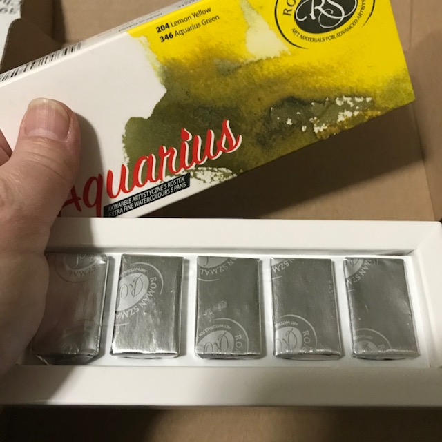
I ordered a set of 5, and 7 other colors I thought I may enjoy. The “starter set of five” each came individually wrapped, in a box, but without labels. It cost me $13.14. The individual colors have a watercolor paper wrapped around them with color name, pigment information, and a painted stripe of color, which is nice for seeing the actual color. I used a tint tip sharpie to write all paint info on each pan. If you know me at all, you know choosing TWELVE out of ONE HUNDRED AND FORTY was massively difficult for me, and writing this post is only making me want more More, MORE.

IMG_7775

IMG_7778

The colors I ordered:

Buff Titanium PW6:1

Lemon Yellow PY61

Flesh Tint PW4, PY42, PR 264

Aquarius Red PR 214

Quinacridone Red PV19

Mineral Violet PB 29, PV19

Ultramarine Light PB29

Cobalt Coelin Blue PB35

Ocean Blue PBr 24, PB15:3

Aquarius Green PY150, PBr25, PB29

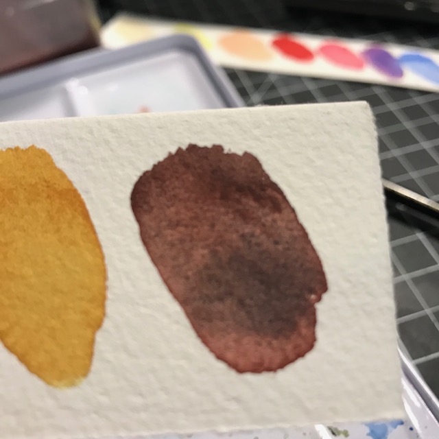
Quinacridone Gold PY150, PO 48

Caput Mortuum PR 102 (always one of my favorites!!)

Please ignore the Schmincke logo there. I had an awesome Schmincke palette EMPTY, so… filled it with these twelve full pans.

IMG_7957

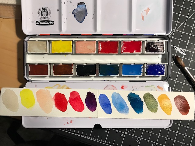
I think I need a brighter blue, and a brighter pink. And I really like sap green, too… I think the ultramarine light is a little TOO light, so may try the French Ultramarine. So… I feel another LITTLE order coming on. At LEAST the pink and blue, for now.

IMG_7962

IMG_7963

IMG_7961

I do love me some granulating colors!

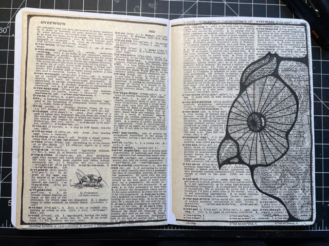
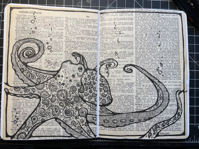
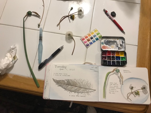
I used  my large porcelain palette (which has daniel smith, schmincke, kremer, davinci paints) and the roman szmal together for a little play time…. They all work effectively together. No problems at all!

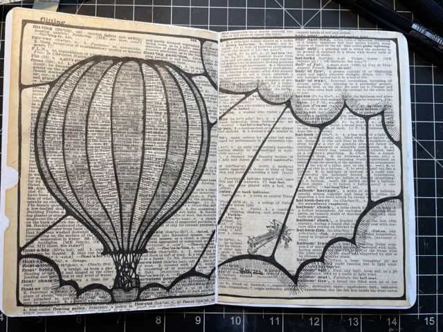
This one is just roman szmal watercolor:

IMG_7916IMG_7917

I like the palette I came up with, but will try replacing the Quin Red with Quin Pink, and Ultramarine Light with French Ultramarine (eventually), plus will be adding a Phthalo Blue. ($2.96 for phthalo blue green shade!! and the phthalo turquoise, PB16, for $4.60,  looks lovely, too!) And to be honest, I wouldn’t purchase “Flesh Tint” if I were doing it again. That one may go, to give me room for one of these others.

To sum up… I have limited time painting with them, but so far find them bright and vivid. They rewet nicely and are affordable. They work fine with other brands, too. And you can’t find them (yet) on Amazon. Try Jackson’s Art!

Have you tried this brand? What do you think of them? WILL you try them? Do you have another brand you’d like to see me test, or you just want to recommend because you love it? Let us know!

An Origami Bookmark- Feb. 22, 2020

I was going to title this A Quick and Easy Origami Bookmark… then I had to wonder if you’d agree. It is quick for me now… with the exception of one tricky step… but the first one took me a bit. Here is a link to the Youtube video I followed…  I was going to take photos and give instructions here, but they have presented it quite well. Why reinvent the wheel??

IMG_7494

Look how cute it is? I used typing paper here (yes… I have some of that still) and decorated it with washi tape. You can use any size paper, as long as it is kind of long and skinny.  I measured my first one out to the size used in the video, after that I tried other sizes, not really measuring.

I also tried some scrapbook paper, and less effectively some comic pages from a calvin and hobbes book (the paper works well but it’s difficult to get a pattern I want onto the heart area.)

I actually loved the little scrapbook paper one on the right… it was very short, barely longer than what you see.

You slip the bookmark between the pages, and the heart hangs over to a different page.

These stay together nicely but I liked putting a little piece of tape on the back of the heart. I mailed a few of these in cards… go try one! Let me know if it works for you!