At the beach!! My favorite.
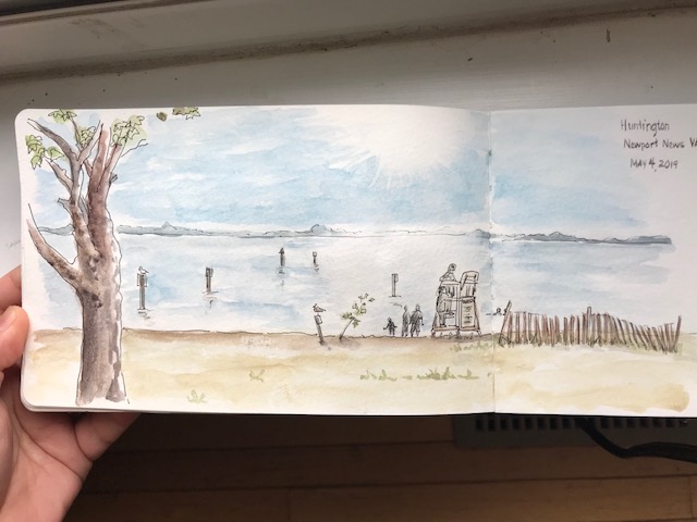


Some beach-goers (and Donna 🙂


It was a beautiful evening, perfect for being outside. Okay, actually, the wind was an inconvenience to the paints and the paper, but felt so lovely that it was worth it!


A 365 day art project… one drawing a day

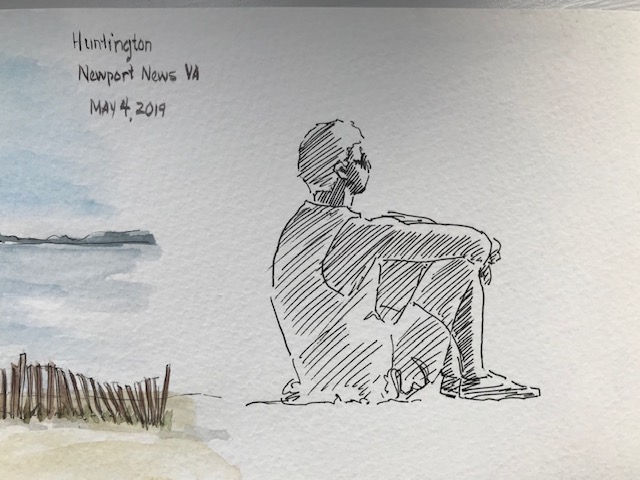
At the beach!! My favorite.
Some beach-goers (and Donna 🙂
It was a beautiful evening, perfect for being outside. Okay, actually, the wind was an inconvenience to the paints and the paper, but felt so lovely that it was worth it!

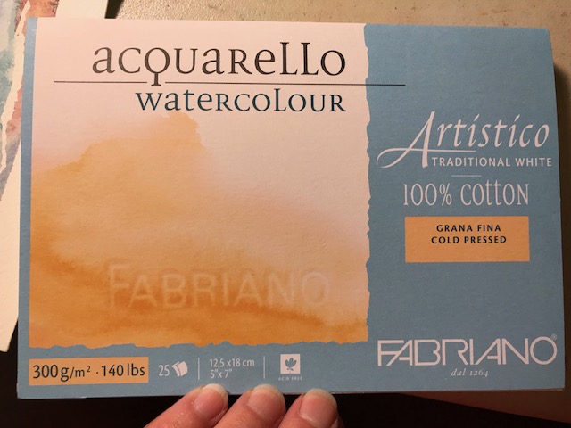
I’m trying Fabriano Artistico 100% cotton 140 lb watercolor paper… this is a 5×7 “block”, meaning the edges of the paper are all glued together. One corner remains open… once a painting is complete, you simply slide a palette knife (or anything) beneath the page and peel it off. Painting on blocked paper provides a firm work surface and prevents the page from warping much even with a heavy application of water. Looking on Amazon, I came up with this link, to the extra white cold pressed Fabriano block… Remember, Amazon prices fluctuate. At $15.95 right now, this is a pretty good price, I think, but I got it a bit cheaper at Jerry’s this weekend while it was on sale, and then with 20% off for a members discount… (if you prefer to try the Fabriano hot press, that’s even less at Amazon right now at $13.05).
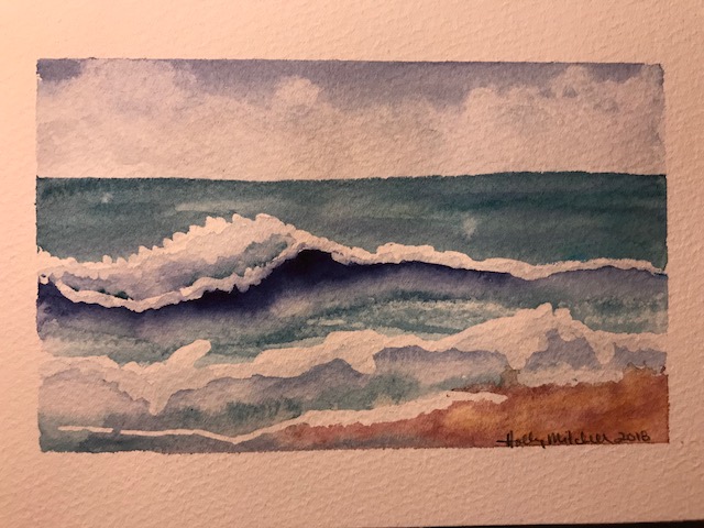
Let me just say WOW. I really like the way it feels. Please don’t judge the Fabriano p[aper by my painting. I actually liked this more than Arches. So far.
I started with tape (unnecessary on a block, except for leaving a white edge) and masking fluid:
I used EEM (Eventually Everything Mixes) burnt sienna, Daniel Smith Indanthrone Blue , and Daniel Smith Mayan Blue Genuine , a very green blue… the description says it is a green indigo, but it isn’t dark. I may try the mayan blue dark sometime, now that I’ve seen it exists! These are both lovely colors. Not necessary to a palette, but I can see a lot of times they’ll be used. Daniel Smith really has a LOT of lovely options.
Paint applied: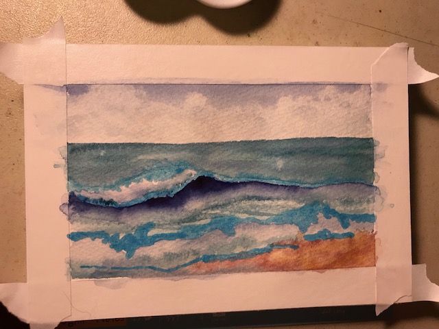
It could use more definition but I decided to leave it kind of stylized and quit while I was ahead. A quick fun sketch with just three colors!
I actually painted this for a summer haiku swap. Here are the two haiku (haikus?) I came up with for my partner:
“The ocean murmurs
Ever haunting lullabies
To the sun warmed sand”
And
“If I could, I’d spend
Each passing summer moment
Fingers in the sand.”

Another Peter Sheeler tutorial. These tiny sketches are helping me. I can see improvement happening, although I still don’t control the paint and water like I mean to. If you want to practice some watercolor or line drawing skills, check out his youtube channel!


I really like Peter Sheeler’s style… his quick loose sketches are exactly what watercolor is noted for AND exactly what I’m worst at (I think. I may not have found my worst yet) And I love the look. I’m going to continue to try his tutorials. There’s a lot I can learn from them. (I won’t do this every day, though… I’ll try to mix things up for you!)


I am finding that my lower grade paints and papers do not react the same way his artist grade supplies do. The end result is ok, but not the same. Some of this, I know, is skill, but since I am watching what happens as he applies the wet paint, I can see that some of it is materials. They simply act differently. I’m not prepared to drop several hundred dollars on paint. Or paper. Right now. But this is something I’ll need to adjust over time if I plan to pass a certain point, and maybe purchase even one or two colors at a time of some superior line. Regarding paper, some artists recommend purchasing student grade paper on which to learn and practice (that’s what I’ve done, and it made sense to me, since some of what I produce will be useless, and none of it will be “art” I plan to display.) Steeler suggests purchasing high quality paper from the beginning, and says you’ll have to relearn skills when upgrading from less expensive to professional paper because it feels and acts differently. This makes sense to me, too. I’ll think about it over the next few days.
These were sky studies.


