Thursday 1/31/19: EEM watercolor

I know technically today is Friday… I’m just a day behind posting. This is Thursday’s journal page. No, this does not have ANYTHING to do with my day. I couldn’t think of anything I wanted to paint, but then I thought… I’ll just play!

I used EEM handmade watercolors (Eventually, Everything Mixes)… go check out her site! You’ll have to watch for watercolors for sale, and grab them quickly when you find new colors. I really like them. They rewet easily, have little (to no?) color shift… and they smell nice!

IMG_5992

IMG_5993

IMG_5991

Thursday 1/24/19 EEM watercolor paints

Mail today!!

img_5857

If you’ve been thinking about testing some handmade watercolors, check EEM’s site (Eventually, Everything Mixes) They are really nice paints, rewet easily, vivid colors, and she wraps them so prettily, and fills them generously. She sells out quickly, but keep watching and grab them when she has them. Her burnt sienna (still available, I think, at this writing, in a full pan!) is one of my favorites. A bunch of others, too, but I won’t tempt you by talking about them, since they aren’t available right now. The raw sienna monte amiata that I painted in the pan is lovely, and still available, I think, and maybe the yellow, blue, and green in the top left corner… the blue has actual sterling silver added for sparkle! She always tries something unusual. 🙂 Whatever she has available… try them!!!

img_5856

Wednesday 1/9/19 urban sketching

One of my resolutions this year is to try to get out of my house weekly to draw or paint. I thought the abandoned Toys R Us would be interesting… once so full of fun, now so lonely. The trash cans are overflowing, the cover of the “o” has fallen out of the sign, etc.

I brought as little as I possibly could today… including my new etchr slate mini bag, and the little tin I decorated last week, filled with only six handmade watercolors (from EEM (Eventually, Everything Mixes) and Dr Oto Kano), a pencil, and a water brush and blotter.

img_5558

img_5559

I attached the paint tin to my journal with a magnetic clip (thanks for the tip, Mandy!)

I loved the paints. I used a water brush, which is new to me, and had trouble with it. Super convenient, yes, but I had so much trouble doing… well, doing pretty much everything with it! I meant to fix it up a bit when I got home and then just decided to leave it. I’d forgotten my pen today, too, trying to really keep my supplies to a minimum.

img_5557

Some perspective errors (my weakness!!!), some color errors, whatever else…  It’s good enough. I’ll get better!! 🙂 And I did enjoy myself!

img_5555


Negative painting, leaves using EEM watercolors

Following more youtube tutorials tonight! This technique requires thinking backwards. First, tape off the edges of the paper. Paint a  light wash of blue and yellow for the background, then paint in a few leaves, but only paint AROUND them. Leave them the lightest color.. (those end up being the lightest leaves) After this dries, add a few more leaves, again painting AROUND them only, and around the first set of leaves, using a slightly darker color… do this until you are really out of room for leaves, finishing up with a very dark bit of in-between-leaves. Then add a touch more color to the lightest leaves, some little veins with colored pencils, remove the tape and you have a leafy masterpiece full of depth. 🙂

IMG_2807

I used the EEM paints here… I really like them. They rewet very easily, and the M41 is a really beautiful yellow for mixing greens. (I almost didn’t order that one!)I especially enjoyed using Cote d’azure violet and caput mortuum for the little dark accent on the tips of the leaves.

This technique is a little bit of a brain teaser. But go try it!


Azalea, using EEM watercolor paint

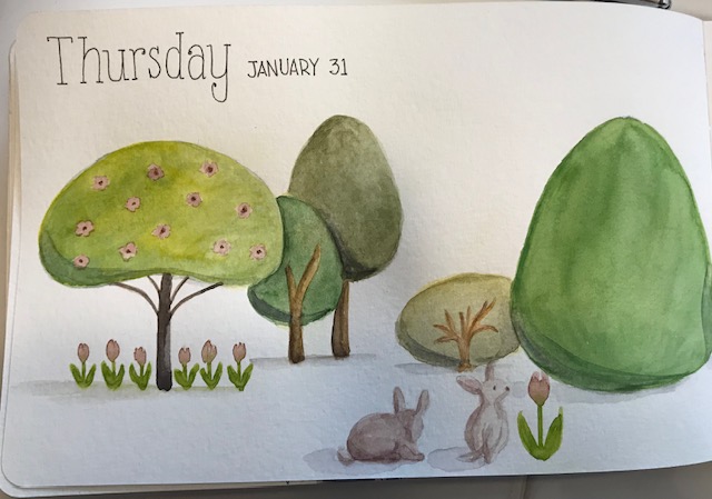
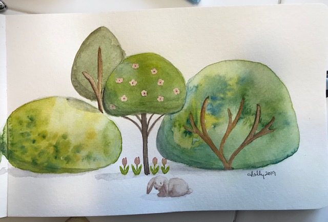
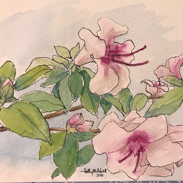
My azaleas outside are pretty scraggly and sad… but they do have some nice blossoms so I wanted to catch them before they are gone!

IMG_2507

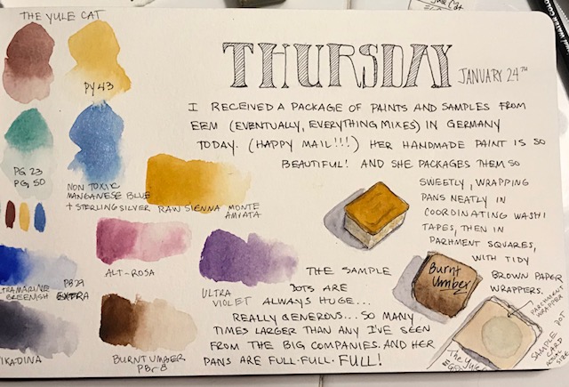
I have two new sets of paint I’m really excited to play with and share with you. The first I present today…The brand is “Eventually, Everything Mixes” or EEM. Several of her colors are unusual and surprising mixes with really fun, heavy granulation, many are single pigment, and as far as I’ve seen, all are excellent or very good lightfast ratings. (actually while I was checking tonight, I only found excellent)

IMG_2508

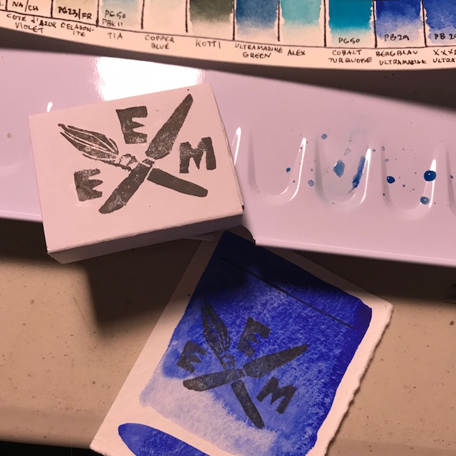
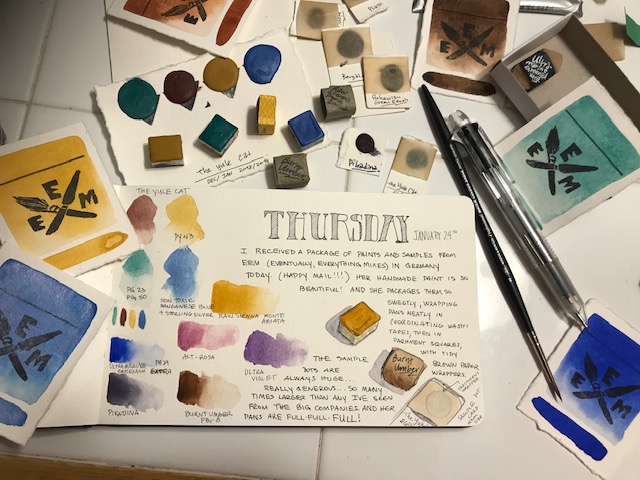
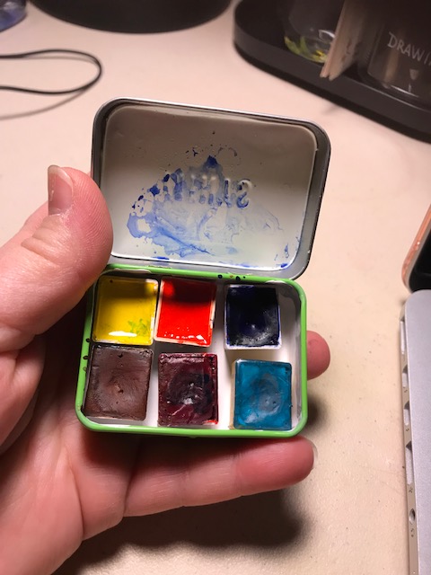
You can google either EEM or Eventually, Everything Mixes and find them online. The paints are handmade in Germany, individually. The half pans I ordered came filled REALLY full…. quite a bit over the tops of the pans. Like…. Really. Generous. And the sample dots on cards were also extremely generous. If you decide to order any of those, you’ll be able to do quite a bit with them. In fact, I took some of my sample dots and pressed them into half pans as well. (bottom row, the three on the far left, as well as the one alone on the row) Pans are relatively inexpensive, around $6.50 each, so I ordered several this time around to make shipping seem less costly to me, per pan.

I don’t (yet!!) have other brands of handmade paints to compare with these, but I really like these.  Most are transparent, a few are quite opaque. I was afraid of opaque colors when I first began painting, but I’m starting to like them more now, and one of these, caput mortuum, I LOVE. (I’ve found recently I seem to like all types and brands of pr101, and pr102 apparently is similar in feel, with a more purple hue) I’ve just ordered a few more colors and there are two or three I’ll eventually add, so you can look forward to future swatchings!

IMG_2502

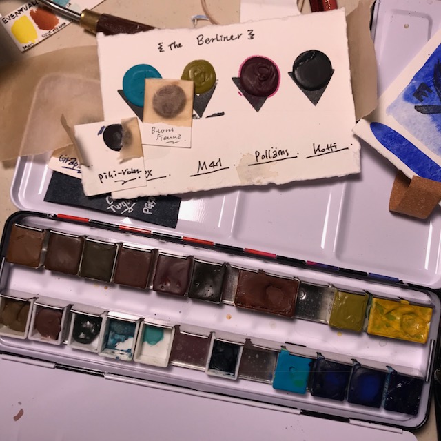
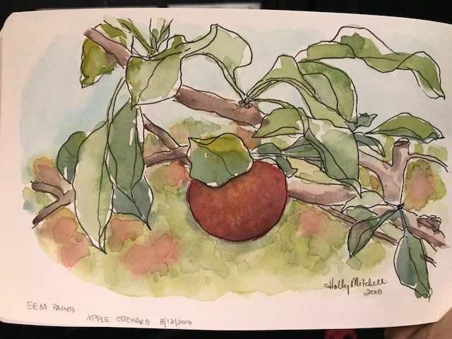
I was surprised by how vibrant they are while sketching this azalea today. The palette looks so muted, but the colors are strong (with the exception of a trio that are very light) without much shift in color as they dry. The colors I used today:  Pollams Pink (pr122 and pg23), Bergblau (pb29: ultramarine), Mais (yellow: py150, py110), a touch of Ultramarine Green (pg24, gorgeous color!) in a couple of the shadows, a bit of Cyan (pb15:3) mixed with bergblau for the sky, Rehbraun (py43) and Caput Mortuum (pr102) for the branch and some of the shadows.

I have here THREE shades of py43, all different. Cool!

These colors are all so vibrant. I don’t have a traditional selection of colors, but I just love looking at the swatched colors! I do have a nice triad, with the Pollams Pink, Mais, and either cyan or ultramarine, so can mix any color I want.

One of the colors, Ludwig Green, even has gold mixed in (upper right corner of the swatch sheet)

The packaging is fun… four pans arrived nestled in a paper matchbox with the logo outside. And each pan had washi tape decorating the pan, and a brown parchment wrapping it. Then a dark paper sleeve with the paint name written on it. The dots are on heavy pieces of quality watercolor paper, also wrapped in brown parchment.  You could easily take a sample dot card out with your painting journal for urban sketching or plain air painting.

So, I’ve done nothing with these yet except swatching them, and painting this azalea sketch, but I look forward to doing more with them. And when the rest of my colors arrive, I’ll be moving these to a new tin, perfecting the order they’re in, and making a fresh swatch card. Woo-hoo!

Seashore postcard and haiku

I’m trying Fabriano Artistico 100% cotton 140 lb watercolor paper… this is a 5×7 “block”, meaning the edges of the paper are all glued together. One corner remains open… once a painting is complete, you simply slide a palette knife (or anything) beneath the page and peel it off. Painting on blocked paper provides a firm work surface and prevents the page from warping much even with a heavy application of water. Looking on Amazon, I came up with this link, to the extra white cold pressed Fabriano block… Remember, Amazon prices fluctuate. At $15.95 right now, this is a pretty good price, I think, but I got it a bit cheaper at Jerry’s this weekend while it was on sale, and then with 20% off for a members discount… (if you prefer to try the Fabriano hot press, that’s even less at Amazon right now at $13.05).

IMG_1812

Let me just say WOW. I really like the way it feels. Please don’t judge the Fabriano p[aper by my painting. I actually liked this more than Arches. So far.

I started with tape (unnecessary on a block, except for leaving a white edge) and masking fluid:

IMG_1809

I used EEM (Eventually Everything Mixes) burnt sienna, Daniel Smith Indanthrone Blue , and Daniel Smith Mayan Blue Genuine  , a very green blue… the description says it is a green indigo, but it isn’t dark. I may try the mayan blue dark sometime, now that I’ve seen it exists! These are both lovely colors. Not necessary to a palette, but I can see a lot of times they’ll be used. Daniel Smith really has a LOT of lovely options.

Paint applied:IMG_1810

It could use more definition but I decided to leave it kind of stylized and quit while I was ahead. A quick fun sketch with just three colors!

IMG_1811

I actually painted this for a summer haiku swap. Here are the two haiku (haikus?) I came up with for my partner:

“The ocean murmurs

Ever haunting lullabies

To the sun warmed sand”

And

“If I could, I’d spend

Each passing summer moment

Fingers in the sand.”


Day 9, 30×30 challenge: common octopus

Sticking with the octopus theme. I used EEM (Eventually, Everything Mixes) Burnt Sienna for this. And that dot of Daniel Smith Bloodstone for the eye, and a bit of white gouache for the suckers on the tentacles.

IMG_1418