
When I started with watercolor, my head was SPINNING from everything there is to learn. Granulation, transparency, tube vs pan, manufacturing differences, lightfast ratings. It was so much for me to take in! Over time, I have become more familiar with terms and characteristics of watercolor. If you are new to watercolor, don’t despair! Soon it will be easily understood! Let’s discuss lightfast rating just a little bit…
In 2018, I set up a miniature “lightfast test” of my own. Pretty simple, not scientific at all, but good enough for me. I tested only three colors… opera rose, carmine, and mayan blue dark. Let me first try to explain the idea of lightfast ratings a bit. (If you are not new-ish to watercolor, skip down to the other photos! This might be boring for you!)
The pigment which paint manufacturers use (they are mostly all the same pigments, with some exceptions) have a lightfast rating from the ASTM (American Society for Testing and Materials), but the individual paints (which are made up of one or more pigments, combined with different binders, and sometimes other fillers) have a lightfast rating which may differ from the pigment rating because of the way it is created, or the pigments or other things it is combined with… I’ve made it clear as mud, right? This rating tells the artist that a paint should retain its color and vibrancy for x number of years… generally a top rating, “excellent”, will last over a hundred years, a color rated “very good” should be stable for at least 50-100 years, those rated “fair” should last 15-50 years without change, “poor” will last 2-15 years unchanged, and “very poor” (or fugitive) less than 2 years. It gets more complicated than this, though, because these ratings also take into account sun exposure, which part of the world, time of year, etc. Also, some companies break it down into more categories, some into fewer. But generally, the idea is the same.
Several artists I follow use opera pink, knowing it is fugitive, but they love the intense brilliant color. One of them insisted its fugitive nature really doesn’t make a difference that she can see. She even sells her work! This got me wondering about opera pink, (which I have never even used because of my fear of its fading) -But also about other favorites I have that are labelled II for lightfast instead of I. Paint companies say their top two tiers are both perfectly acceptable for artists to use. But… are they?? (And why the heck am I so intimidated by these lightfast ratings??)
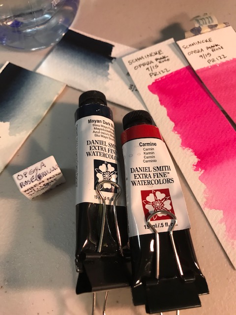
In September of 2018, in an effort to calm my fears about lightfastness once and for all, I made a little swatch of my only opera (Schmincke’s opera rose… a brand I certainly trust), and another swatch of Carmine (Daniel Smith, another great company… this is the pink/red I was using at the time, only because I received two free tubes of it, and liked it fine.)
Schmincke’s Brilliant Opera Rose, PR 122, has a fluorescent additive, rated “fugitive” by Schmincke, as any fluorescents are by other paint companies. Schmincke paints, generally, have high lightfast ratings. You won’t find many fugitive colors in their line. The fact that these well respected companies still sell fugitive colors makes me think, well, artists still want them.
The term fugitive, relating to watercolor paint, means this color will change or even fade completely away quickly if exposed to light , humidity, etc. Artistnetwork.com says to consider a fugitive color as temporary. Opera rose has that fluorescent additive, giving it a beautiful unique vivid hue, but in my mind this means “Caution! don’t paint with this!”… But honestly, I am giving up some beautiful colors with this thinking. (Although… if you saw my watercolor collection… I’m quite greedy and you would quickly realize I have plenty of colors to choose from… and really, now I wish I only had 24 or so. Because I quickly develop Indecision Painting Freeze when looking at all those very similar colors. But. That’s a discussion for another day)
The other paint I tested, Carmine, PR 176 , is rated II by Daniel Smith, which is the second highest and considered “very good” by the company. With my limited experience, I have still been wondering whether the difference between I and II is enough to worry about. I mean, the paint manufacturers say it isn’t. And lots of other things I’ve read also say, use paints rated Excellent or Very Good with the same confidence. So. Here’s what I did. (spoiler: it wasn’t sufficient)
I swatched both opera rose and carmine, on quality watercolor paper, then 6 months later in March of 2019 I added a swatch of PB82 Daniel Smith’s Mayan Dark Blue, … because I love it but I had read it might fade. I cut the sheets down the middle. I placed one half of each, labeled with the color name and date, in a closed security envelope, and the other halves I taped to my studio window. This window faces south and we live in Virginia, near the ocean. It is exposed to sunlight most of the day, particularly in the afternoon. I have no idea really how this affects my test but I know it DOES.

I checked my original two swatches after 6 months, when I added the mayan dark blue to the group, and saw little change in the carmine, but did notice a change in opera. Not as much as I’d expected, though.
One thing I DID learn… washi tape, left on a sun exposed window for over a year, does not like to come off. 😦 Yeah, do this a different way.
(I took this photo today, to show you my washi tape error. I don’t want you to think the swatches weren’t in the sun, though… today it’s quite wet and overcast… it is generally sunny in this area. Trust me, these swatches were sun-exposed… sometimes I feel like our weather in Virginia is like Camelot… and if you get that, you may be a musical theater geek like me… post the reference in the comments!)
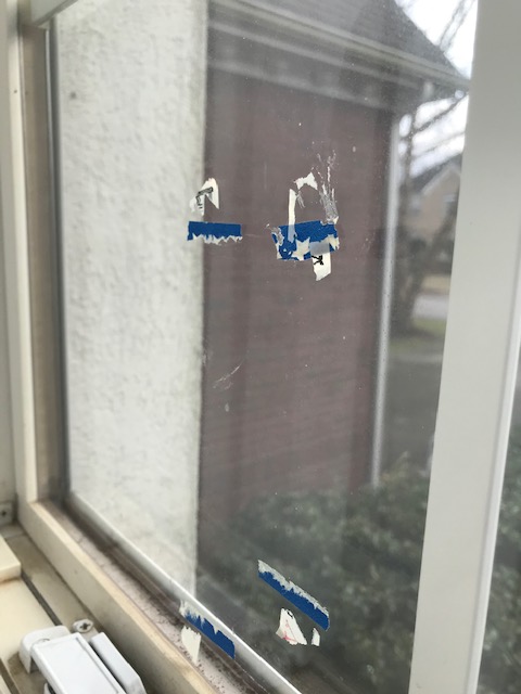
Also, don’t tell my husband about the window.
Today I checked them…
Carmine :
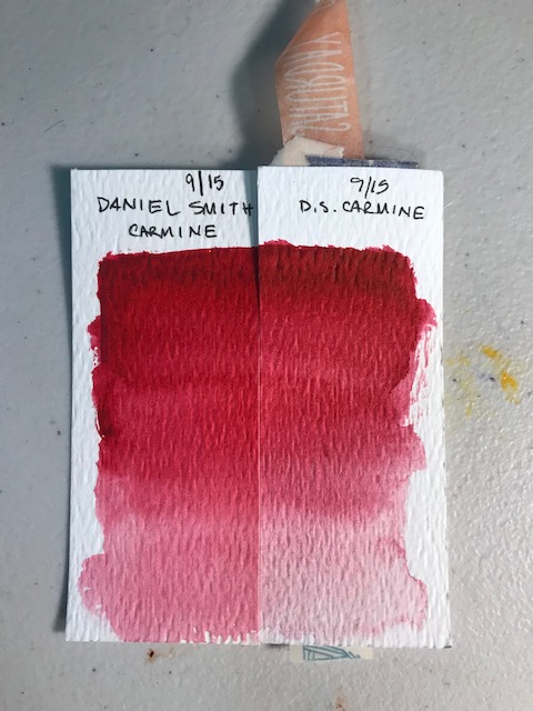
Carmine lightened all the way down. Particularly noticeable where the paint is more diluted.
Opera Rose :
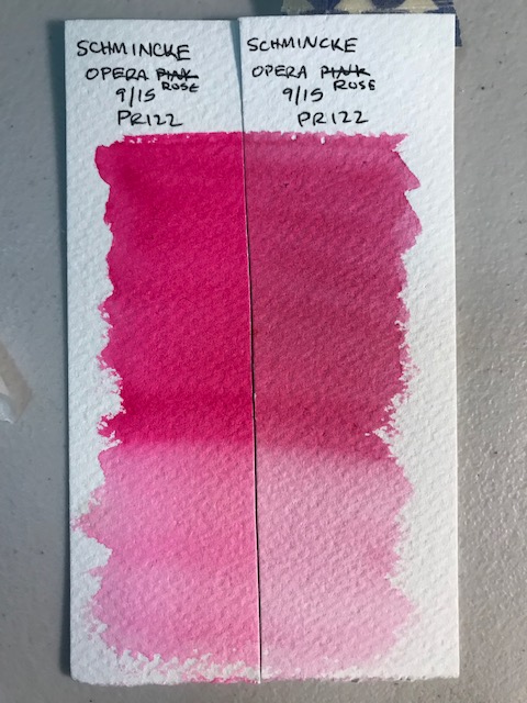
Opera Pink lost its brilliance, and basically changed color. Maybe that’s what PR122 looks like without the fluorescent additive? Also, it occurred to me the fugitive control swatch may have changed even in the envelope?? So I did a quick fresh strip of color on the swatch to compare:

You decide. Looks the same to me?
Mayan Dark Blue :
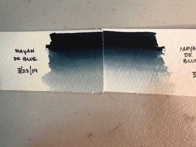
Pretty good at its most intense, saturated level. Obviously faded, though, where more diluted with water. This color seems like a nice replacement for another I love, Indigo, and generally indigo, pure indigo, isn’t very stable. BUT, Daniel Smith’s Indigo is a hue… a mix of two other pigments, lamp black and indanthrone blue, (one of my favorite blues, by the way) and is rated I for lightfastness. (Did I mention there is also some controversy over whether you want to use a single pigment color, like mayan dark blue, or a blend of two or more pigments, like DS indigo?? Which is why I considered the mayan dark blue… it really isn’t going to matter, though, except when mixing colors, and you will learn as you experiment with your colors what works… so DON’T worry on this account) I didn’t test it… but my assumption is DS Indigo would have faded less or not at all (I told you… this wasn’t a very scientific test.)
Another thing I didn’t test… I’ve heard that if you blend a fugitive color with a lightfast color, you have to worry less about a color shift. I have to be honest, this doesn’t make sense to me. The lightfast color isn’t going to change, but isn’t the fugitive color still as unstable as ever? I suppose if you use mostly the lightfast color…
The fading of the “Very Good” colors, when used in a diluted manner, surprised me. I expected the opera to be significantly more altered and the other two to remain unchanged. As I mostly paint in journals, for myself, it won’t affect my work. And also won’t matter for any prints I sell. I will be honest, though… as I use up colors, I may look more at replacing with those rated Excellent as opposed to Very Good, so I don’t worry about it. Except my favorites. Of course. Like Da Vinci red… which I can’t imagine painting without. After all… I won’t be hanging the paintings in my studio window…
My recommendations, based on this teeny tiny test: Find good quality paints, and trust their colors. Within reason. Use the colors you love… pay attention to the lightfast rating, but don’t stress over it. If you love a color, use it.
And… I think I will test some of my “Excellent” paints this year and see how they hold up to those harsh conditions. If they fade at all, I can stop worrying about the difference.
I’m listing a few of my favorite brands here… I can’t find an Amazon link for Da Vinci, so I linked to their site. Those tubes are generally by far the most reasonably priced, and I love their colors. AND… watch for a sale, they had one in December which I missed but the watercolor deals were spectacular. If you purchase anything from Amazon using these links, you should know I will get a tiny percentage back, and thank you for supporting the blog! I will only link to something I absolutely love, so know that if it’s listed, I enjoy it. Happy painting!
Schmincke color selection one,
Daniel Smith’s introductory set
Da Vinci’s original watercolor palette, reg $112, on sale now $56
Qor introductory earth set, on sale $20.99
M Graham starter set

I had wondered on and off about Opera Pink. It made me reluctant to buy it but maybe I will rethink it. Great, informative post.
LikeLiked by 1 person
Thanks! It is really very pretty before it fades… And still quite nice even after a year, though not the same. I wonder after ten years (IN THE WINDOW) what it will look like? I know Dr Oto Kano did a test on her channel of Aureolin yellows and the genuines just turned ugly and muddy beige, over a couple months. And I think they were all rated II? She said “good” but the ds site says Very Good. A little fading isn’t so awful but changing color is not ok. Plus if we KNOW it might change we can work around it! I’m feeling like testing everything now! I am probably going to avoid opera for real paintings (if I ever do any) but if I want it in my journal I won’t worry about it.
LikeLike
Very Interesting colour experiments…
LikeLiked by 1 person
Thanks for posting. I’m really interested in how these paints behave and there’s a broad spectrum of opinion out there.
Some thoughts for your testing, I was told by a prof artist that Opera is fine as a base wash or a mix with higher lightfastness – perhaps it takes on the lightfast qualities of subsequent paints?
Would also be interesting to add a third swatch mounted behind UV glass to see the difference.
And, at the end of the day, you’d be crazy to purchase original art and hang it in full sun (or say the bathroom), and expect longevity.
LikeLiked by 1 person
Oh that’s a great idea!! Mix some with some excellent lightfast colors and see. I’d love to know that as well!!!
LikeLike