An amateur’s assessment:
Regarding watercolor paint sets, I use Daniel Smith and M Grahams together right now, from pans I’ve filled myself, because I have different colors from each company. I use them as if they are one brand, and as far as I’ve noticed, both are amazing and work well together, although of the two, I’ve finally decided Daniel Smith is the brand I’ll be building on in future.
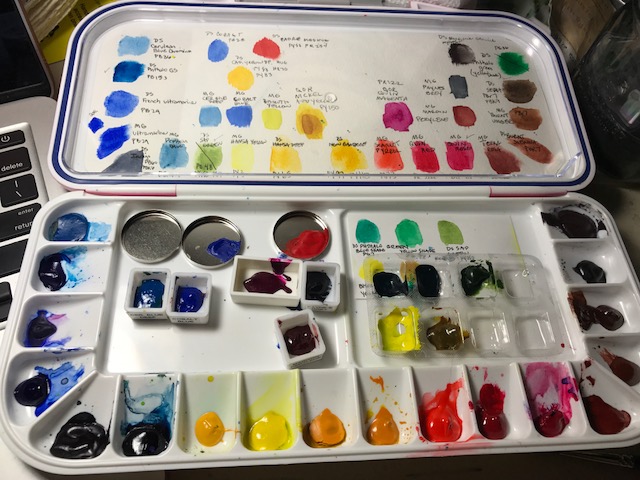
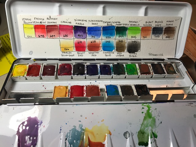
I also have my palette of Sennelier pans I’ve been using. I love the palette tray itself, and the paints rewet nicely and feel rich and creamy, like the Smith and Grahams, so I’ve been trying to decide if I like one over the other.
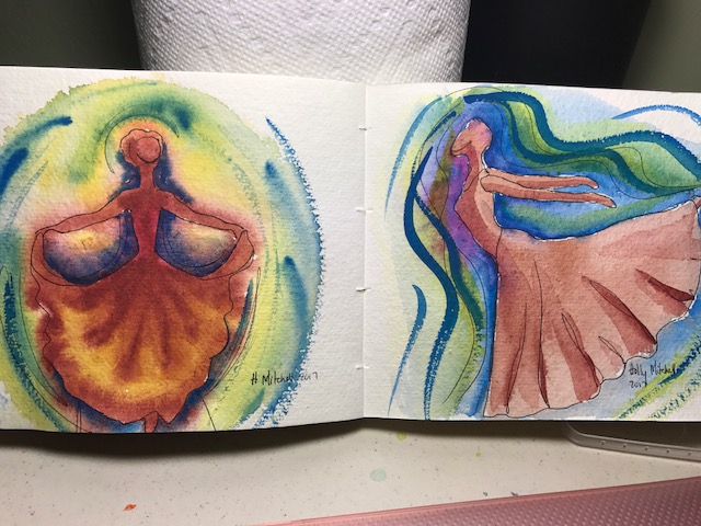
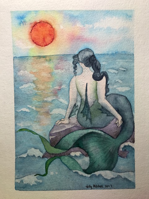
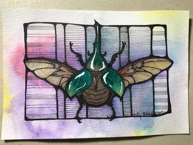
I noticed with my mermaid last week the paint got much lighter when dry, and wondered if that was because I used Sennelier. (I want a few more colors in the Sennelier brand, or another palette tray for the Daniel Smiths, and am trying to decide which investment to make!) So I just doodled a bit after following a tutorial by “Maremi SmallArt” on Youtube. Here are my results, but my conclusions are still vague…
These are the Sennelier, on the left, and Daniel Smith, on the right, while wet:
I rather expected the Sennelier to lighten up. But here they both are dry:
A little lighter, but still vivid. I ran a wet brush across the bottom once they were dry, and look how much paint lifted off the Sennelier colors! This could be useful to know if you WANT to lift an area, or if you want to be sure to keep one…
I tried the following samples to see how large areas of water made them react. On both pages, Sennelier is on the left, DS or M Graham on the right. Both flowed freely but the Sennelier tended seemed to dafe more. Really they are fairly similar.
Here is the tutorial idea I followed. You can see with a lot of water, the Sennelier (left) reacted very differently becoming rather muted, even though they started out quite strong. Also, I had to lead them through the water a bit more than the Daniel Smiths. I tried to keep my paint and water quantities similar. (?) The Daniel Smiths stayed pretty true.
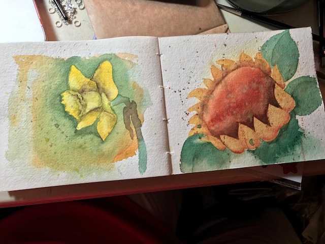
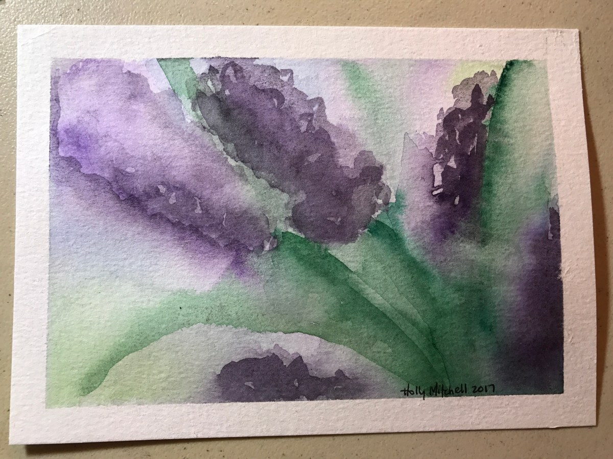
Finally I tried a quick sketchy flowerish thing, using several layers:
I like the way the Daniel Smith (right) responded better, in general. Moved more fluidly without losing its color. Sometimes the Sennelier was TOO fluid, disappearing, sometimes it barely moved at all…
My conclusions? Well, I love them all. If I’m doing something with a lot of water, and I want my colors to bleed nicely but also to stay fairly vivid, I’ll choose Daniel Smith. If I’m doing something less wet, without large wash areas, the Sennelier are very nice to use. (this is a much less costly set that I’ve linked here, with very sufficient colors to get started, I think, but a kind of crap container. A very affordable step into Sennelier.) If I could only choose one brand, I suppose I’d choose Daniel Smith and either of the storage palettes I have, the Martin Mijello 18 well palette, which comes in fuschia or blue,. Or the Meeden tin, seen here. I have to confess, though… there’s something I love about using the Sennelier set. I enjoyed using them so much when I painted my mermaid recently. I don’t see much difference in their overall performance (except less movement) and I think their slightly softer leaning has a place in my watercolor toolbox. (edit: even today I tried to add a shadow to a dry painting and it simply lifted the color beneath away. Rather frustrating. Good paints, but Daniel Smith would be my first choice.)
larger meeden paint palette listed here, with 24 full pans (empty, but full sized)
Daniel Smith introductory set… very small tubes but they fill a full pan nicely and it is an EXCELLENT assortment of basic colors. Great to see if this is the brand you like.