Day 105 (sat April 15) Quote, Prima paint, K Werner

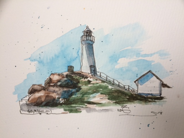
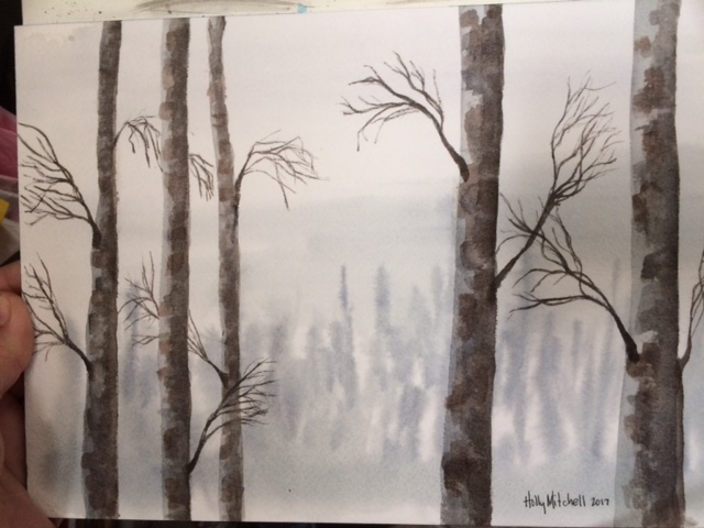
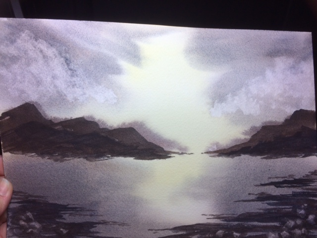
Ooooh playing around with these Prima watercolors is SO much fun!! These are the ones I purchased from Amazon back in January. My first watercolors, so I wasn’t sure what to expect. I have loved them from day one and love them still. In fact, it is probably because of these paints that I’ve spent so much of this first part of my 2017 project on watercolor. The professional sets work differently, and I love them as well. But these. Well, go look at them!!! In the above link!

They are a GREAT deal. I paid $17-$22 for my sets (which was a great price!!!) and they are $14 today (click the link quickly before they increase again!!! I’m so glad I decided to mention them today, and then when I checked they’ve gone down in price!!) They are not technically artist grade, and I have ordered some artist grade pans for myself to use as well, but honestly I don’t think I could enjoy a paint set more.

A few weaknesses:

These paints don’t list the paint number that each pan consists of (not something I am experienced enough yet to care about),

they don’t use traditional names (this did bother me at first, until I found a site where another artist had matched them to their closest traditional names… and this may only matter in a case like mine, where I am trying to learn about painting and colors by following youtube tutorials)

and they don’t list a lightfast rating. I DO care about this, and it is why I am investing in an artist grade set. I did my own simple BRIEF lightfast test and found over a month or so only two or three faded. But I’d have to do it for a year or two to really know. So I will assume they WILL fade. However, if I am only using them in books and journals anyway, or on cards and things I mail out and don’t expect to be hung in a frame, it really won’t matter.

But so many great points:

Very little color shift as they dry (they stay nice and bright)

They are so creamy, they pick up so easily without even prewetting the pans, just dip a wet brush and go.

They have incredibly bright, vivid, bold colors.

They come in a really nice metal case, that fits in your hand. I have even fit 21 half pans in my case, but I narrowed it down to the 14 I really love and think I will use most often.

Each set comes with 12, and I purchased three different sets and combined them. Then used the other pan for another paint set!

The Tropicals set may be my favorite. But Decadent Pies is right up there. And classics has some nice colors, but not as necessary for me. I haven’t tried the pastel set.

I just love playing with them. I can’t say enough GOOD about this sweet dreamy little set, and at $14 it’s a steal. The palette alone is worth that. Ok, I know I sound like an infomercial. I just love them so much. Daniel Smith and M Graham may be a better quality paint, but they are $15 A COLOR, with no palette, and I don’t love them MORE (although… I do love them) If you are itching to just try watercolor, or you want a little travel set, or something for journals or crafts, something a million times nicer than the dollar sets you played with as a kid, but don’t want a big investment…. I highly recommend these. They are just fabulous. (imo)

FullSizeRender

Oh my goodness look how dreamy-bright they are!!

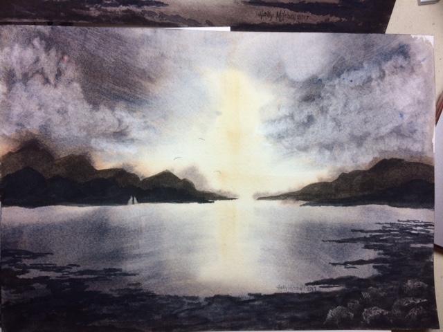
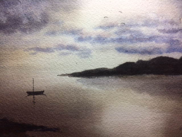
(well good grief, I didn’t even mentioned this is from a tutorial by k werner designs!!!)

Day 103 (Thurs April 13) greeting cards

I masked off a strip with tape, then added some quick stamped images and one painted word. In honor of April being National Card and Letter Writing Month.

For card #2, I just used markers. Easy peasy, and saves five bucks a piece. I arted up the envelopes as well, but I’ll keep those private so I’m not posting addresses on the internet 🙂 I’ll post some of my envelopes sometime. I’m a firm believer in prettying up the mail. Mail should be fun for everyone whenever possible… the sender, the recipient, and those who move it along for us as well.

Day 101 (Tues April 11) Another Lighthouse, Sheeler style

I guess I may end up working my way through each of Peter Sheeler’s tutorials. They are perfect for my 2017 project, and I feel very comfortable with the style. And they are small and fit well in my sketchbooks. I’ll add the link for the Uniball deluxe micro pen again from Amazon. This is the three pack. It is really nice for this (or regular writing) and SO affordable. I love my special art supplies… but this pen is probably one of my favorite finds. This micro deluxe, also here in a set of 12 for $20, specifically says waterproof, and I haven’t tried the regular, so I don’t know about it
(although it says the regular protects against water, fraud and fading).

(In case you’d like to try it, this is a link to a set of 12 for $5…  the regular uniball micro, not the deluxe. I have only used the deluxe so far, listed further up, and love it, but I may try the regular since it is SO affordable, and compare sometime. If it is waterproof and fade proof, and creates a nice line, that’s all I’m really looking for.)

IMG_5048

Day 100 (Mon April 10) tree trunks

A watercolor wash, and a few tree trunks. Easy peasy. I just copied another tutorial. I used that Silver mop brush again from the other day for the background today. I do like it. And it doesn’t smell so goat-y today so I think a good rinsing will take care of that. 🙂 I’m so glad I bought this brush. I try to do anything with a very wet wash on this Arches cold press block. Expensive paper, yes, but I’ve decided well worth it for the quality difference, and the blocked pad makes painting washes and wet pictures a pleasure. It is great paper, and doesn’t wrinkle or curl a bit on the block, however wet I get it! Amazon has it for a good price, too, compared with what I’ve found other places!

IMG_5047

Day 99 (Sun April 9) butterfly

Oooh, I love this one. Another Peter Sheeler tutorial. Definitely more my style than the past several days. When I’m washing watercolor over, I generally use the pen Sheeler recommended, the Uniball Deluxe Micro Pen. It is an inexpensive pen with waterproof ink, and a nice steady flow. (a three pack for under $7 on Amazon) I assumed I’d need to use expensive art pens so it was a nice surprise to see how well these work. I really love them. Great for sketching and for everyday writing!

IMG_5045

Day 98: (Sat April 8) One last try at the light study

I purchased a mop brush, the Silver oval mop seen here on Amazon,  to try the background off these paintings one more time. I like the brush a lot, but I may still try to get a hake brush sometime. I think the shorter, but still very soft, bristles will work better for what I’m trying. I liked this one. It hasn’t shed any bristles for me, (contrary to the Amazon review), BUT…. when it is wet, it stinks to high heaven. No lie. This is some serious goat hair here. It holds a ton of water, though, and I’m hoping after a few uses it will smell like nothing for me. This brush does handle the large wet areas of wash better, but I still had trouble here (like not letting the background dry enough before I laid in the first layer of land) Still, I think it is progress.

IMG_5040

Also, my paints are granulating, I think, which means they separate some as they dry. See the effect?

I like the granulating effect but I think for this particular piece I’d rather have it flat and smooth. (like the yellow part is) which means (I think??) I’ll need to use a different blue. I’m not sure if I need a different brand or a different shade. (So maybe I’ll try it one more time with my prima paints?) The clouds are made by just touching a crumpled tissue to the paper to lift the color. Some colors won’t allow this, but these colors lift nicely.

Day 97 (Fri April 7) More light studies

Still following Steven Cronin’s tutorials, here are a couple more.

I tried a cheap acrylic brush for this first one because I didn’t have the hake brush he used, but it absolutely didn’t work. Left stripes everywhere. It is very stiff and bristly feeling and (turns out, after a moment’s research) the hake is very soft.  The mountains are supposed to have three layers so you see distance, but the first layer was too wet and bled too much. The second layer too dark, so the third also too dark. I like the way he lifted a tiny sail out of the paint on the mountains to show boats in front of them. The rocks in the bottom right worked better today that yesterday. But not like his. They were scraped away with a bit of plastic gift card.

FullSizeRender

This second tutorial used the same hake brush (!!) which I still didn’t have, but a different technique. He dried the whole painting, then wet the whole thing again, adding another wet layer, dried it again, added another layer. So I learned that if I wet the whole thing evenly I can rework it a bit. I’m happier with the light here, but the red I added to the clouds didn’t want to lift, and my little foregrounds on the right are too symmetrical. Still, it’s a light study, and I learned about light:

FullSizeRender

Using a very limited palette, three colors, on Arches cold pressed block, with Daniel Smith watercolor paints. I like the way dried pans feel better, but I think Daniel Smith tubes might be better quality than any dried pans available.

If I crop it this way, I really like it a lot better:

IMG_5013

Day 96 (Thurs April 6) a piglet!

I saw a cute little acrylic painting of a piglet in Tuesday Morning the other day, so copied it (sort of) in watercolor. I like him AND he was fun. (her? She? I think he) Okay, he’s a little freaky looking. He can’t help it. Stop judging. Used my Daniel Smith paint set for this, plus Burnt Sienna. If you are just starting out, this makes a really great color palette for a smaller investment than some huge paint sets. Don’t let my odd little piggy keep you  from starting. (I think that blue circle may actually be an M Graham Prussian Blue.  But don’t hold me to that.)

IMG_5025

Day 95 (wed April 5) Watercolor daffodils AND The Best Paintbrush Ever. And some darn nice paints.

Okay, FIRST, the many flowers. Way more than ONE attempt today. I tried several different styles, two kind of from tutorials.

Now on to the good stuff. I was so wrong to think my little cheap paintbrushes would hold me for long. AND also wrong to think I had to spend a fortune on a great brush. Check out this super cool brush, the da Vinci CosmoTop Spin #6.  (see link) Best spent twelve dollars and thirteen cents EVER. This is a synthetic brush but a DREAM to paint with. (Oh my goodness I will probably SWOON when I use a #6 real sable brush, if I like this so much!) Anyway, it’s clean, smooth, gorgeous, and I swear it paints forever (well, nearly) on one dip of paint. This all may be slight exaggeration because I’m still on painting cloud nine, but really. You’ll like it.

Also I used this set of Daniel Smith paints… they are teensy tubes, but a little goes a long way. (they are 5 ml tubes…figure 2 1/2 ml to load your half pan so you can fill twice, maybe?) I’ve been trying to decide whether I like M Graham paints or Daniel Smith better so wasn’t ready to commit a lot to either… So far, my choice is Daniel Smith, although I love both. This whole set of 6 colors is less than $23 and a great way to decide whether Daniel Smith paints are the way you want to go. (edit: this set went up to $27 as I wrote! Still a bargain imo for a good starter set…) Most of the 5 ml tubes are like $9 a piece, so I feel like getting 6 colors to try for the price of two or three is awesome. And really between these six you can mix nearly anything you want.  (seriously, ANYTHING. You get a warm and cool of each primary) But consider (once you know you like them) adding Burnt Sienna (because it mixes with all kinds of stuff, and with ultramarine or phthalo makes lovely grays), Hansa Yellow Deep (‘they’ say this is the truest, most “primary” of yellows. I don’t know if that’s true. But I love it), and Sepia (because I like it, esp mixed with ultramarine) I linked these to the 15ml tubes because it’s only like $3 more for the 15ml sepia vs the 5 ml sepia, and I assume it’s the same for the others. Once you know you like them, get the tube that is three times the size for just a few extra dollars. And now ta-daaa!! A complete palette!! You don’t need those crazy convenience colors. (Okay I MAY invest in cerulean or prussian blue… but those are hardly convenience colors, are they?? And a quinacridone or two, but we can discuss those another day. After I get them)

Go check them out. You know you want to. I won’t tell. Also… check out all my links! It took me two hours to figure these things out, ha!!!