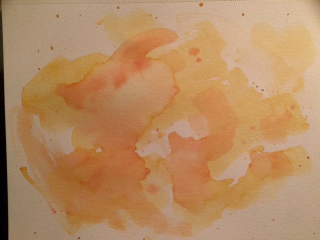
First attempt at a quick wet-on-wet tutorial. I had to rush because Ellis was waiting for me!! Another try another day. 🙂
A 365 day art project… one drawing a day

First attempt at a quick wet-on-wet tutorial. I had to rush because Ellis was waiting for me!! Another try another day. 🙂

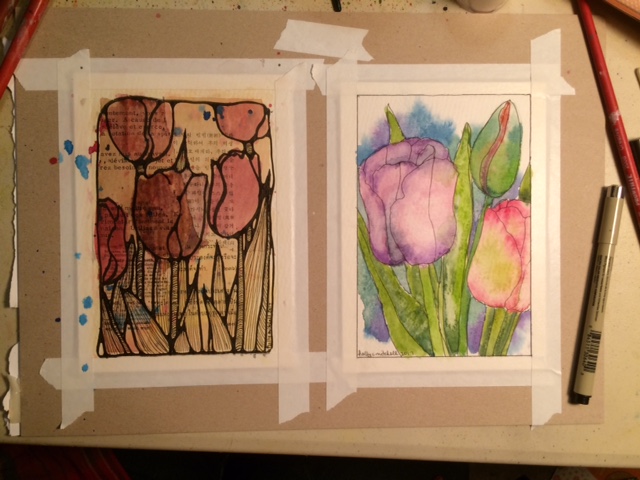
5″x7″ art journal pages for a swap I’m in… our chosen them was flowers. She will attach these pages to pages in her own art journal… because sending a beloved art journal out into the world for others to work in is exciting, but a huge risk! I used some old foreign book pages for the background of one because the recipient specifically said she likes them. I hope she will like what I’ve come up with! I’m really happy with them. I love doing stuff like this.


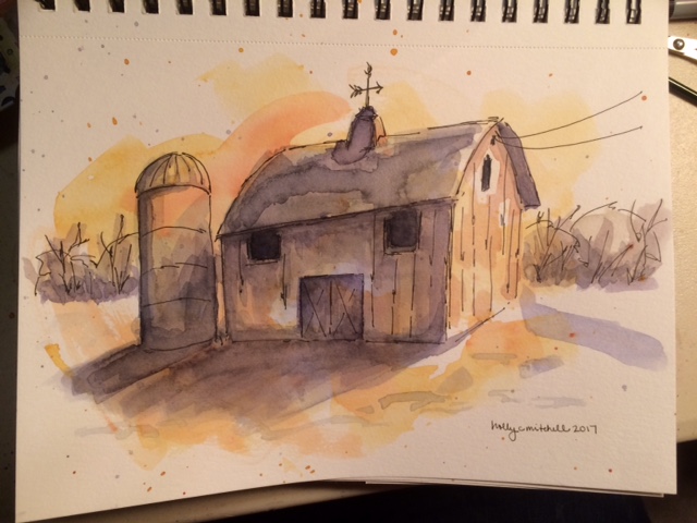
I saw this technique in a youtube video… you splatter color onto a dry page, then use a wet brush to push it around into a light loose wash. Once fully dry, you do an ink line drawing on top and shade with more color. The result can be much more interesting than a line drawing and watercolor on a white page. This isn’t a great representation, but I made several backgrounds and then tried a quick sketch. I’ll try more of these on my other backgrounds.

(Not MY journal, but one going out for a swap, “Stuffed Winter Journal” … or something like that. Basically, pages of either ephemera and notes from whatever I have done, or whatever have felt like doodling throughout January and February. – Swap partner Djcamp04, don’t look!)


And the gift card inspiring the page can be seen peeking up… (I have an addiction to collecting interesting gift cards) Then I googled drawn snowflake images and used other people’s creativity.


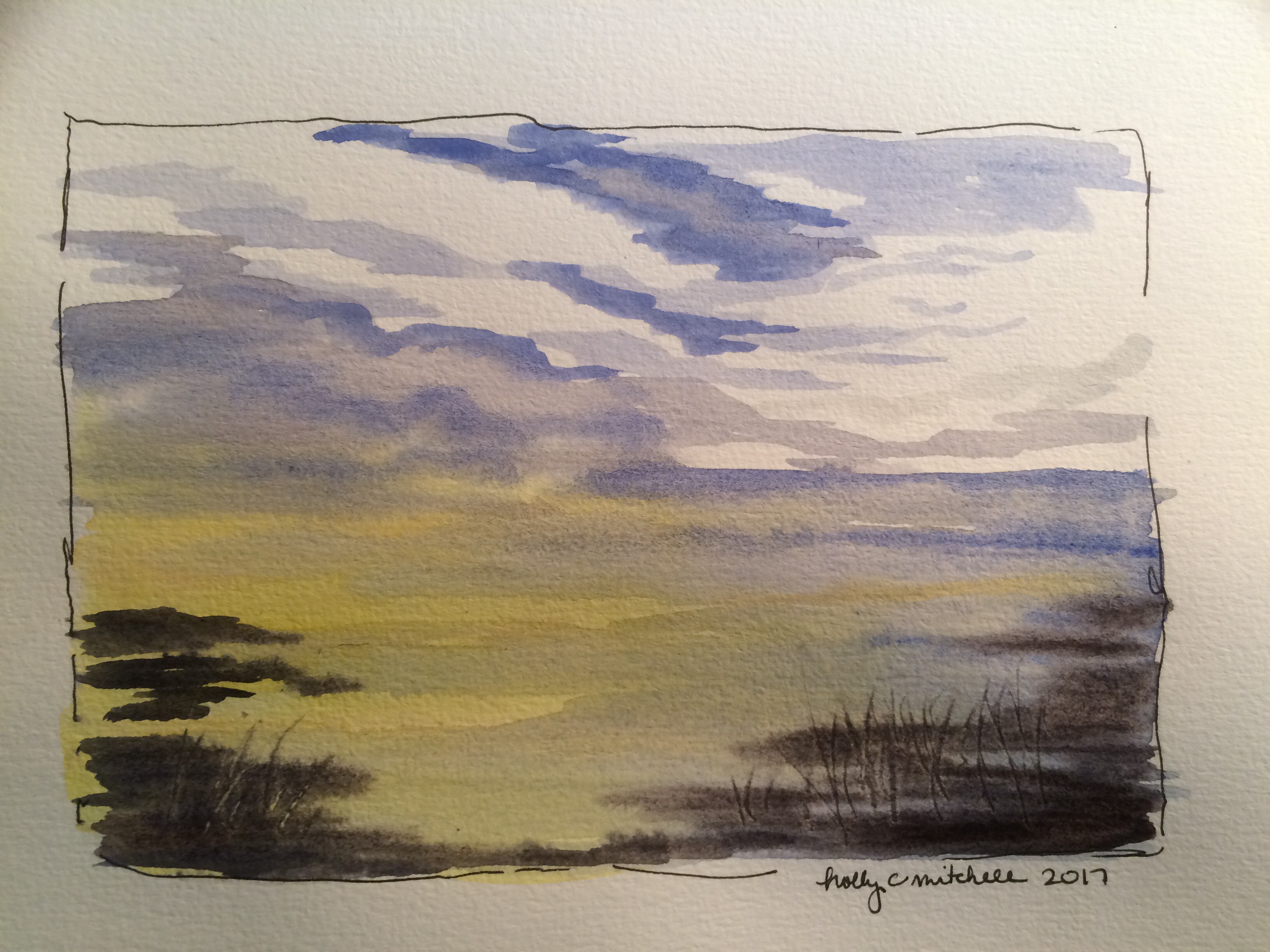
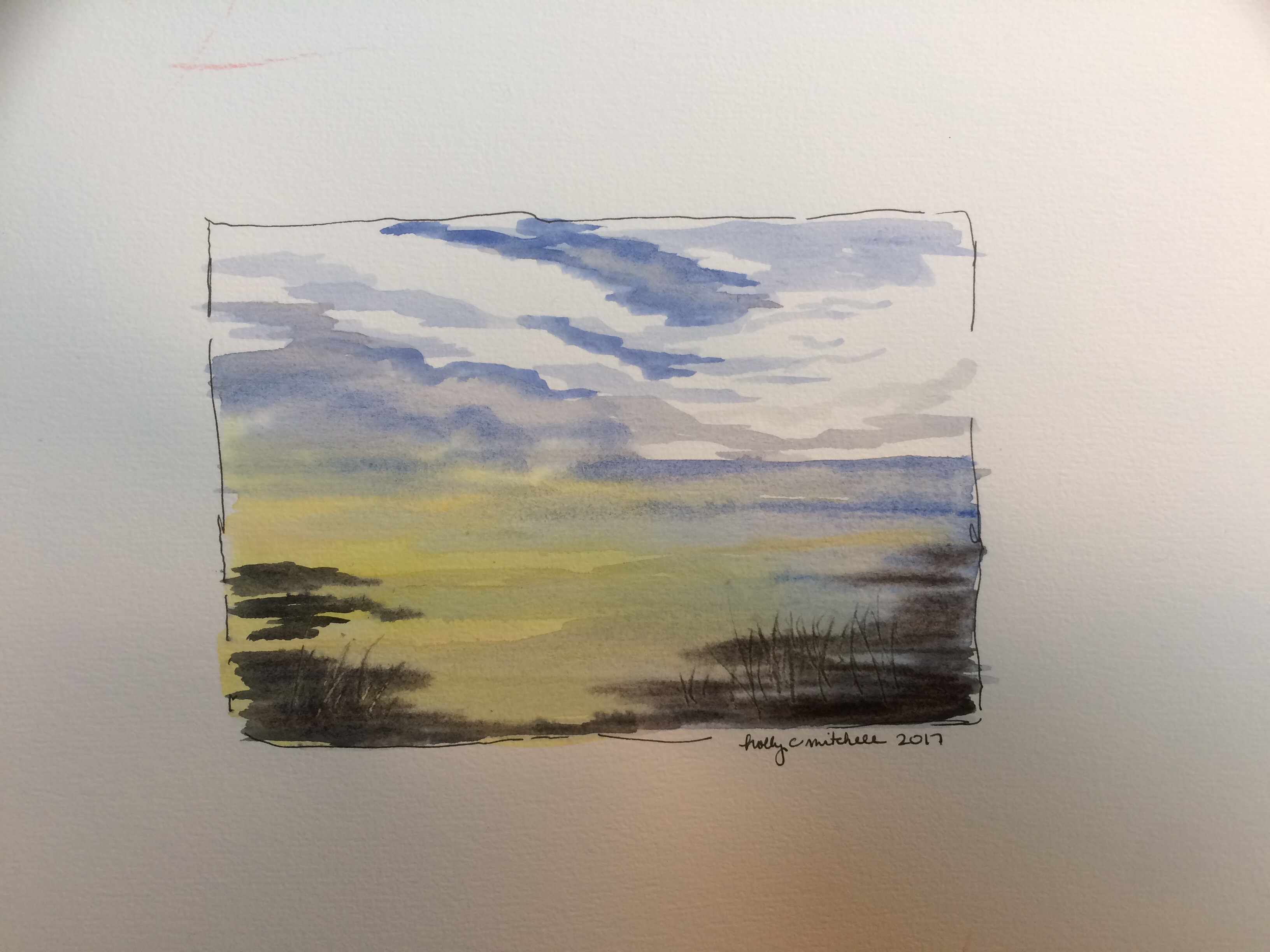
Two techniques to practice (learning from a , you guessed it, youtube tutorial! “Geoff’s Top Tips One-Part One”), wet on wet and wet on dry. So here goes!
Wet on wet:
Four attempts at this one. I like some of the results. This will make a pretty background. Technique: wet the whole area. Working quickly, mix three washes, a thin wash of cobalt blue, with a little touch of the rose madder (a TOUCH, you don’t want to turn it purple, although… mine looks purple here), then a translucent gray, again with a touch of rose madder to warm it, and finally (with a very clean brush) a thin wash of a creamy naples yellow, with a bit of vermillion added. (An interesting note: I don’t currently own ANY of these colors. So… I used what I have.)


Wet the whole page, start the yellow/pinky color at the bottom, nice and light, working it up in horizontal streaks but leaving lots of white, adding more water as you go up. The use the blue in horizontal streaks, lightly, letting it seep a bit into the pinky color as it goes lower. Leaving lots of white. Finally the gray, more heavily, which really forms the clouds. (thinner lines at the bottom) All of this must be worked quickly. And I mean quickly. 30 seconds, a minute, not much more. The paper must be wet the whole time.


wet on dry:
I like these results as well. Technique: Mix colors as you go this time. Wet the whole area. Use a naples yellow wash across from the bottom up, leaving some white, particularly in the middle, as the brightest part of the sky. Let this fully dry. Mix french ultramarine, a strong vivid transparent blue (apparently this is important, the transparency), gray it slightly with a hint of burnt sienna. Start at the upper left, make horizontal streaks across, moving down, adding a touch of water to soften it and to vary the strength. (again: I don’t have these colors, which I will use as my excuse for these not looking terribly like the tutorial sample, but really that’s not the reason. It’s a combination of supplies and experience.)


The second technique is a little more precise feeling and more difficult, but gives very different clouds so is necessary if I want thinner less puffy clouds. The first is more fun.

Another Peter Sheeler tutorial. These tiny sketches are helping me. I can see improvement happening, although I still don’t control the paint and water like I mean to. If you want to practice some watercolor or line drawing skills, check out his youtube channel!


From yesterday’s drawing… I’m really happy with this one. And best of all, no tutorial needed!!! A breakthrough!! (I’m going to keep following tutorials, though. I love them.)


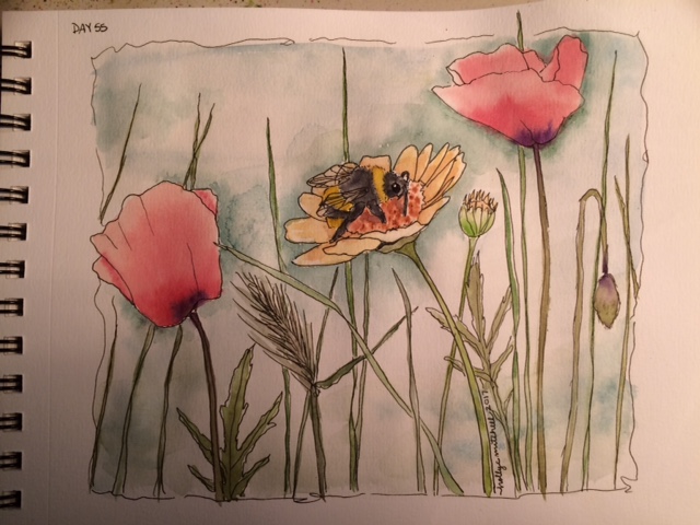

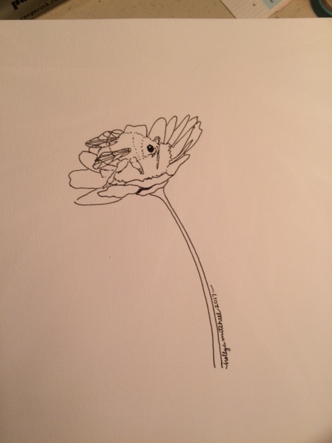
A quick little bumblebee because I’m running behind. But I’ll work on him more tonight or tomorrow!

Similar to the splatter technique I used in January for the cherry tree, but you spray water on it after splattering paint everywhere (and I do mean everywhere.) I definitely haven’t mastered this. These are unattractive paintings. BUT… I had fun doing them, and may use this idea in the future.


That Peter Sheeler. Mine are always just a little OFF. I like it, though.
Wait till you see tomorrow’s. Messy, messy, messy.

