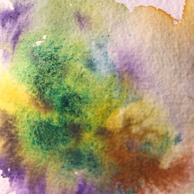
Messy. Playing with QoR’s Cobalt Teal tonight.
PG50… rather opaque… liftable, at least on this paper (which surprised me)
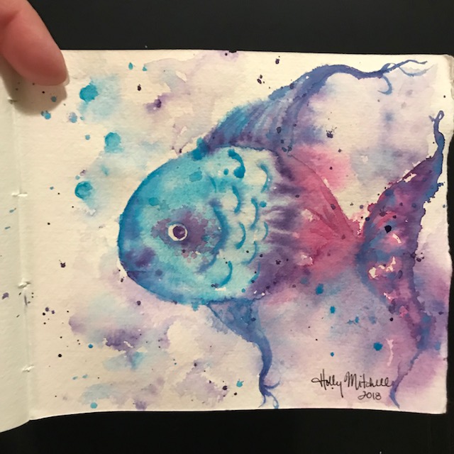


Like all QoR paints, it has nice flow and dispersion.
A 365 day art project… one drawing a day

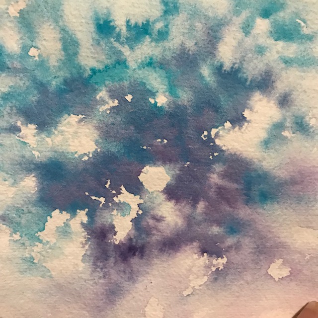
Messy. Playing with QoR’s Cobalt Teal tonight.
PG50… rather opaque… liftable, at least on this paper (which surprised me)
Like all QoR paints, it has nice flow and dispersion.

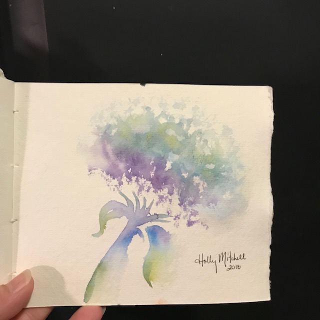
Because it’s just so fun to doodle.

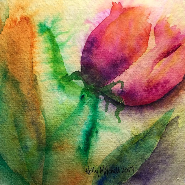
I saw these beautiful tulips yesterday at a big annual yard sale we attend each year in historic Hilton Village:
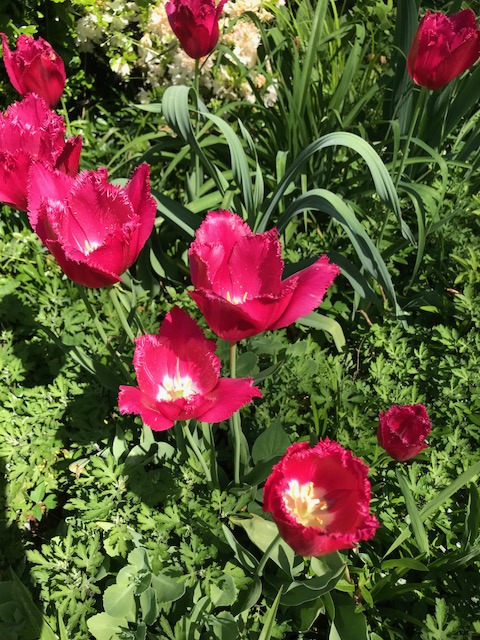
And came up with this little sketch based loosely on them:
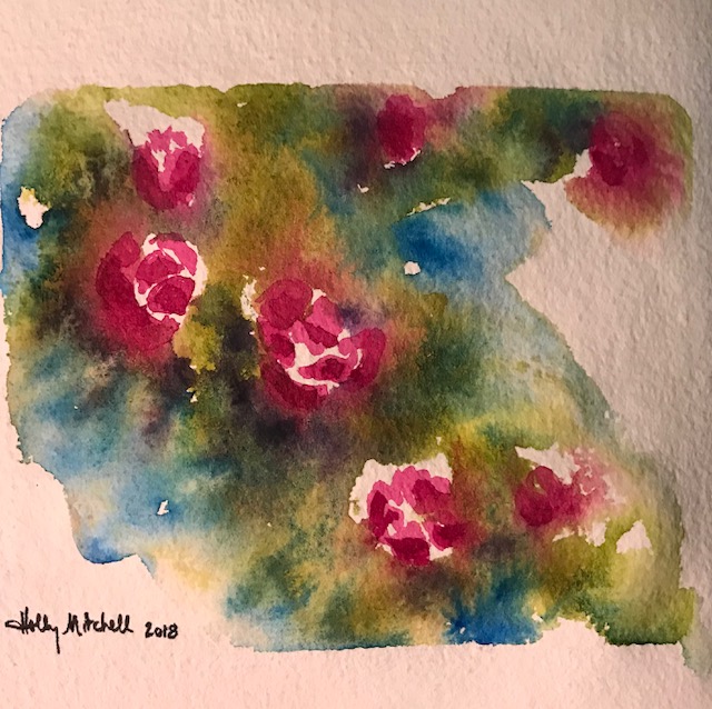
A few things I don’t like much about this, but I still love the way the QoR paints inspire play, and the lovely granulation coming from the tiny addition of EEM’s ‘Tia’. (See my previous several posts for more about Eventually, Everything Mixes watercolor paints.)
")
Today I used a couple of QoR colors with the handmade EEM paints. I love the combination of dispersion and granulation…
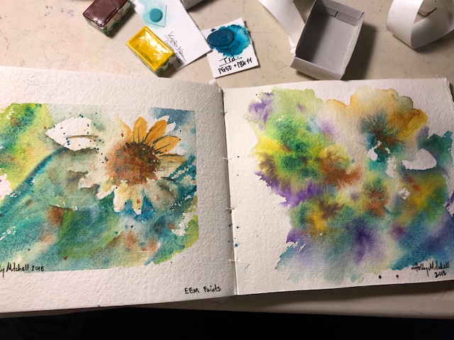
Ohhh, that lovely QoR dispersion… this brown was just the tiniest dot of color added on top of the wet EEM paint, ‘Tia’.
Look at this intense granulation, from the little dabs of ‘Tia’ dropped in here and there.
Yum.

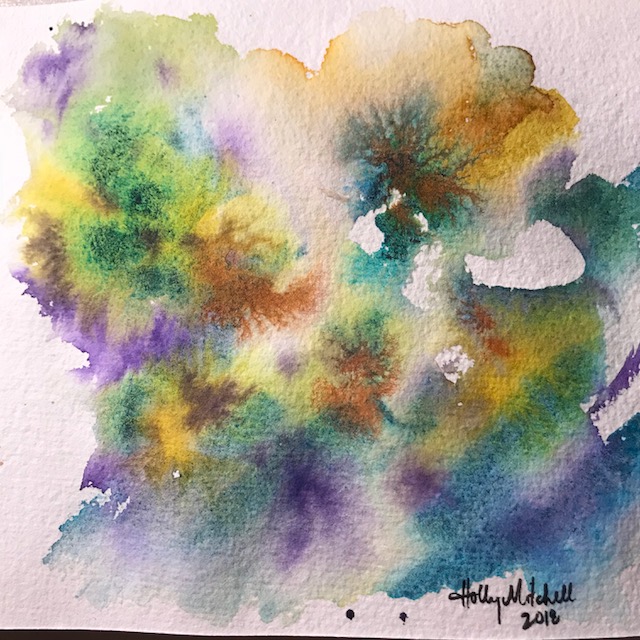
My tape tore the bottom of the paper off… even though I first put it on my shirt to make it less adhesive! I may need to find different painter’s tape.


This was just a quick fun low-pressure scene. I added little flowers with a white gel pen and with “fluorescent chartreuse Golden High Flow Acrylics” (only because both were right there on my desk and readily accessible!) Not much to it, but fun to do!

I used kelogsloops again from youtube for these practice entries. I haven’t done faces and admire them but don’t really know how? These are from entries in his watercolor journal… you can find him on youtube and see his originals, which are much nicer. I stayed fairly true with the first one and took quite a few liberties with the second, but it is still very definitely his design, face, and hair. These are quite fun and I’m hoping in 2018 to be able to design my own. The first (blue) used Qor paints, the second (red) used White Nights. I enjoyed both, the Qor kept more vibrancy as they dried. Drying lighter is normal for watercolors, so not a weakness in the White Nights, but an unusual attribute I think of Qor and Daniel Smith.


My last entry for 2017!! I wish I had been able to do something EVERY day, and not missed so many days the last quarter, but I really learned a lot this year and consider my project a success, even though I missed some days. (And I’m so happy that I ended on 365!! I expected my count to be off!) Many days I invested HOURS, not moments, so maybe it kind of evens out. There’s no way I could have painted these faces last Christmas, even copying someone. I didn’t even know I enjoyed watercolor. I have a lot of favorite pieces from this year… even a bunch of things I DIDN’T COPY from someone else’s idea, but created myself, so YAY ME. And I’m figuring out my “style”, which is cool. I expect to continue my project into 2018. If there are things you’d like me to try, or supplies you’d like to see tested, let me know. And happy new year… 2017 was good, and 2018 will be better. There’s a lot to look forward to… Stuff we don’t even know about yet. Exciting things are coming our way!!

Ok, look how cool the green paint at the bottom acted… it just GREW ITSELF into tall grasses! I think a tiny yellow treehouse next…? [ I have “commissions” for four separate people waiting to be started… why don’t I work on THOSE?? (I think I’m afraid of disappointing myself or the people who asked for them…) ] Read on only if you want info on the colors I used. 🙂


I’m using Qor paints, and also these Daniel Smith watercolors… I love all three of these colors, particularly the Undersea Green. Mixed with just a touch of Daniel Smith’s sap green it is really extraordinary in my opinion, and I love it in those trees. The Undersea Green with just the tiniest touch of Qor Manganese Blue (which I purchased at Jerry’s Artarama in town nearby, because I couldn’t find it on Amazon :), makes the blooming grassy area in this treehouse… I turned the paper upside down and let gravity help. (a little hint… painting on an easel makes a big difference!) And the sky is the Qor Manganese Blue.
The Qor colors bleed and develop into the most interesting patterns. They are really REALLY fun to use… if you haven’t tried them yet, consider starting with the Qor High Chroma watercolor set , the colors are fabulous, and the purple in it is what I have enjoyed using in the trees so often. The pink, too, actually. The Green Gold is what I have been starting most of my trees with, adding dots of yellow and blue and even the purple. I watched a video recently suggesting letting colors blend on the page more often than mixing in a palette, and it does give satisfying results. The reddish brown of the tree and chimney are Daniel Smith’s Transparent Red Oxide, which I am enjoying very much, but is quite similar to other colors I already had. (Including the Transparent Pyrrole Orange which comes in the High Chroma set, I think.) The yellow is Daniel Smith Naples Yellow… which I haven’t quite decided about. I think I like it? The Qor and the Daniel Smith Naples Yellow are slightly different colors and I haven’t compared them much yet.

Just a little playing around tonight to see some of the Qor colors. I love them. So vivid. Such interesting flow and movement on the paper. Nothing beats the lightfast ratings of the Daniel Smiths, of course, or the quality of the pigments. But the Qor are good, and fun to play with.
Here is a link to the Qor High Chroma Set on Amazon, currently $21.36

I’m proud of this one, even if Angela Fehr had to show me the techniques. She was exploring Qor watercolors (pronounce it “core”, made by Golden) and demonstrating some of their more interesting properties. When the Qor paints touch water on the paper, the unique binder they use causes the paint to quickly feather out into the water, little tendrils of color spreading out like tiny rivers on a map. It’s very cool to experience, and even Daniel Smiths don’t react exactly that way. I received a free set of three small Qor tubes recently and had one of the colors she was using. I found adding a Qor paint to a Daniel Smith, I still get that reaction. So of course I ordered the Qor High Chroma set of paints she was demonstrating. (try the link!!) I mean, really… I kind of had to once I saw how interesting their response was.

You may be able to see some of the texture added on the foliage area by using plastic wrap on the first layer as it dried!


Very happy with this one.
