Birthday Girl

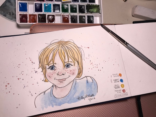
Only six years old, and already she’s a comic book character.

IMG_2175

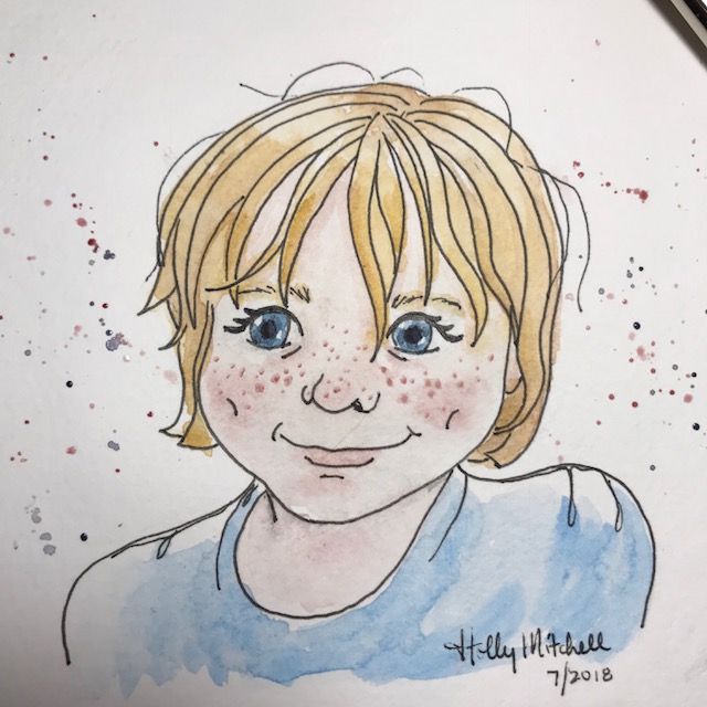
A few errors, but she’s pretty cute. Maybe I’ll thicken up the lines a bit.

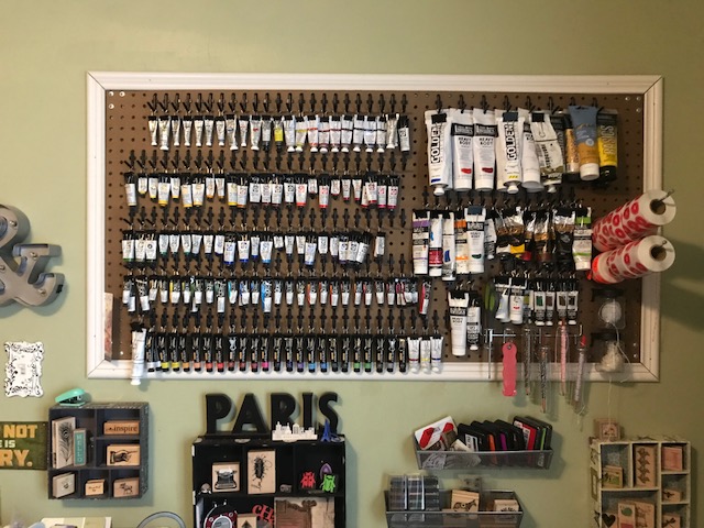
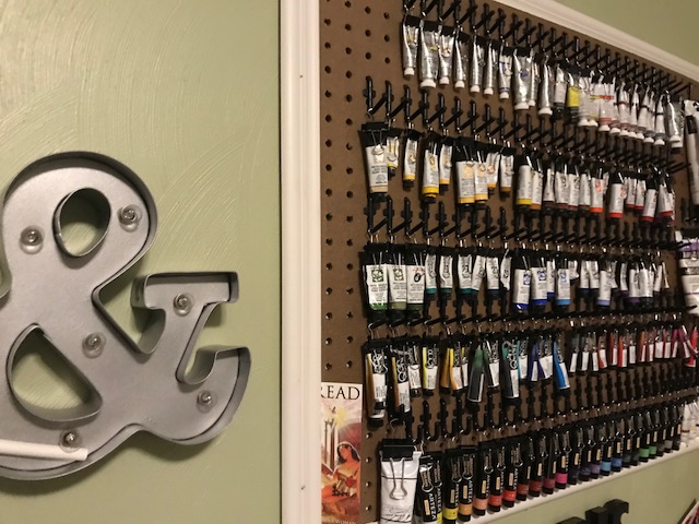
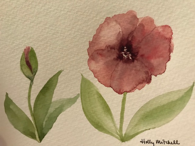
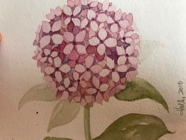
I’m using a new ‘faux squirrel’ paintbrush. PLEASANTLY CHEAP. Through an online sale at http://www.wetpaintart.com… an art supply store in Minnesota. I don’t know if the sale is still going on, but they are worth keeping an eye on. I’ve gotten both of my ‘limited edition’ Schmincke watercolor sets there, and my QoR mini pan set, some good brushes on sale and a miniature paint set which is super adorable. Good sales, good products, and great customer service) I like it. I still get most of my supplies other places but some of my favorites from there. I’m a fan. (If you happen to live near them, it sounds like they offer a bunch of cool classes as well!)

IMG_2176

I thought maybe in this journal I’d add a little swatch area for the palette choices on each page. It will show me what I’m usually using, in the future it will show me what colors I used (because I definitely won’t remember) and also I can learn a bit about choosing a palette for a piece, maybe.

IMG_2178

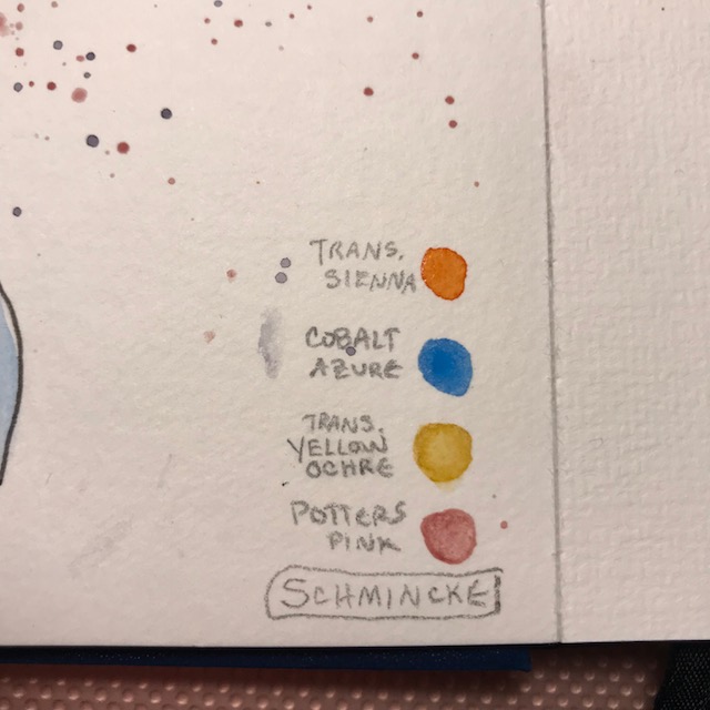
I guess tomorrow I’d better add the pigment numbers as well.

IMG_2180

Following a Rose Tutorial by Jay Lee

Here is the rose I painted during the livestream session today (and what could be nicer than painting on a rainy summer day?) :

IMG_2164

It isn’t bad, but if I showed you Jay Lee’s rose that I was copying, you’d see why I wasn’t happy with this. I see what he did. I just didn’t do it. I was trying to paint what he painted as he painted it, and I couldn’t keep up… So afterwards, I pulled up my own reference photo, and came up with this:

IMG_2165

Still not perfect, but I do think it is better than it would have been in early 2017. So I will keep moving!!


Quick watercolor doodles

Leaves and balloons… what could be simpler?? Trying out some new Schmincke colors here.

And with that… ta-daaaa! This watercolor journal is complete!! Woo-hoo!! On to the next. But first:

I’d love to hear your thoughts on fugitive* colors… (particularly Opera Pink… PR122, which came in my newest Schmincke set.) I keep pulling out any fugitive colors I have in my sets. And I’ve been really picky about choosing paints with good reputations in lightfast ratings. Lately I’ve seen artists saying they don’t worry about fugitive colors because they are only painting in journals, it wouldn’t be hanging on walls, etc. I think my work will mostly remain hidden as well… it just seems to me there are so many lightfast colors available, why should I include those known to fade in my selections? But maybe I’m worrying about nothing?

Maybe I’ll accidentally create something amazing in a journal one day and want to display it? Shouldn’t I plan for any eventuality? What are your thoughts on fugitive pigments, and how do you handle them when they come in your sets?

(*Fugitive colors= pigments known to fade over time when directly or indirectly exposed to sunlight)

IMG_2092

So here is (part of) what I’ve been doing instead of painting…

I have a lot of trouble keeping my studio at all reasonable because of my personality.  I’m naturally creative* (*messy: I have trouble cleaning up after myself and tend to slide stuff over and just clear a little sad spot to work), pensive** (**lazy: I tend to find better, more engaging, more soothing things to do instead of cleaning), sensitive*** (***moody: I get irritable and dejected and try to find ways to boost my spirits, besides cleaning up after myself), and an aficionado**** of all things cool, ephemeral, and affordable (****a borderline hoarder: I collect things that should be tossed into a bin, and repurpose them… will buy a bunch of the same super cheap item on sale, instead of one expensive quality piece which will last… and REALLY enjoy a good yard sale, perusing other people’s rejected items.) … the combination of which creates chaos in my environment.

So, occasionally I spend a month or so immersed in anxiety about my studio, and the knowledge that its current state needs improvement, and stress about how to tackle it, feeling childish and disorganized and ridiculous because of the mess, and finding ways to procrastinate… before I  finally just take a bit of time and fix things. Yesterday was that day. I spent most of the day trying to clean up my creative space. I didn’t complete everything, but am terribly impressed with my progress.

One project I actually did earlier last week, but I love it so much, and it makes such a difference, I have to show you.

I saw this idea a while back on Oto Kano’s youtube channel. Using small black binder clips  and little black pegboard hooks , both purchased in bulk on Amazon (which was so inexpensive!), I organized all of my paint tubes.

(If you don’t have a pegboard, Oto offers a different suggestion in her video. I altered it for the pegboard above a little desk in my studio) No more digging around in bins to see if I have a color! I may also add a small color swatch to the side of each clip… I haven’t decided yet if that is actually necessary. (oh, there’s that pensive* quality again!) I ordered the wrong size clips the first time around, but used them for my acrylic tubes, and reordered the smaller size.

How fun is that?

IMG_1908

IMG_1953


Crazy World

Who could resist those eyes? To read more about Emmett and Clara, go to:

All the Crazy World, a blog mainly about our life with humongous puppies.

(by humongous… I mean Emmett at 2 years is 160 pounds, Clara at 9 months is 120 pounds… and still full of puppy. It’s a small life full go big puppies)


Using a Rosemary & Co Triangle Brush

Trying out a brush I’ve ignored for quite a while. I got this Triangle brush from Rosemary and Co last year… (you may also see it called a pyramid or wedge brush)

(looking straight down the ferrule):

IMG_2091

I tried to do the petals and leaves as one stroke each. It wasn’t as simple and intuitive to use as I expected/hoped… on the other hand, it was a VERY quick sketch using few strokes. Maybe if I play with it a little. (I felt like I enjoy my #6 round sable better, and kept wanting it. You can tell I didn’t love doing it, because there’s only a single attempt!)

These colors are Schmincke mixes, in my Strathford 400 series watercolor journal.

Finetec/Coliro Pearlescent Colours… YES!

I added Finetec Pearlescent paint to this little red headed girl, painted with Schmincke watercolors (please excuse the photography… it IS NOT on pink paper! ) and the shimmer is sweet and fun. Even her freckles sparkle. This paint was so easy to use, I felt I should share it with you!


IMG_1991

I do highly recommend these “Finetec Pearlescent Colours”… linked here at Amazon.  (now packaged as Coliro, but still manufactured by Finetec in Germany, in exactly the same way as before) If you are looking for shimmer, I think you’ll find they apply easily and are nicely opaque, and are smooth and luscious. They have other sets as well, including a set of 12 colors, and a lovely earth tone set. (And lots of others. I don’t know how the prices usually run, but right now the 12 set is $27.11, “regularly” $45.75, and the 6 tone earth set is $26.99, so the 12 set might be a good deal… but it is the 6 set with gold, silver, and copper that I have. The Kuretake Gansai Tambi set is only $11, but I’ve tried those (individually, not that set) and I wasn’t happy with them. I think there are some youtube reviews comparing the two brands)

These come in a lovely sturdy tin… the large pans pop out and replacements can be purchased and snapped back in.

Color me impressed! I’m not generally into glitter or shimmer, and I would not have ordered these. I did pay for them, and probably a premium price… they came in a lettering subscription box from ArtSnacks. And I’m happy I have them, now that I’ve played with them!


Youtube artists: Pearfleur and Drawing Wiff Waffles

Today I want to post two (mostly-)stolen images. I want to learn to sketch people, but I don’t know much about them… certainly not enough to create a figure without a reference. I follow Pearfleur and Drawing Wiff Waffles, both talented artists, both great at drawing people. Click below for Pearfleur’s video, talking about Sakura Koi watercolors (and to register for her giveaway!!):

Pearfleur’s giveaway ending August 31st, and her Sakura Koi watercolors…

She painted this face, and interesting background…

IMG_1897

I just stole the eyes, although I may try again with a similar background. Here’s my attempt:

IMG_1957

That odd texture is because it is in my watercolor journal, and is actually on the back side of the paper. (but why waste a whole side just because it reacts a little differently?)

Click here for Drawing Wiff Waffles One Marker Illustration…

Drawing Wiff Waffles posted this drawing, in a video where she is challenged too use only one color marker:

IMG_1891

How cute. And what an interesting drawing challenge. She also shows how to use alcohol with an alcohol marker to achieve a watercolor effect, like she did for the skin tone. Click the link to watch the challenge.

My attempt (at her picture):

IMG_1903

[I just noticed, I completely forgot her freckles…oops]

I used the Uniball deluxe micro pen that I always go on about for the outline, and Schmincke English Venetian Red for this.  Using one color is fun (and easier with paint, I think, than with a marker!) Drawing Wiff Waffles also gives a link to this image as a coloring page, if you’d like to try the one marker challenge yourself without drawing it.

I found the Uniball fine tip .7mm pen HERE on Amazon, right now the three pack is only $4.37! If you have been thinking about trying these pens, that’s a great price. The .5mm tip, which is the micro tip I generally use, is HERE on Amazon, currently $6.81 for 3… also a great price. They seem to fluctuate tremendously. I’ll tell you what I think of the larger tip after I’ve tried it a bit.

If you like these pictures, go check out the tutorials. You’ll enjoy them even more.