A tiny acrylic landscape FOR BEGINNERS 7/2/19

I followed Ray Grimes’ Youtube tutorial for this one, “Simple Landscape from a dot”… and yep, you basically start with a dot. (See video here) Here it is as simply as I can explain it.

First: cover the canvas in white.

Then: add a tiny dot of color (he used purple, I used burnt sienna, because I don’t have a pretty purple) Use a stiff brush (apparently any, because I didn’t have any of the tools he used) to tap the dot in and around (see my land on the left side.)  Add a tiny (sienna) dot on the right, tap it around.

Use a dry flat brush to drag down through the bottom of the color, then a swipe horizontally (for the reflection for both pieces of land).

Add a third (sienna) dot at the bottom right, tap tap tap with the brush, repeat the dry flat brush draggy thing a bit. Don’t overwork it.

Apply a thin line of white to the flat edge of a palette knife, drag it beneath where the “land” should be, and maybe a stripe or two in the “water” (see my image) Sign your name… you are done!!! A 5 inch, 5 minute masterpiece. Incredible.

I REALLY love the sienna color. I will try more single color paintings, I think!

IMG_0841

The supplies I used. (That long brush is actually a stiff flat brush, it just rolled itself sideways)

IMG_0829

I’d love to know if you try this!!


Thirty Days of Everyday Life: Day 5, Blueberry pancakes

Sundays rock. The scent of maple syrup and bacon spreading through the house is just The Best AM gift. It lured me out of the studio and began a day of both work and relaxation. We spent the day at a team meeting, dinner with some of our kids, then home, and I forgot to journal until just before bed! So, a quick pancake sketch.

IMG_0816

Thirty Days of Everyday life: Day 4, sketching at MacArthur Center

I met with the Norfolk Urban Sketching group for the first time Saturday at MacArthur Center in downtown Norfolk. We were asked to try to tell a story with our page… I found the sculpture of the herons, being both ‘art’ and ‘nature’, a sharp contrast with the merchants and shoppers surrounding it, capitalism at its height. Plus, I really wanted a pretzel dog.

Indoor sketching is very difficult for me. So many lines, and all of them in 3D! When sketching outside, for example drawing the building across the street, my mind quickly converts the scene to 2D. When I am in the center of all of these lines and vanishing points I find it confusing.

IMG_0791

Everyone in attendance was quite skilled. It was a nice couple of quiet hours, and I may have learned a thing or two as well. (Plus, the pretzel dog…)

Thirty Days of Everyday Life: Day 3

A stool from the dining room at work. Proportionally challenged. No… perspectively challenged. Maybe both, I guess, but that’s what I get for sketching in ink. (Either way, I filled the time which I should have spent interviewing someone with a journal sketch, because they did not show up) In real life, the stool is nice and straight.

IMG_0751

Salt shaker, also from work. Dinner (salmon, green beans, salad) made by nice husband! Neighbor’s dog, Barkley.

IMG_0752

IMG_0754

My life is pretty boring. But honestly, I enjoy drawing the mundane, so I suppose it suits me rather well!

Thirty Days of Everyday Life (Day 2) MarletteArt on Etsy

Received paint in the mail today… woohoo!!

IMG_0739

Check out the etsy store here, MarletteArt The owner, Hunter Marlette is “taking a short break” according to the etsy site, but this paint will be worth the wait, I think. The colors rewet immediately, and are lovely. The pans are filled to the brim, and have nice strong magnets attached (the neodyne type I use, not those wimpy self adhesive strips) He adds the store name, color name, and pigment information to the pans, and packages them nicely. The paints are milled with honey, which gives them a lovely texture, but they aren’t as sticky as M Grahams.

The paint comes nicely wrapped and labelled.

IMG_0735

One thing that attracted me was the quinacridone gold he offers, which is made from the original pigment, PO49, no longer available. (I think he could get more money for this paint, and told him so. 🙂 The sap green he makes from this color is GORGEOUS Oh-My-Gosh-I-love-it-gorgeous. Gorgeous. Yeah. Probably my favorite sap green ever. (and I feel like I’ve tried them all??)

IMG_0737

His metallics are VERY metallic. Very shimmery and pretty. And the sample dots he included are generous enough to really see if you like using the color.

I really enjoyed the fun envie it was all shipped in as well, so included that in my journal 🙂

IMG_0738

Hunter has the same initials I have and I remember off and on for years trying to come up with a fun logo with my initials, HM. Well, he’s done it, and puts it on his packaging. I’m a little envious of that logo.

IMG_0742

IMG_0741

Thirty Days of Everyday Life (Day 1)

The challenge: to fill 30 days of art journal. (one full book)

Using this watercolor journal:

(I have spoiled myself recently using heavy 100% cotton paper. I gotta admit it does make a huge difference. The paper in this journal is fine for the way I sketch, and the journal is quality… but I’m finding I have to readjust the way I’m painting because the paint dries so quickly, and I’ve gotten used to the cotton paper, which stays wet and can take so much water.) If you haven’t tried cotton paper… do.

The title page:

IMG_0727

*That interesting light blue background is lapis lazuli from A. Gallo in Italy. A really soft gorgeous color. She sells out almost immediately when she posts colors, but I love all of them. If you can find some available I do recommend you grab them.

PS Those are lightning bugs (fireflies!) and pussy willows in the “f” and “e”… you just can’t really tell.

What fun sketches will my boring life inspire over the next month???

Santa on Vacation… 6/19/2019

I realize I am not posting as frequently as I was, and I offer my apologies! I gotta get back on my game.

IMG_0534

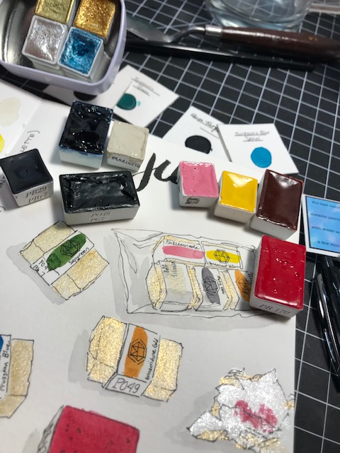
Supplies: Daniel Smith watercolor paint, and M Graham titanium white gouache, “Fluid 100% Cotton Watercolor 300Lb Ez-Block, 6X8” , Uniball Deluxe Micro pen, .5mm, black ink  and Uni-Ball Signo 207 Retractable Gel Pen, 0.38mm Ultra-Micro Point, Black.

First I want to mention these supplies. I LOVE THESE PENS. Why doesn’t the whole world sing of the virtues of these pens??? At least, the whole art world… There should be sonnets written about them, plaques in their honor, statues set up… I use them for drawing, writing, watercolor sketching, everything… the ink is archival and waterproof, and the ball point pens don’t skip or wear down for me. The retractable signo 207 ultra micro tip is such a fine tip… I love it! I got a few of these pens free from Office Depot, using some of their rewards points I had accumulated with my purchases. I don’t remember exactly what they were priced at, but I think these Amazon prices are comparable. (Definitely shop around, though… the prices on Amazon change frequently!) I have used the micro deluxe for two years now and am pleased to be adding the ultra micro signo. (The signo comes in several line widths, too, so really I could probably just get that in different sizes, and may do that next time I order.)

The paper is extremely affordable for 100% cotton  IN A BLOCK, and 300 lb to boot. I think it is a great way to try 300lb paper, to see if it is for you. There are more expensive papers I like better, but I’m happy with this for now and will order again. (They have pads, too… I’m not sure a block is necessary with paper this thick. It isn’t going to buckle on me with the amount of water I generally use. But I do enjoy the convenience a block gives, even if it is partly in my head)

Now, on to my art!

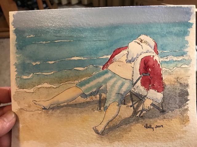
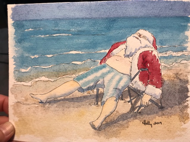
I have a swap* due out soon and my assigned partner loves Santa Claus (me, too!) (*www.swap-bot.com) But the swap has to be something I make, in BLUE. Blue Santa?? Why not? I started with this Santa at the beach, because we are hosting a Christmas in July event at work and will be having a storytime featuring a guest reader in July (Santa, on Summer vacation!) and we are at the beach, so I have Beach-Santa on the brain. I found a fun reference photo and went for it, using recently acquired paints I hadn’t tried before. Very granulating colors! Perfect for sand, not so perfect for ocean waves or sky… (live and learn!! Gotta use the paints to get to know them!) My Santa looks downright drunk (He isn’t! He’s basking in the warm sun) vs the photo Santa who looks just completely reclined… I’m not sure why, but I’ll figure it out.

My reference:

IMG_0529

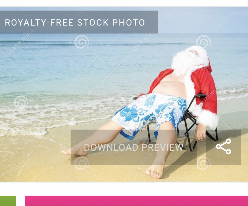
(I hope I’m allowed to post that here… it says royalty free, and you can download the image for free…)

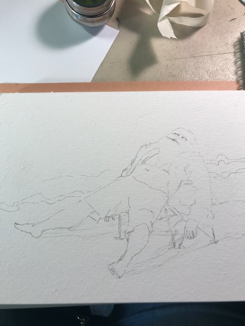
I started with pencil, unusual for me now, but I wanted to be careful about the size:
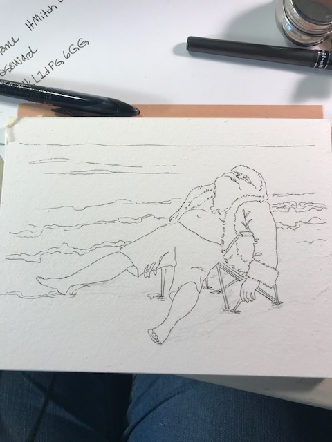
58266919938__026E6CA3-E0F4-466B-B930-E753E11C0788

Added ink:

58267016331__ADA7E7BC-C4E3-4CEF-9E09-012727EFD7CB

Then layers of paint:

IMG_0531

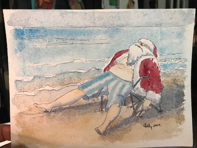
Some of that “granulation” is actually damaged paper. I used tape around the edge first, then realized I wanted no border. As I removed the tape, it pulled the surface of the paper off, especially across the top of the water, at the horizon. So. Yeah. Lesson learned, I hope. I thought it was unsalvageable. (Enter, my obsession with youtube!!) Recently I’ve been watching watercolor videos by Marco Bucci. Marco does beautiful urban sketching AND teaches lessons I actually understand! (Whether I retain them or not is another matter) One thing I have been interested to observe is his use of white gouache in nearly every sketch. (Yes, gouache, my old nemesis from two years ago). A little DING went off in my brain… so I tried adding gouache to my blues and repainting the water and sky. Guess what? It kinda worked. Not perfectly, but well enough that I’m happy I had added white gouache to my palette a while back.

IMG_0535


In the end, I decided not to send out this one, but to do something a little simpler. And bluer. (since it IS a “blue” swap):

IMG_0532

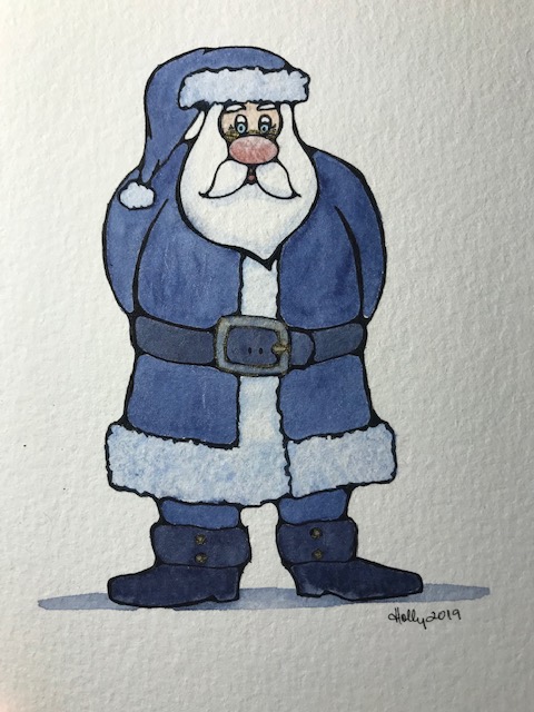
Rather different, I know! The line work was so fun on this thing. You can’t tell, but his buckle, tiny glasses, and also the buttons on his boots are shimmery. I’m going to include a copy of my sunbathing santa, too, if I can print a decent one. Which would you have chosen to send off?

Some of the above Amazon links are affiliate links… purchases made through them help support my blog at no extra cost to you!  So, thank you!

Urban Sketching with the grandkids! 6/13/19

Yesterday my daughter and I took the grandkids on a picnic. Ellis and I did a little sketching of our lunch, and here is what she came up with! (There’s a fly, if you look closely at the largest black spot. Attention to detail.) She drew it and painted it herself, immortalizing our lunch!

IMG_0407

davinci paint in a very tiny watercolor journal

The artist:

Rainer wanted a chance with the paints, too, so I found a sketch that hadn’t been colored last year:

IMG_0408


Acrylic paint play 5/27/19

Using liquitex muted turquoise, muted green, titanium white, and a palette knife instead of a brush, here’s what I came up with. That pretty “sun” upper left is just a photo reflection, as is part of the shadow at the bottom. I like them both and am going to try to add them to the next attempt.

IMG_9617


IMG_9614