Daily Journal Entry 4/7/20 – Nature Stuff. And a mini paint palette. Of course.

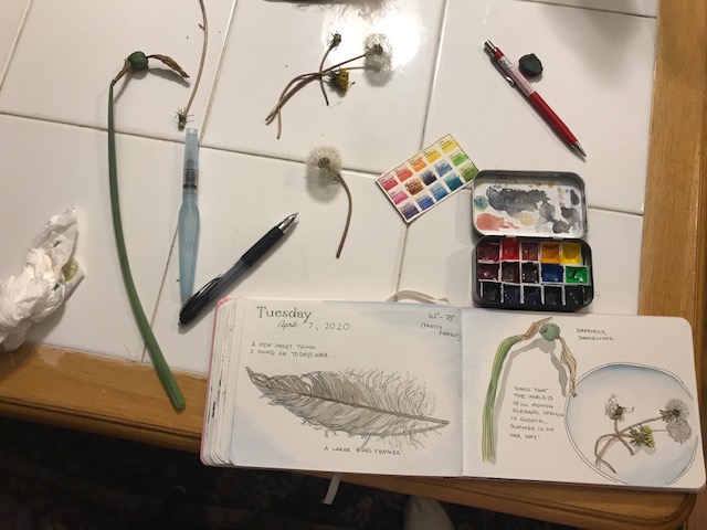
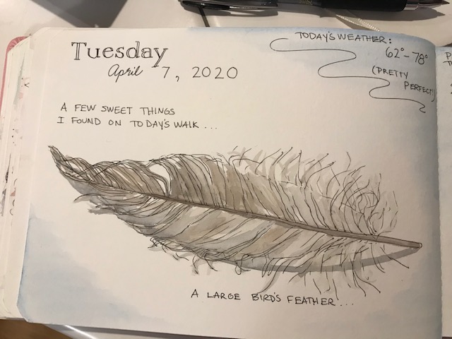
“Stuff”… just bits I found on my walk yesterday… Getting out of this house during quarantine is nice… plus, my dr insists. 🙂 30 minutes of cardiac movement every(ish) day. Yesterday I noticed a big feather, the dying daffodils right by my door, and dandelions in different stages. It was nice to just walk, and breathe, and notice.

IMG_8984

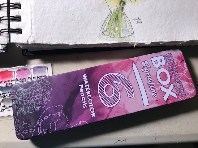
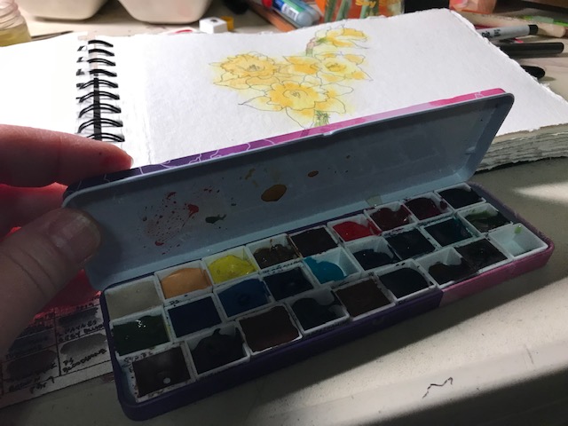
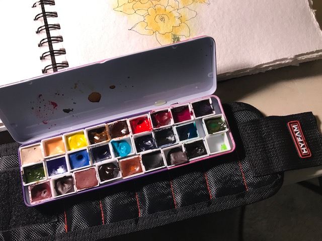
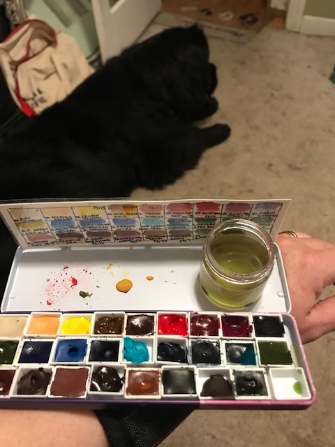
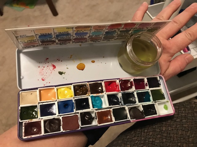
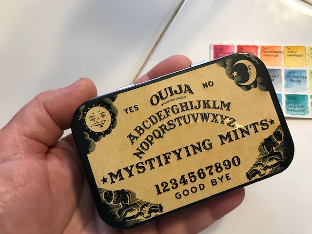
I used a little paint tin my friend Shelley sent me for Christmas. It is actually decorated like a Ouija board, and held mints, but she sent it with a list of colors recommended by…. someone professional online artist she respects. But I forget who…

IMG_8994

Anywho….  the colors work really nicely together. So they were right. It is missing a few of my favorites go-to colors… but I didn’t need them, turns out. I’m listing the colors this other artist (I’m sorry I don’t have your name here) recommended, as well as what replacements I made in my set. I tried to match pigment numbers (which I googled for each brand) and actual colors as closely as possible.

IMG_8991

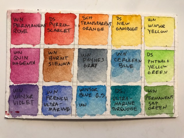
The recommended colors:

WN (Winsor & Newton) Permanent Rose

DS (Daniel Smith) Pyrrol Scarlet

SCH (Schmincke) Transparent Orange

DS New Gamboge

WN Winsor Yellow

WN Quinacridone Magenta

WN Burnt Sienna

WN Paynes Gray

WN Cerulean Blue

DS Phthalo Yellow Green

WN Winsor Violet

WN French Ultramarine

WN Winsor Blue GS (green shade)

DS Ultramarine Turquoise

WN Permanent Sap Green

IMG_8992

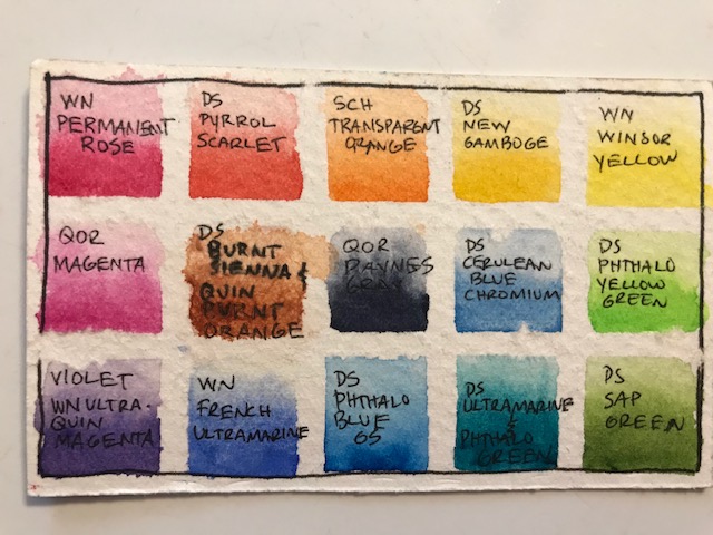
(I did this on the back of the swatch card, with the colors I ACTUALLY used. They don’t all look the same but are closer than you’d think, just some of my swatches are painted darker. I’m looking at you, Paynes Gray… I know mine is not neat and tidy like hers. She is a super pro at it)

I didn’t actually have exactly the colors and brands selected, but got as close as I could, because she had sent me a swatch card to match. Here’s what I changed out:

I used QoR Quin Magenta instead of WN Magenta

used a mixture of DS Burnt Sienna and Quin Burnt Orange for WN Burnt Sienna

used QoR Paynes Gray for WN Paynes Gray

used DS Cerulean Blue Chromium for WN Cerulean Blue

used a mixture of WN Ultramarine and QoR Quin Magenta for WN Winsor Violet

used DS Phthalo Blue GS instead of Winsor Blue GS

used a mixture of DS Ultramarine and DS Phthalo Green for DS Ultramarine Turquoise (the same way DS makes it)

used DS Sap Green for WN Permanent Sap Green.

(I had WN Permanent Rose, DS Pyrrole Scarlet, SCH Transparent Orange, DS New Gamboge, and WN Winsor Yellow)

I don’t generally use Paynes Gray… I use DS Bloodstone if I want a gray or black color and don’t want to mix one. I like its moodiness and granulation. I also include DS Buff Titanium, and DaVinci Red, and DS Green Apatite Genuine in most of my palettes. I’m going to keep this one the way it is for a while, and see if I miss them… I can always switch them out. Overall a very nice selection of colors, even if I did replace many.


IMG_8989

IMG_8990

(for the shadows i added a bit of the burnt sienna mix to the paynes gray… I like it)

Soooo…. how are you spending your quarantine?

Poppies. And daffodils. And a new travel watercolor idea…with magnets, tin, and paint!

(This post has affiliate links)

So after watching “Following the White Rabbit” set up her palette  on Youtube, I was inspired to look around and see if I had a similar sized tin. I found two. One is a Pentalic drawing pencil tin, the other BARELY larger, a Sketchbook watercolor pencil tin. The tiny bit of size difference allowed the Sketchbook tin to close perfectly over my half pans, and fit an extra row of pans, too (or brushes, if I prefer, later) Plus, it’s pink and cute.

IMG_7320

It’s slim, lightweight, already painted white inside, and EXACTLY holds three rows of 9 half pans, so I can use it in the studio or out and about. I filled it with lots of Daniel Smith, a few Schmincke, 2 QoR, and even one A.Gallo paint.

IMG_7321

IMG_7322

(yeah this is what my table generally looks like)


I ordered THIS magnetic tool wristband from Amazon for under $10. (Arrived in two days… bless you, Amazon) Some of the other bands’ reviews said the magnets weren’t strong enough, so check reviews carefully if you don’t get this same one… this one is quite strong enough for my needs! (You see where I’m going with this?)

I added super strong little magnets (Found HERE on Amazon) to a little plastic cup with a screw on lid, and to the bottom of a swatch card I made of the colors in my palette, set the whole thing on my wrist and was ready to try a painting… (I use E 6000 glue because I have it… there may be other glue that works for these magnets as well. Somehow between December 1st and today I have used 99 of these little magnets!)

IMG_7314

This worked great, and I THINK might be even better once I take it “on location” somewhere, because I’ll have my etchr bag with me to rest my arm on! It would fit ANY size tin, and I have much smaller ones if I want to use them instead, but this tin is very lightweight.

IMG_7315

IMG_7318

IMG_7319

So what do you think? Love the idea, or hate it? What type of things have you tried to make plain air or urban sketching more convenient?

-Indigo watercolor journal (I like the paper, I don’t like the spiral binding), Daniel Smith paint (Perylene red, lemon yellow, quin gold, green apatite, Uniball Micro Deluxe pen

Day 95 (wed April 5) Watercolor daffodils AND The Best Paintbrush Ever. And some darn nice paints.

Okay, FIRST, the many flowers. Way more than ONE attempt today. I tried several different styles, two kind of from tutorials.

Now on to the good stuff. I was so wrong to think my little cheap paintbrushes would hold me for long. AND also wrong to think I had to spend a fortune on a great brush. Check out this super cool brush, the da Vinci CosmoTop Spin #6.  (see link) Best spent twelve dollars and thirteen cents EVER. This is a synthetic brush but a DREAM to paint with. (Oh my goodness I will probably SWOON when I use a #6 real sable brush, if I like this so much!) Anyway, it’s clean, smooth, gorgeous, and I swear it paints forever (well, nearly) on one dip of paint. This all may be slight exaggeration because I’m still on painting cloud nine, but really. You’ll like it.

Also I used this set of Daniel Smith paints… they are teensy tubes, but a little goes a long way. (they are 5 ml tubes…figure 2 1/2 ml to load your half pan so you can fill twice, maybe?) I’ve been trying to decide whether I like M Graham paints or Daniel Smith better so wasn’t ready to commit a lot to either… So far, my choice is Daniel Smith, although I love both. This whole set of 6 colors is less than $23 and a great way to decide whether Daniel Smith paints are the way you want to go. (edit: this set went up to $27 as I wrote! Still a bargain imo for a good starter set…) Most of the 5 ml tubes are like $9 a piece, so I feel like getting 6 colors to try for the price of two or three is awesome. And really between these six you can mix nearly anything you want.  (seriously, ANYTHING. You get a warm and cool of each primary) But consider (once you know you like them) adding Burnt Sienna (because it mixes with all kinds of stuff, and with ultramarine or phthalo makes lovely grays), Hansa Yellow Deep (‘they’ say this is the truest, most “primary” of yellows. I don’t know if that’s true. But I love it), and Sepia (because I like it, esp mixed with ultramarine) I linked these to the 15ml tubes because it’s only like $3 more for the 15ml sepia vs the 5 ml sepia, and I assume it’s the same for the others. Once you know you like them, get the tube that is three times the size for just a few extra dollars. And now ta-daaa!! A complete palette!! You don’t need those crazy convenience colors. (Okay I MAY invest in cerulean or prussian blue… but those are hardly convenience colors, are they?? And a quinacridone or two, but we can discuss those another day. After I get them)

Go check them out. You know you want to. I won’t tell. Also… check out all my links! It took me two hours to figure these things out, ha!!!