Bee and cherry blossoms

Cherry blossom feast, Chesapeake, VA, (my front yard!) April 5, 2019. Daniel Smith watercolor paints (phthalo turquoise, lunar red rock, piemontite, quinacridone gold, and a bit of bloodstone added to the bee. I also used lunar blue as under-shadows. Sketched and painted (without a pencil, yay me!!) in my handmade journal of Arches cold pressed paper. These colors are sweet together. Play around with piemontite or lunar red rock, phthalo turquoise, and quin gold. Really fun.

IMG_8073

Urban sketching in my neighborhood, part 2

My house, this time.

IMG_7958

I’m really proud of myself for not using a pencil at all on these!

IMG_8032

(The brick wall curves around.)

A closer view, from March 31st.

IMG_7867


Urban sketching in my neighborhood- part 1- 4/4/19

IMG_7957

It’s funny how perspective is seen in a photo vs in person. I never would have realized how different it is if I weren’t doing this urban sketching so often lately. I will finish drawing the scene, take a photo, look at it, and think “Huh. That isn’t what I saw!”

Anyway, here’s a little piece of my neighbor’s house. There’s a brick wall on one side of it, and the brick pillar is part of the wall in front of the house. This particular house is very long, the two car garage you can see in the photo behind the tree, then there’s a little breezeway type room, then the full house with another two car garage.

I guess it’s really a sketch of a pillar and a tree, with some house in the background, since I didn’t didn’t draw much of the house!

Resized_20190404_212706_4277


A new favorite watercolor trio?

Daniel Smith Quinacridone Lilac

Holbein Marine Blue

Holbein Aureolin

I’ve linked all of the above with the best prices currently on Amazon. (As an Amazon affiliate, if you purchase them through these links instead of searching them, I get a few cents without costing you anything extra. If you aren’t purchasing them soon, however, I suggest you check prices a little, because they do fluctuate)

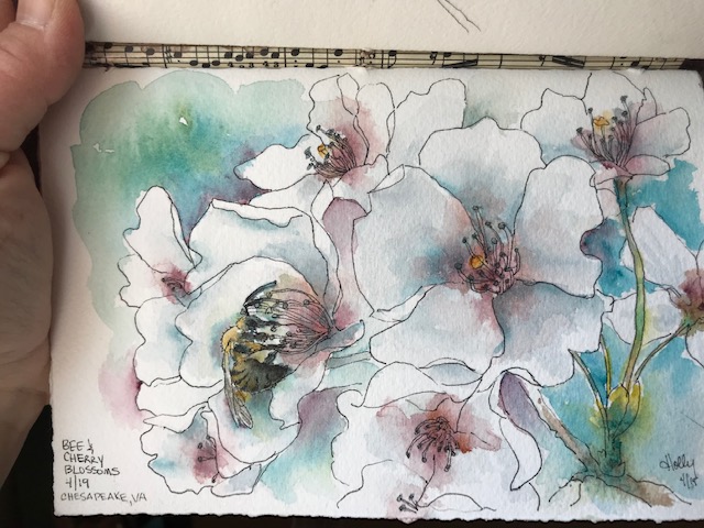
I was more impressed with each of these, and with the secondary colors they produced, than I expected to be. The blue is really gorgeous. Well, all three are. They are a little more vibrant in person than in this photo.

I’m planning to use these three as my primaries in my current travel set. (Not that I travel much, but there is a local group urban sketching opportunity soon!) The browns were more difficult for me to get, and keep consistent, but I think that was me, not the paints. Once I found them, I liked them quite well. I couldn’t get a good black shade easily, but that also might be me… I did get a gray I liked. In fact, I got a nice purple tinted gray, and a nice blue gray as well. And a sort of ugly-interesting green gray I haven’t decided about.

To be honest, I’m not sure how I feel about Holbein in general, but these two are nice. I found these through Dr. Oto Kano’s channel, specifically this video, listing her favorite 8 colors. (Not necessarily all for the same palette, but her favorite colors overall.) I think I also found my paint storage solution from one of her earlier videos. She used a white board, I used pegboard.