Using Joyce Hicks’ art as inspiration…

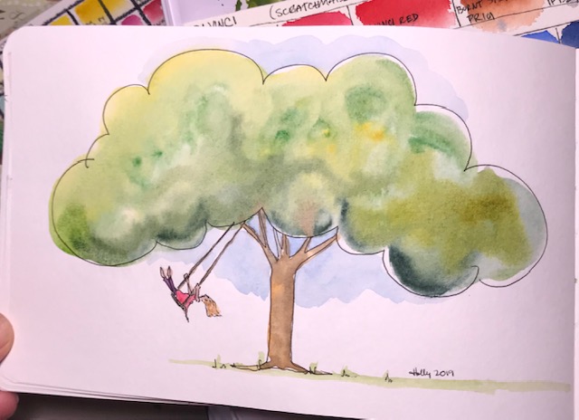
When I say “using” I mean “copying”… but I think it is different enough that she will be happy. Go check out her work at https://www.jhicksfineart.com It is lovely. So light and airy and beautiful. I really want to learn to paint as freely as she does, and you can tell from my attempt that I HAVEN’T! But it is only my first attempt. I’m confident I’ll improve.

DaVinci watercolor has a new palette with colors she inspired, including Joyce’s mother green, which you can see through this link: https://www.davincipaints.com/category-s/123.htm (I am not affiliated with Davinci, I just enjoy their paints and find them both quality, and affordable, which is nice!)

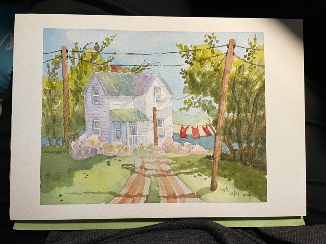
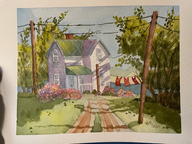
I purchased her palette, and after swatching the colors out, wasn’t terribly interested in it, to be honest. Then I ran across a little tutorial Joyce offers using the palette… https://youtu.be/K3DNoaKqHJk This tutorial was not what I expected. AND it was easy to do, and fun. It got me wondering about some of her other things, so I pulled up a couple more tutorials to watch, then found a painting of hers to attempt. Once I started, I realized I really didn’t know what I was doing. But I completed it, (using her palette!) and I’m really happy with it. A friend wanted a painting of a house with the word “prosperous” on it, and I thought she might really like this, so I added it when I did the finishing touches, cropped it to 5×7 ( for convenience for her, but also happy to crop out a mistake or two)

I learned a lot from this painting. It is hard not to just focus on the errors, but there are things I like too, and I really like her layering techniques. I’m so glad I tried something I didn’t feel ready for, and hope to do more.

I’m afraid I didn’t think to take photos of the different stages.

Almost done.
After darkening the shadows and bushes, and adding the sign.
The cropped image, 5″x7″
In a plastic sleeve, ready to mail out!

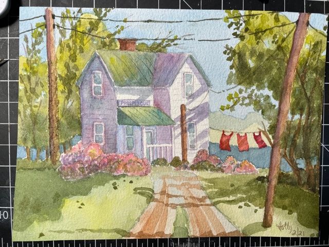
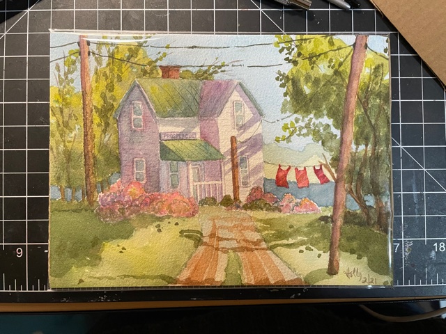
There are glaring mistakes, I know! But still, isn’t it cute? Joyce Hicks is good! I will keep trying to learn from her.

Curious George… and DaVinci watercolors!

I ordered the Scratchmade Journal set of DaVinci watercolors. I’ve watched several youtube artists review them, discussing their quality and their (relatively speaking) affordable prices. I like the selection Scratchmade Journal chose for this set (if you haven’t checked out Scratchmade Journal’s blog, here’s the link) … they look like really useful colors, especially if someone is starting out and wondering which colors to start with. I think this palette at DaVinci paints was $79. That may sound like an investment, but it’s quite a deal for 18 artist grade colors.

I LOVE the dark gray metal palette. And the semi clear paint pans, 6 full and 12 half. AND DaVinci included a really nice set of sample dots, with three rows of 8 or 9 dots in reds, yellows, and blues, so the artist can find a primary set they love. Having searched primaries all year, I love this idea. But mostly, I am really happy with the paint, so far. They rewet very VERY easily, are extremely vivid, and I’ve seen little (to no) color shift while drying.

Best of all, the DaVinci red included in the set is my idea of a perfect primary red (warm), so bright and bold. I have (seriously) been trying to find the perfect red all year. I learned the pigment used in this red is the same pigment Ferrari uses for “ferrari red.”

IMG_5326

I sketched a quick Curious George for a card swap I’m doing. Other than a too small head, he’s great (and that was because I was too lazy to get a pencil before jumping right in with ink)

56685063122__78252A4C-DAB3-4AF2-90EE-47970665141C

I’d have to add this to the list of supplies I’d suggest as a great Christmas gift, even though it wouldn’t arrive in time. You could wrap a photo of them. 🙂