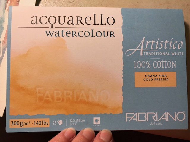
I’m trying Fabriano Artistico 100% cotton 140 lb watercolor paper… this is a 5×7 “block”, meaning the edges of the paper are all glued together. One corner remains open… once a painting is complete, you simply slide a palette knife (or anything) beneath the page and peel it off. Painting on blocked paper provides a firm work surface and prevents the page from warping much even with a heavy application of water. Looking on Amazon, I came up with this link, to the extra white cold pressed Fabriano block… Remember, Amazon prices fluctuate. At $15.95 right now, this is a pretty good price, I think, but I got it a bit cheaper at Jerry’s this weekend while it was on sale, and then with 20% off for a members discount… (if you prefer to try the Fabriano hot press, that’s even less at Amazon right now at $13.05).

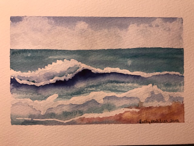
Let me just say WOW. I really like the way it feels. Please don’t judge the Fabriano p[aper by my painting. I actually liked this more than Arches. So far.
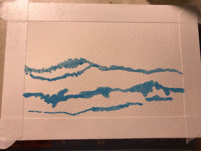
I started with tape (unnecessary on a block, except for leaving a white edge) and masking fluid:

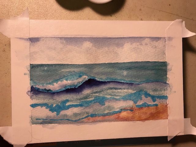
I used EEM (Eventually Everything Mixes) burnt sienna, Daniel Smith Indanthrone Blue , and Daniel Smith Mayan Blue Genuine , a very green blue… the description says it is a green indigo, but it isn’t dark. I may try the mayan blue dark sometime, now that I’ve seen it exists! These are both lovely colors. Not necessary to a palette, but I can see a lot of times they’ll be used. Daniel Smith really has a LOT of lovely options.
Paint applied:
It could use more definition but I decided to leave it kind of stylized and quit while I was ahead. A quick fun sketch with just three colors!

I actually painted this for a summer haiku swap. Here are the two haiku (haikus?) I came up with for my partner:
“The ocean murmurs
Ever haunting lullabies
To the sun warmed sand”
And
“If I could, I’d spend
Each passing summer moment
Fingers in the sand.”
