Day 222 (Thurs Aug 10) Gouache

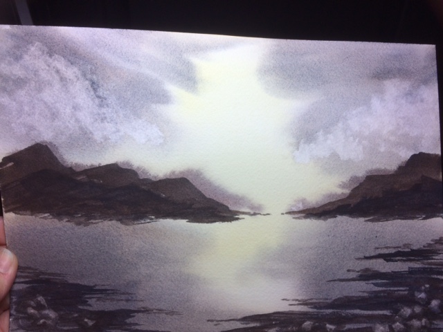
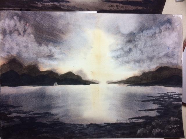
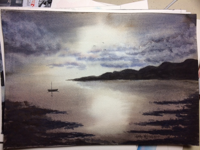
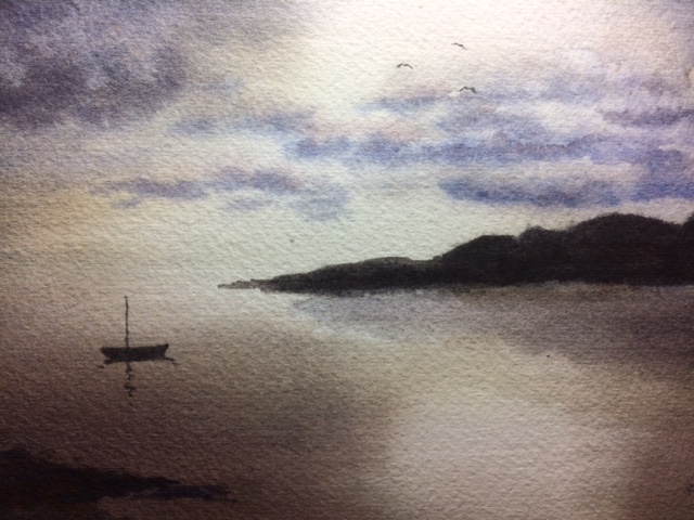
I have been eager to try gouache paints. I’d never even heard of them before this year… a 600 year old medium, kind of a marriage of watercolor and acrylic in behavior. Can be watered down and flow together like watercolor, can be used light on top of dark like acrylic, can be built up in heavy strokes like oil… Maybe the best of both worlds? I found this set of caran d’ache gouache pans, the only pan set I could find… They remind me of tempera paints, and even say poster paints in one place. A kind of chalky finish of the final product I’m not crazy about. I can see the benefit to using tubes instead of pans, and being able to use thicker paint. It was strange after all this time learning to leave white spaces white, to now add them in with paint… I don’t know if I liked it or not!

The set came with a number 8 caran d’ache brush as well, which works nicely so far. I followed a video by Myriam Tillson, at a vlog called Myriam’s Illustrations on Youtube. Mine didn’t end up looking much like hers… but enough that I knew I’d better say it was her idea! I think tomorrow I may try a more coloring book type thing.


Day 98: (Sat April 8) One last try at the light study

I purchased a mop brush, the Silver oval mop seen here on Amazon,  to try the background off these paintings one more time. I like the brush a lot, but I may still try to get a hake brush sometime. I think the shorter, but still very soft, bristles will work better for what I’m trying. I liked this one. It hasn’t shed any bristles for me, (contrary to the Amazon review), BUT…. when it is wet, it stinks to high heaven. No lie. This is some serious goat hair here. It holds a ton of water, though, and I’m hoping after a few uses it will smell like nothing for me. This brush does handle the large wet areas of wash better, but I still had trouble here (like not letting the background dry enough before I laid in the first layer of land) Still, I think it is progress.

IMG_5040

Also, my paints are granulating, I think, which means they separate some as they dry. See the effect?

I like the granulating effect but I think for this particular piece I’d rather have it flat and smooth. (like the yellow part is) which means (I think??) I’ll need to use a different blue. I’m not sure if I need a different brand or a different shade. (So maybe I’ll try it one more time with my prima paints?) The clouds are made by just touching a crumpled tissue to the paper to lift the color. Some colors won’t allow this, but these colors lift nicely.

Day 97 (Fri April 7) More light studies

Still following Steven Cronin’s tutorials, here are a couple more.

I tried a cheap acrylic brush for this first one because I didn’t have the hake brush he used, but it absolutely didn’t work. Left stripes everywhere. It is very stiff and bristly feeling and (turns out, after a moment’s research) the hake is very soft.  The mountains are supposed to have three layers so you see distance, but the first layer was too wet and bled too much. The second layer too dark, so the third also too dark. I like the way he lifted a tiny sail out of the paint on the mountains to show boats in front of them. The rocks in the bottom right worked better today that yesterday. But not like his. They were scraped away with a bit of plastic gift card.

FullSizeRender

This second tutorial used the same hake brush (!!) which I still didn’t have, but a different technique. He dried the whole painting, then wet the whole thing again, adding another wet layer, dried it again, added another layer. So I learned that if I wet the whole thing evenly I can rework it a bit. I’m happier with the light here, but the red I added to the clouds didn’t want to lift, and my little foregrounds on the right are too symmetrical. Still, it’s a light study, and I learned about light:

FullSizeRender

Using a very limited palette, three colors, on Arches cold pressed block, with Daniel Smith watercolor paints. I like the way dried pans feel better, but I think Daniel Smith tubes might be better quality than any dried pans available.

If I crop it this way, I really like it a lot better:

IMG_5013

Day 94 (Tues April 4) Light studies

I wasn’t satisfied with ANY of these, particularly, but I did learn about keeping the light in a dark sky or water.  I didn’t even finish some of them. And now that I look at them, I want a reflection of the land in the water (but that was’t in the tutorial.) I do like elements of most of them, though.


Also, the first two used m graham watercolors, the next used daniel smith. I liked the daniel smith better, but in the end, I don’t see much difference, really.

I really had trouble keeping the paper wet enough, but not too wet, controlling the color, etc. I enjoyed using my new Arches cold pressed block. The block of paper is sealed on all four edges so the paper stays flat, then you insert a palette knife of something in the one inch piece left open and slide it all around, removing the finished page. It’s so much nicer than using a book for a very wet painting! And taping edges isn’t required. Although, I still did it in some of them because I like the look. 🙂 The only down side for me is that I’m just doing studies and would like to keep them in a book. I have some rings and I’m tempted to hole punch them and hook them all together but something inside me is resisting that idea. Any other thoughts about keeping all these separate pages together somewhere?

This was a Steven Cronin tutorial. He makes it look SO fast and easy. I didn’t actually have the same colors he used, but close enough.