Wed 2/28/18 more stolen watercolor ideas

I stole this adorable idea for an entry in my watercolor journal from this blog, “Karijn’s Watercolors”…     her people are so cute, and what an original idea.

I hope she won’t mind. Not only is it not my idea, I copied her sketch nearly exactly… (with small changes)… then did the painting in a similar manner as well (again with some differences, but minor)

I had to do this one after I saw it because my granddaughter spelled F-I-S-H for me tonight for the first time ever, and I promised I’d do a painting of a fish. Perfect timing!


Gouache. Yikes! A little more info than my long ago post.

gouache
ɡwäSH,ɡo͞oˈäSH/
noun
noun: gouache
  1. a method of painting using opaque pigments ground in water and thickened with a gluelike substance.
    -opaque watercolor of the type used in gouache painting.
    -a picture painted using the gouache method

Gouache isn’t new… it goes back at least 600 years. But until last year I had never heard of it, or at least it didn’t register with me.

I’m trying out the set of Caran D’Ache Gouache paints I got last year, but feeling like I’m all thumbs. It’s so different than watercolor (OR acrylics)…  I have to think and act so contrary to what is natural with watercolor. The good news is, my badness at gouache makes me feel like I’m better at watercolor than I was previously thinking. 😉

Gouache acts like watercolor in that it can be rewet, even years later on the paper or palette, and acts like acrylic in that it is thick and opaque, covering whatever is beneath it. When gouache paint dries there’s generally said to be a considerable color shift, darks drying lighter and lights drying darker, so while the painter can continue adding, changing, or correcting as long as desired, mixed colors can be difficult to match once dried, if a color key or something similar wasn’t prepared. Also, in gouache painting, white can be added on top of darker colors, and different shades are created by adding chinese or titanium white to the paint…  many watercolorists don’t use white paint at all while watercolor painting. (most, I think!) Whites are created by being careful not to apply paint to areas that should remain white, and lighter more translucent colors are made by simply using more water.  So the way you plan out a piece with gouache vs watercolor is considerably different.

People seem to either love gouache or hate it. I hated it last year… but this year I’m hovering. I might be inclined to see its potential and kinda want to spend more time with it.

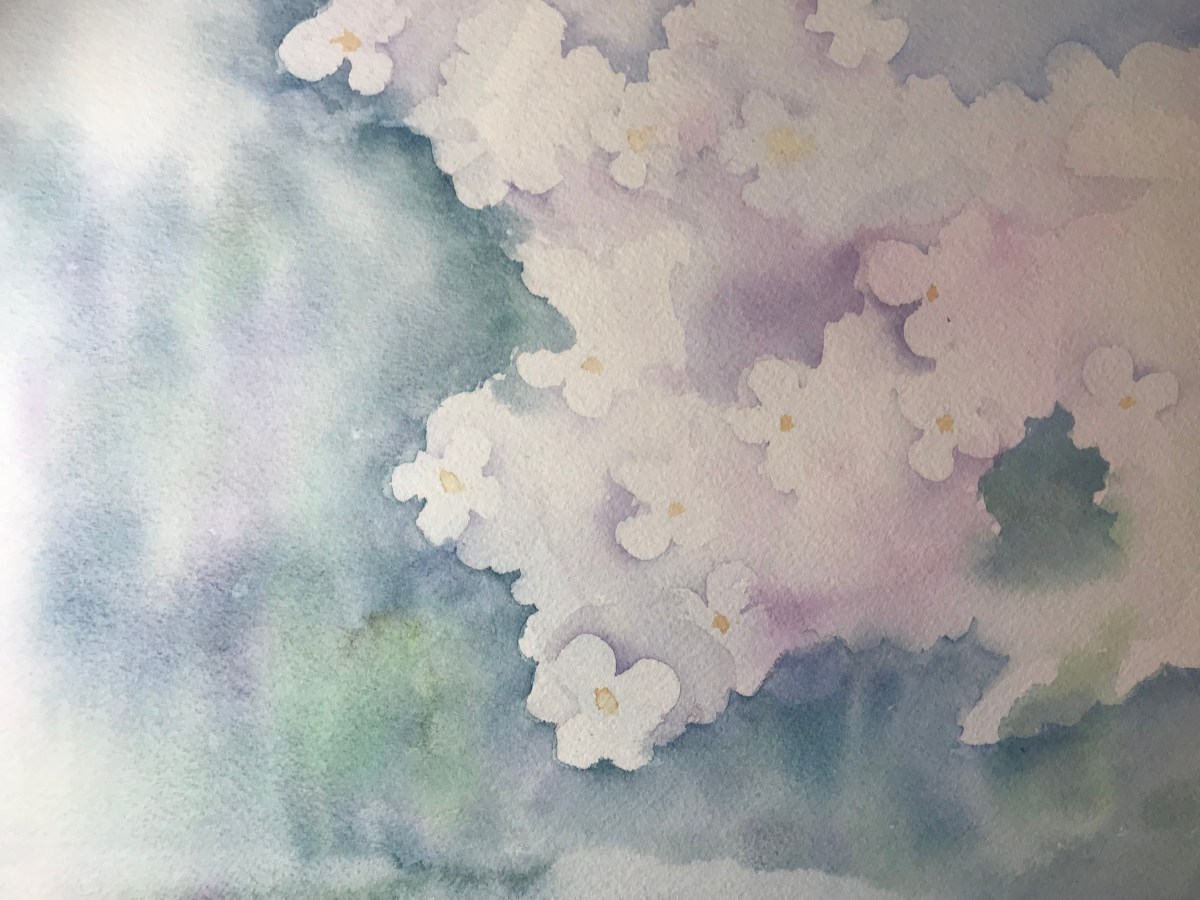
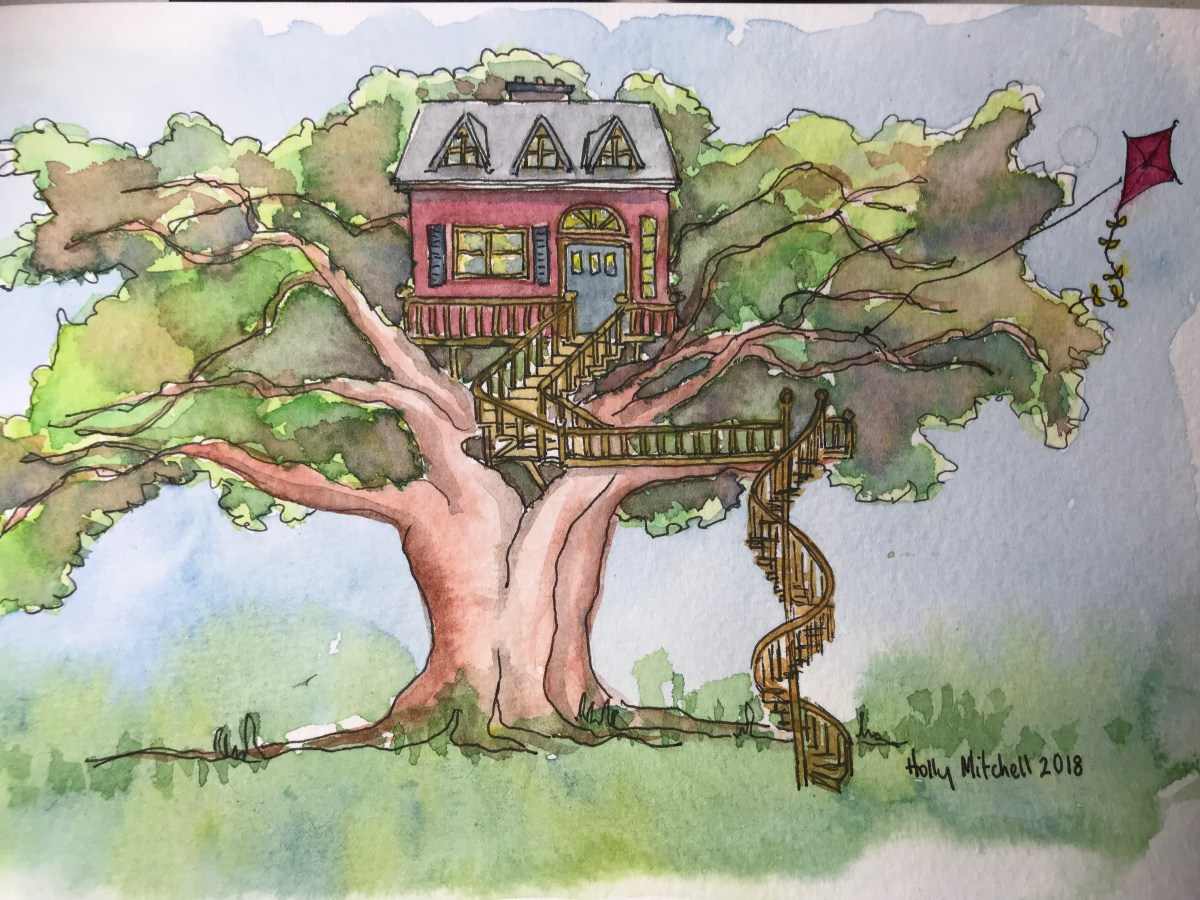
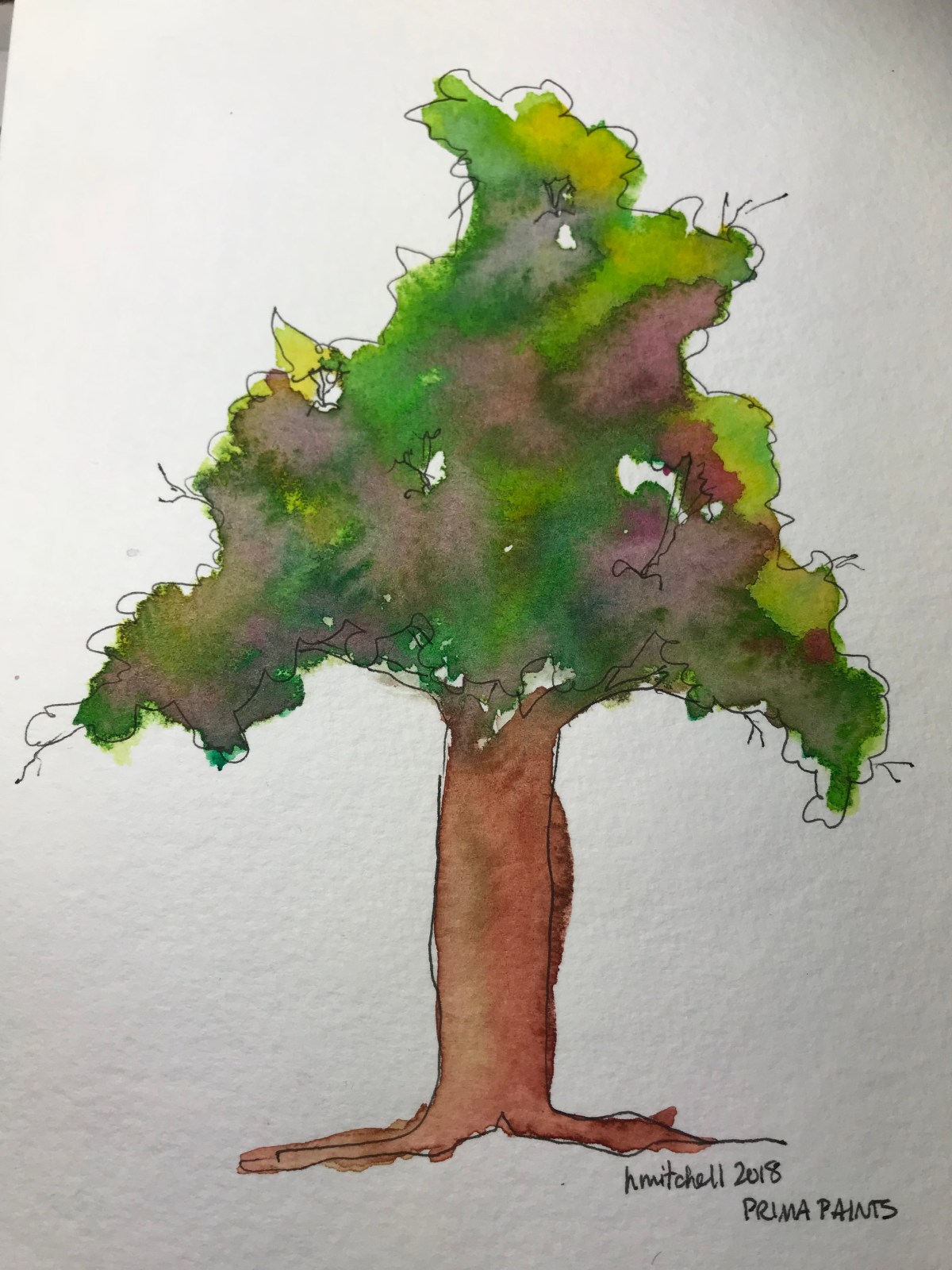
Here is my first attempt (well, first since my original two attempts a year or so ago) The one on the right is a watercolor from earlier this month, testing the new Schmincke limited edition watercolor set, the one on the left is my attempt to do a similar picture using Caran D’Ache gouache paint pans:

I used the paints kind of like I’d use acrylics. I definitely could do better with that background. Having to add white was messing with my brain. I miss the flow-i-ness and translucence of watercolor here.

Then i tried this, coloring in an ink sketch from January:

IMG_9323

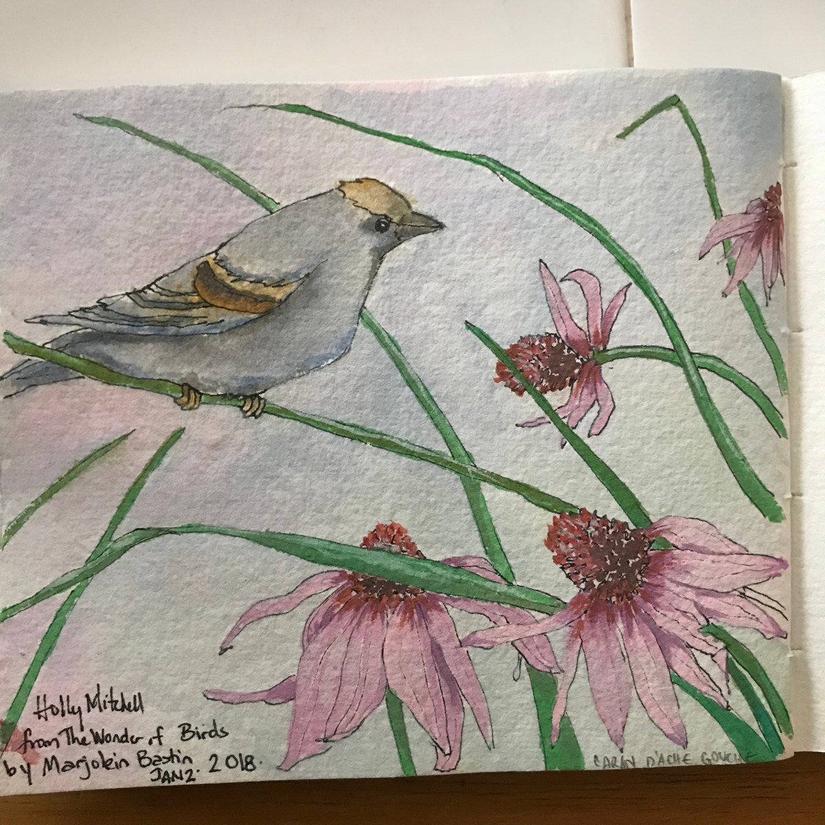
A different approach, using the paint as I would watercolor. It’s ok. But… I’m not using the paint as it should be used, really. And I know if I had used actual watercolor paint I’d like the result better. Gouache just doesn’t move. It isn’t made to move.  (also, please ignore the bird coloring… I couldn’t find the picture I took this from and don’t have any idea what colors the bird should be.) So… how to use gouache as gouache??? I’ll need to go back to youtube and watch more videos, and practice practice practice.

Still… I’m liking the medium and think with practice it could be really fun.

Caran d’ache is the only company I could find last year offering gouache PANS as opposed to tubes. Today I bought three M.Graham gouache  tubes to play with and see if tube vs pan makes a difference. (plus I got what I thought was a good deal on a big tube of titanium white gouache, which I can use to add elements to watercolor paintings as well if I want to: stars, highlights, etc) The pans seem to rewet well and become rather creamy, so it isn’t that I’m unhappy with them. Simply unfamiliar with the medium and looking at all possibilities.

Here’s a link to a fairly inexpensive Caran d’Ache pan set, 8 colors… it is currently just under $20.

Also to the set I have:

Caran d’Ache 15 gouache colors…  currently $32, down from a high of $41 in January. They offer the tubes as well for a bit more, but the pans seemed simpler for me to start out with last year, and I’ve since read good things about the company and its products on some online artists’ boards. These rewet really nicely and are rich and creamy. Put a drop of water on each before you begin painting.

And finally, here is an M Graham gouache starter set…  I can’t say whether I like these or not yet, as I haven’t tried mine, but I’ve only read great things about M Graham gouache paints so I’m expecting to like them. I don’t know if this is the best price available, though, for this set. It’s cheaper than what I saw for it today at the art supply store.

Disclaimer: if you purchase something from these links, I get a few cents from Amazon, but it doesn’t increase your cost at all. I ONLY include links for items I enjoy myself and believe to be quality products, at the best price I can find at the time, and will try to remove links for anything I ever decide for some reason isn’t a good product.

Have fun!!

Thurs 2/15 SCHMINCKE fabulousness

I don’t even remember what other paints I have. I’ve died and gone to Schmincke heaven.

Daniel Smith MAY have met his match today. I got this limited edition set of Schmincke Horadam’s new colors. For $70!!! It’s worth 2 or 2 1/2 times that, if you add it all up separately. (check Wet Paint to see if they still have it) Twelve colors in a sweet, almost square tin that will hold 18-21 colors. (I added three colors, too, when I ordered the set) I won’t go into what I love about these right now… except their creaminess, vibrance, the beautiful way they dance in the water (this is fantastic), the color shift upon drying is negligible… the tin IS nicer than the meeden and other inexpensive tins… these are all single pigment paints with high lightfast ratings (of course)… (siiiigh)… I’ll play with them more first and talk later.


I’m really a huge fan of the granulating potter’s pink.


Mon 2/12/18 more watercolor work on the white flowers

A lot more effort earned me a subtle improvement, but the basic bones are still wrong. Since I’m wondering anyway how many times I can rework the thing before the paper is shot, I think I’ll try one more sitting and see what I can add. Then try something different!

Saturday 02/10/18 watercolor

I don’t want you to think I haven’t done any art!! But actually, I was sick in bed Wednesday and Thursday, so didn’t. I did the other days.

I’m following an Angela Fehr online tutorial/class/workshop thing and she has us painting white hydrangeas with negative painting. So far (attempt two) I’ve gotten this far and don’t know exactly where else to go:

IMG_9155

I’ll work on it more later or start a new one. Not a terrific start but excellent practice skills.

Also, found this great thrift store palette… (you know glass, ceramic, porcelain are optimal surfaces… and wells for separation are nice…):

IMG_9156

Yep, a deviled egg tray. You can find these CHEAP at thrift stores… go find one! great for when you need a little more paint. Also, I could squeeze 12 colors out into the wells and keep them there if I wanted to.


Mon 02/02/18: valentine coloring page

A work project… A Valentine coloring page for us to use during storytime… the kids can color them and cut them apart. The last one will have a coupon on it for free food ( I guess that goes to their favorite Valentine!) All of them say Chick-fil-A Virginia Beach Blvd on them, but I can create something similar for your business if you are interested… contact me!

IMG_6143


Sat Feb 3, 2018: Prima Marketing Confection Watercolors… yes or no?

The first watercolor set I purchased at the beginning of my 365 challenge was a Prima Marketing Confections set, and I quickly added two more. These are affordable paint sets with bright, vivid colors that activate with just a touch of water. They feel creamy and are fun to use. They call themselves artist grade, but offer no pigment or lightfast information, so really they are considered a crafter’s tool. They are very good, I think, for doodling and journaling, and each set comes in a very nice palette box. Their best trait… they are inexpensive. But prices fluctuate so look around for deals.

Today I pulled out all of my old Prima paints and organized them into one set. (minus a few I deemed unnecessary, that wouldn’t fit.) I absolutely love using these paints individually… but today I found when I mix colors sometimes they end up muddy. Many of my Daniel Smith paints are single pigment paints now, and I think maybe these Prima use more pigments, which can cause colors to muddy when blending them. I’m spoiled now. When I purchased them people were complaining that they didn’t have color names. Well, they have added them now, although they are not at all traditional paint names. So I wrote the number, color name, and lightfast rating on each color pan, then organized them and swatched them out. I also added what I thought might be some of their traditional names so I can use them if I specifically want yellow ochre or phthalocyanine blue or a few other basic colors.

Look at those vivid colors!!! Besides being crazy bright, they are also slightly thicker or more opaque than my other paint sets.

I hadn’t been able to find any lightfast rating information on them, and did my own test last spring which wasn’t very scientific, but did show a few weren’t lightfast. Today I found this blog which includes the pigment information the author, Jessica Seacrest, received from Prima when she asked. It doesn’t include the newest set, Odyssey, but I found it very helpful. Prima doesn’t share what rating system they follow, so really it may not mean much, but only a few of their colors have two stars, one has one star (the one that really faded in my own test), and the rest, according to them, have three stars.

confectionsswatches_updated

The sample tin in that photo looks different than mine… I love mine specifically because the two rows of paints are close enough to the edges of the pan that if I want to I can include a third full row of paints in the middle instead of brushes. I’m hoping they haven’t changed that and will find out if ever I purchase the newest set.

I painted this, purposefully using quite a bit of water. Too much, maybe:

IMG_9048

Last fall I painted these with my other paints (either Qor or Daniel Smith… I’m not sure now!):

I wanted to see if I could recreate the tree effect. But this is as close as I got:

IMG_9058

Daniel Smith is much nicer… but.. one tube of Daniel Smith paint can cost nearly what a tin full of 12 colors cost from Prima. If you are just starting out, or on a limited budget, these might be a nice little set to try. I’ve linked the cheapest price I could find currently for each set on Amazon because these prices fluctuate… just a few days ago some of these were $14 (like they were a year ago when I bought them), and now they are $17-$21, and the new Odyssey set is $25 (it hasn’t been lower, that I know of) Odyssey and Tropicals have the most useful colors for me. There’s also a pastel set and a shimmery set. If you are going to sink a lot of money into paints, or get all of the sets, consider get something better with fewer colors. Really. But if you want something inexpensive, (or you want to ditch the paints and use the tins!!), these are pretty fun. And a little bit addictive. The junk food of the watercolor world. I’m sure I’ll keep using mine.

Prima Confections Odyssey Watercolor Set

Prima Confections Tropicals Watercolor Set

Prima Confections Classics Watercolor Set

Prima Confections Decadent Pies Watercolor Set