Paint Nite! Acrylic flowers

Last night I went to a Paint Night event at a local pizza place, Spaghetti Eddie’s. (First… I hadn’t been there for a while, and may I say the pizza was fabulous. Yum.) We all painted our own version of the same flower under the direction of the event coordinator, Makayla.

IMG_3103

Being someone who has trouble coming up with ideas, I’m teaching myself to paint by copying others, and I was surprised by how varied our paintings were. My scope of imagination is narrow when it comes to painting (so far) and it is hard for me to go outside the lines, so to speak. But it wasn’t hard for any of my family! I think these four together on a single wall would make a beautiful grouping!

If you haven’t tried Paint Nite, I recommend it, whether you have ever painted before or not. It isn’t about the finished product, it’s really about enjoying yourself. It’s a fun, relaxing evening.

I decided to hang mine, at least temporarily! I hope they all did. ๐Ÿ™‚

IMG_3104


Watercolor Leaves (with Jay Lee)

During the Jay Lee Watercolor livestream on youtube this morning, first we painted a page full of random pretty leaves, without much detail. These are quite relaxing.

IMG_3057

(A cute little keychain I bought from Jerrys Artarama this summer. KIND of a mini posable drawing figure. Not really very posable. But that’s not his fault, and he likes to watch me paint)

IMG_3061

Then, I think to prove to us that he can, Jay Lee helped us paint a detailed, more realistic fall leaf.

IMG_3070


IMG_3071

There has always been something soothing about drawing or painting leaves.

New Foldable Pocket Watercolor Kit

Click here to see on Amazon… currently $15.99 (I expect them to go up closer to Christmas) ย Dyvicl Watercolor Paint Set – 42 Assorted Watercolors Foldable Pocket Travel Watercolor Kit with Brush for Artists, Beginners, Students, Field Sketch Setย ย 

I have been looking forward to writing this review… I tried these paints a few weeks ago, and holy moly, are they ever fun. First, what a unique pan. I had decided if I could find these paints cheaply enough and I hated the paints, I would dispose of them and fill the pans with Daniel Smith colors. But i really like the paint, so far. They are vivid, transparent, and mix well. There is little apparent color shift on the paper as the paint dries.

I don’t know the brand name or manufacturer of the paints, but the set says “Superior” across the top.

There is no lightfast information I can find. I’m going to assume they are not lightfast, until I run my own test (which I’ll do soon, but it takes quite a while to get any results.) Still… 42 colors of quality (feel) paint for under $16, with a waterbrush and mixing palette… what a deal! That all fits easily into a purse or really anywhere. 42 is TOO MANY colors for me, but the smaller sets were only a bit less expensive, and the colors I really wanted were in the larger set. (of course)

I started by creating a swatch sheet that fit in the bottom of the pan. But it was still tricky finding where the paint was. The set fans out, like a deck of cards would in your hand…with 3-9 paints in each strip. The colors at the top, nearest to the hinge, will be harder to use.

The color swatches on the pans themselves were not good… not even close to some of the colors (which is pretty normal, really) so I made my own and covered them with clear packing tape, and glued them over the existing swatches with adhesive dots. Now I can tell exactly where the color I’m looking for is.

It has a top shelf which holds a tiny sponge like piece to be used as a blotter… this piece is velcro’d in place, and can be removed for rinsing. Some of the other brands keep this area empty and it is used as the mixing palette, but a blotter is very useful, particularly if you are taking the paints somewhere outside your studio to use. With this set, the bottom plastic piece has a frame around it so the whole length of the palette can be used to mix paints without worrying about them dripping off. (Also, side note: ย I finally realized I can mix straight on my tile topped table as well!)

I love the paints, I love the interesting design, I love the portability… I found a pencil case at Target the set fits in nicely that I can use for storage. I even love the water brush, and I am not currently a big water brush fan.

I used the water brush and paints for both of these:

IMG_2440

(the shimmery glowy bits on the lightning bug’s behind here are not from this set, I painted over this part with my finetec gold)

IMG_2441

Today I followed a Jay Lee livened youtube tutorial and painted this, using my regular brushes and these paints:

IMG_2935

IMG_2936

I think this set is great fun as an introductory set for someone, an inexpensive way to discover watercolor painting. Or as an interesting travel set for a more experienced artist. ย I’m buying a few more as gifts! Let me know if you try them!


Negative painting, leaves using EEM watercolors

Following more youtube tutorials tonight! This technique requires thinking backwards. First, tape off the edges of the paper. Paint a ย light wash of blue and yellow for the background, then paint in a few leaves, but only paint AROUND them. Leave them the lightest color.. (those end up being the lightest leaves) After this dries, add a few more leaves, again painting AROUND them only, and around the first set of leaves, using a slightly darker color… do this until you are really out of room for leaves, finishing up with a very dark bit of in-between-leaves. Then add a touch more color to the lightest leaves, some little veins with colored pencils, remove the tape and you have a leafy masterpiece full of depth. ๐Ÿ™‚

IMG_2807

I used the EEM paints here… I really like them. They rewet very easily, and the M41 is a really beautiful yellow for mixing greens. (I almost didn’t order that one!)I especially enjoyed using Cote d’azure violet and caput mortuum for the little dark accent on the tips of the leaves.

This technique is a little bit of a brain teaser. But go try it!


Azalea, using EEM watercolor paint

My azaleas outside are pretty scraggly and sad… but they do have some nice blossoms so I wanted to catch them before they are gone!

IMG_2507

I have two new sets of paint I’m really excited to play with and share with you. The first I present today…The brand is “Eventually, Everything Mixes” or EEM. Several of her colors are unusual and surprising mixes with really fun, heavy granulation, many are single pigment, and as far as I’ve seen, all are excellent or very good lightfast ratings. (actually while I was checking tonight, I only found excellent)

IMG_2508

You can google either EEM or Eventually, Everything Mixes and find them online. The paints are handmade in Germany, individually. The half pans I ordered came filled REALLY full…. quite a bit over the tops of the pans. Like…. Really. Generous. And the sample dots on cards were also extremely generous. If you decide to order any of those, you’ll be able to do quite a bit with them. In fact, I took some of my sample dots and pressed them into half pans as well. (bottom row, the three on the far left, as well as the one alone on the row) Pans are relatively inexpensive, around $6.50 each, so I ordered several this time around to make shipping seem less costly to me, per pan.

I don’t (yet!!) have other brands of handmade paints to compare with these, but I really like these. ย Most are transparent, a few are quite opaque. I was afraid of opaque colors when I first began painting, but I’m starting to like them more now, and one of these, caput mortuum, I LOVE. (I’ve found recently I seem to like all types and brands of pr101, and pr102 apparently is similar in feel, with a more purple hue) I’ve just ordered a few more colors and there are two or three I’ll eventually add, so you can look forward to future swatchings!

IMG_2502

I was surprised by how vibrant they are while sketching this azalea today. The palette looks so muted, but the colors are strong (with the exception of a trio that are very light) without much shift in color as they dry. The colors I used today: ย Pollams Pink (pr122 and pg23), Bergblau (pb29: ultramarine), Mais (yellow: py150, py110), a touch of Ultramarine Green (pg24, gorgeous color!) in a couple of the shadows, a bit of Cyan (pb15:3) mixed with bergblau for the sky, Rehbraun (py43) and Caput Mortuum (pr102) for the branch and some of the shadows.

I have here THREE shades of py43, all different. Cool!

These colors are all so vibrant. I don’t have a traditional selection of colors, but I just love looking at the swatched colors! I do have a nice triad, with the Pollams Pink, Mais, and either cyan or ultramarine, so can mix any color I want.

One of the colors, Ludwig Green, even has gold mixed in (upper right corner of the swatch sheet)

The packaging is fun… four pans arrived nestled in a paper matchbox with the logo outside. And each pan had washi tape decorating the pan, and a brown parchment wrapping it. Then a dark paper sleeve with the paint name written on it. The dots are on heavy pieces of quality watercolor paper, also wrapped in brown parchment. ย You could easily take a sample dot card out with your painting journal for urban sketching or plain air painting.

So, I’ve done nothing with these yet except swatching them, and painting this azalea sketch, but I look forward to doing more with them. And when the rest of my colors arrive, I’ll be moving these to a new tin, perfecting the order they’re in, and making a fresh swatch card. Woo-hoo!

The Circle of Life….

Admit it, you’re singing the song in your head right now… Well, I am anyway. I have been listening to this cicada for days and was kind of sad to find her (him?) on my driveway. Dead. But she/he seems to have died of natural causes, so that’s good. Nothing violent.

IMG_2474

Just a quick simple sketch. The green highlights on the wings were more luminescent than this, and quite surprising. That raised x on the back was a surprise, too. ย I used a new (cheap! But fun!) paint set for this, which I will reveal in a day or two!

Is it weird to paint dead bugs? It didn’t seem weird at the time but now that I’m posting it, seems a bit creepy.

A nice, rusty bike.

Two from Peter Sheeler’s tutorials, and one of my own, by special order. ๐Ÿ™‚

IMG_2463

(Mine isn’t positioned well on the page, but I like my flowers here better than his!)

IMG_2404

IMG_2403

I’m pleased with the bike… I’m going to try another, though, to clean it up a bit.

IMG_2462

(Schmincke watercolor, on Fabriano Artistico cotton cold press watercolor paper, 140 lb, 5″x7″)

Gouache: M Graham vs Arteza vs Caran D’Ache

IMG_2375

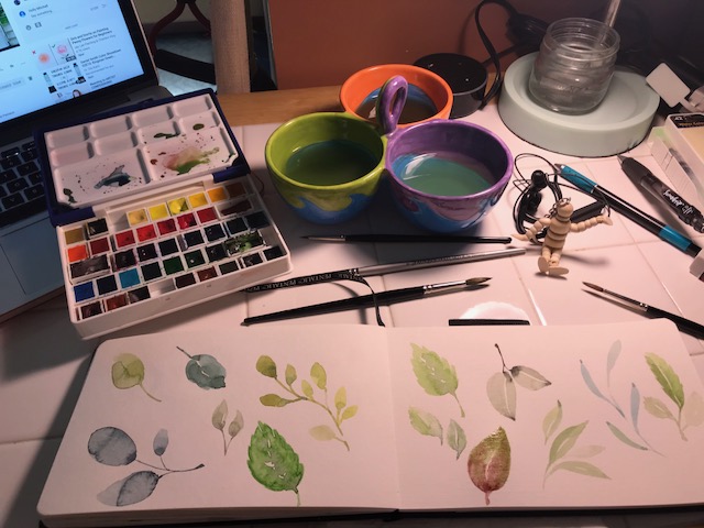
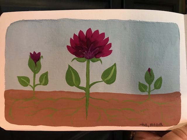
After watching Mira Byler paint with gouache on youtube last night, I thought this morning I’d give it a try. Gouache paint is kind of a cross between acrylic and watercolor, at least in performance. It rewets after drying, like watercolor, so can be put into a palette to dry and easily be carried somewhere to paint. You can thin it as much as desired, but like acrylic it is opaque, and can layer light on top of dark. It’s almost backwards painting compared to watercolor, where you have to think ahead and leave any light or white spaces colorless while you fill in darks. In some ways it is simpler than painting with watercolor (at my skill level). It feels chalky after drying, and reminded me of poster paints and tempera paints we used as kids in school. Gouache can be a bit harder on brushes than watercolor, so I don’t use my very expensive brushes with it. And actually I think the slightly firmer brushes perform great with the medium.

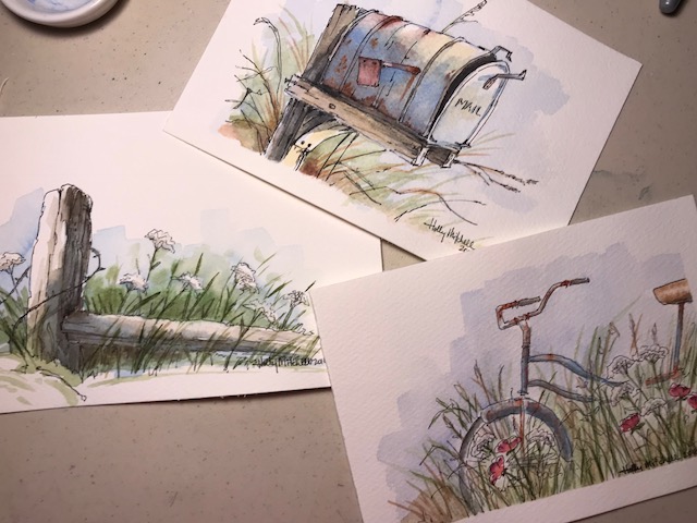
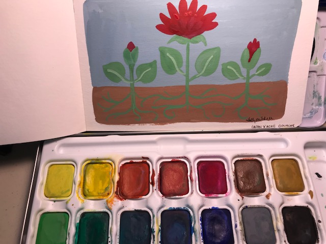
You may (or probably DON’T) recall that last year towards the beginning of my 365 challenge, I tried Caran d’Ache’s pan gouache set… the only gouache set I could find not in tubes. Here is what I painted at the time, following a tutorial:

IMG_2388

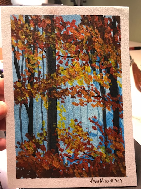
I was new to gouache, and to painting at all, and set them aside.

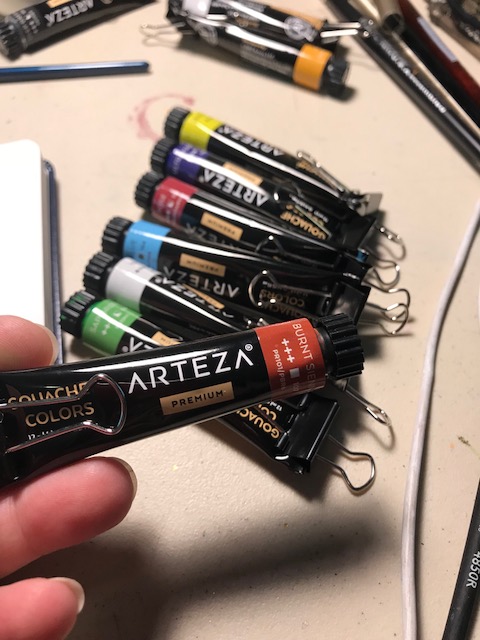
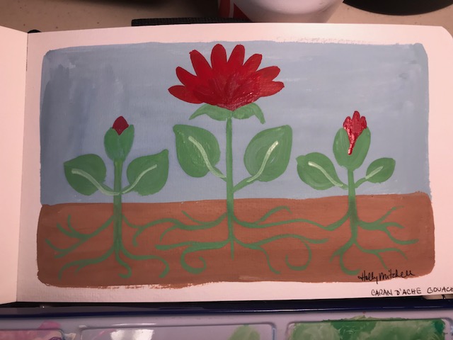
Fast forward to February of this year, I found an Amazon lightning deal on a 24 color Arteza gouache set, thinking maybe I’d like tubes better. And I also bought 4 M Graham tubes from a local art supply shop. So finally (only 6 months later, right?) I decided today I’d give them a shot.
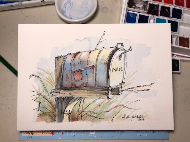
Arteza result:

IMG_2374

The lightning deal on Amazon in February was under $15. The regular price for this set is currently still $18.98, and I’ve linked them here if you want to look at them.ย 

Andย HEREย is a link to a set of 5 M Graham primary gouache tubes for $24.88.

And HERE is the Caran d’Ache set linkedย , 15 colors including a small white tube for $33 on Amazon right now, in a tin, with a paintbrush.

M Graham result (ignore the blob, user error!):

IMG_2390

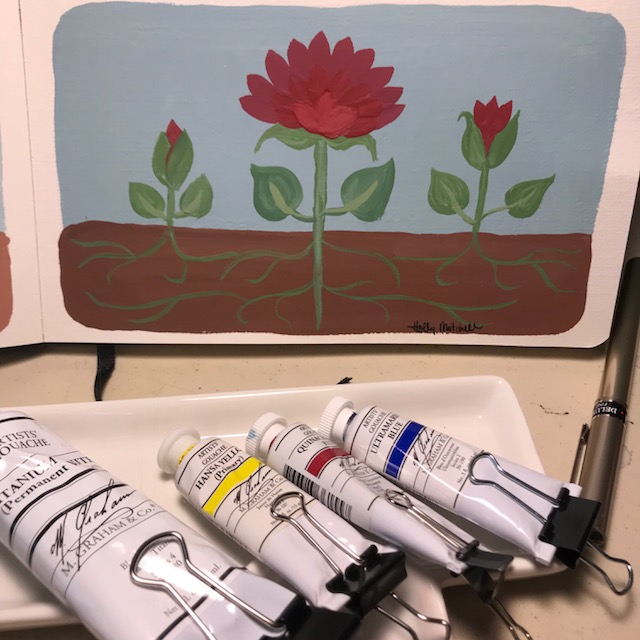
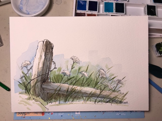
Caran d’Ache result:

IMG_2392

(I can tell you pretty positively, no matter what set you get, you’ll also want a nice big tube of white to add to it. Gouache doesn’t lighten with water the way watercolor does. White needs to be added to get any lighter values.)

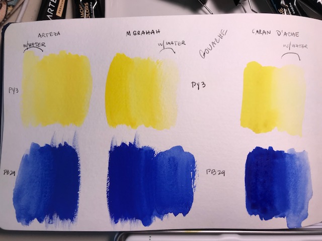
Here I have compared two paints from each brand which use the same pigments: PY 3 (yellow) and PB29 (blue). Caran d’Ache doesn’t give me pigment numbers, but I chose the two that matched. To my not-very-trained-eye, the M Grahams, in the middle, seem slightly more vivid than Arteza, and they went on more smoothly. They also don’t feel as dry and chalky. There is a difference, but it is not significant. (to me) They are all three VERY CLOSE. I doubt I could label one accurately in a ‘blind’ test. The Caran d’Ache was very easy to wet down to a watercolor like consistency. I think I may be able to get heavier opaque results with the tubes, and thinner wet washes (maybe) with the pan set.

IMG_2396


Honestly, my paintings in the end seem about the same. ย This is very likely because I’m a complete gouache novice and they were all fairly crappy ย ๐Ÿ™‚ ย I’ve read in reviews of the M Graham gouache paints that they dry very nicely in pans, and don’t crumble like most other dried gouache brands, due to the honey added. And I can tell you Caran d’Ache has figured out how to pan them up without cracking.

IMG_2389

IMG_2395

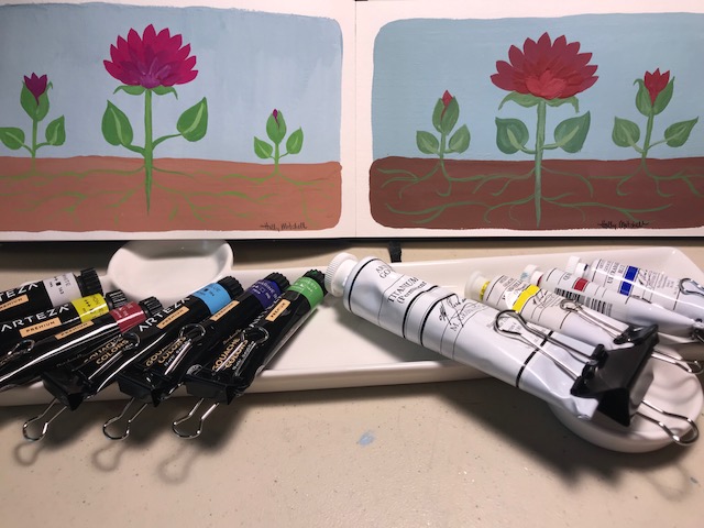
One more thing to consider… as far as I can tell, I can’t purchase Arteza gouache tubes or Caran d’Ache pans individually, to replace a color, only in sets. M Grahams are sold in sets and individually. Which do I prefer? I see benefits to using the tubes over pans, especially if you will be doing large areas of color. It’s tricky mixing large amounts with the dried pans… good to remember if I do pan up my M Grahams. AND I have trouble keeping the pans clean when mixing them. But honestly I enjoyed the Caran d’Ache paints best… they are super creamy and a dream to use. They don’t give me pigment information on the pans, however, and both tube sets do. Pigment numbers and lightfast ratings. I have to assume for that reason that the Caran d’Ache probably aren’t “artist grade”. Still these are the ones I’m more likely to use, I think.

But remember… $25 for 5 tubes vs $19 for 24 tubes vs the $33 Caran d’Ache pan set, 15 colors… this set also has a metal palette box AND a paint brush… I think it really depends on what you’ll be doing with them, how frequently you’ll use them, etc. Are you a crafter? A part time artist wannabe? A professional artist? A gouache newbie, just interested in checking out the medium? Do you prefer using your paint from tubes or from dried pans? Will you be doing very large areas of color? I fully expected to love the M Grahams and hate the Arteza… but I kinda love them all. In the end, for me… all three gave similar results, but the pan set is my favorite.