Day 29: more watercolor study

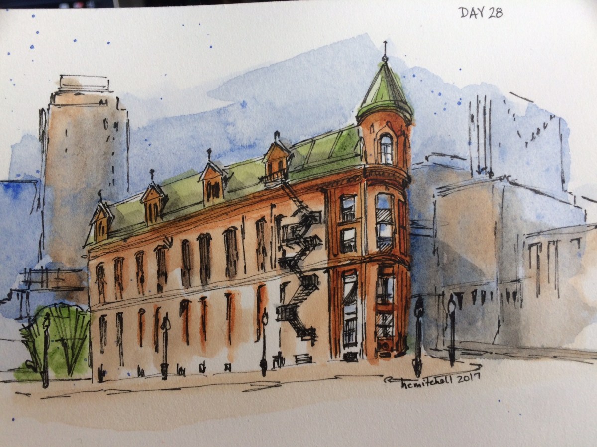
I really like Peter Sheeler’s style… his quick loose sketches are exactly what watercolor is noted for AND exactly what I’m worst at (I think. I may not have found my worst yet) And I love the look. I’m going to continue to try his tutorials. There’s a lot I can learn from them. (I won’t do this every day, though… I’ll try to mix things up for you!)

I am finding that my lower grade paints and papers do not react the same way his artist grade supplies do. The end result is ok, but not the same. Some of this, I know, is skill, but since I am watching what happens as he applies the wet paint, I can see that some of it is materials. They simply act differently. I’m not prepared to drop several hundred dollars on paint. Or paper. Right now. But this is something I’ll need to adjust over time if I plan to pass a certain point, and maybe purchase even one or two colors at a time of some superior line. Regarding paper, some artists recommend purchasing student grade paper on which to learn and practice (that’s what I’ve done, and it made sense to me, since some of what I produce will be useless, and none of it will be “art” I plan to display.) Steeler suggests purchasing high quality paper from the beginning, and says you’ll have to relearn skills when upgrading from less expensive to professional paper because it feels and acts differently. This makes sense to me, too. I’ll think about it over the next few days.

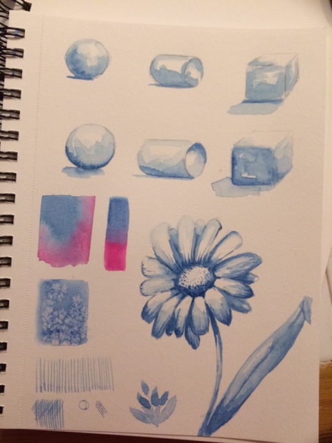
These were sky studies.

Day 28: another Sheeler watercolor lesson

I’ve never thought myself able to paint things like this, and it’s very different from my usual style, so am pretty excited to post today’s art, courtesy of another Peter Sheeler tutorial. This is from a photo he took of the Gooderham Building in Toronto. If I take mine independently and don’t compare it to his, I’m very pleased.

Micron pen .005, Winsor and Newton ultramarine blue, burnt sienna, and sap green, Derwent water brush 2, on Arches hot pressed 140 lb paper.

img_3531

Day 27: Old door study, watercolor sketch

Following a tutorial by Peter Sheeler, around 12:30 am I came up with this watercolor sketch. It isn’t perfect, but I learned several skills from it, and am pleased with the results.

Day 25: more blue studies

For this submission, I followed a youtube video by Alphonso Dunn, here, studying how to create shape and depth with a single color in watercolor, and ending with a quick daisy done all in blue. I definitely learned some things, including start with the darkest shadowed areas, but with vague broad strokes in an extremely light wash. Add pigment with each layer, finishing with darkest details… also that with watercolor you can suggest shadowed areas, don’t need to finish them accurately like you do with pencil. I then painted my own monochromatic flower, trying to employ all of the things the video taught me. I’m very happy with my poppy. It’s better than I could have done last week, and I like it better even than the daisy I did following the tutorial. I can see things in it that could be executed more professionally, and it took me longer than I anticipated… I’d like to be able to sketch more quickly in watercolor. (since that is one of the strengths of the medium!!) But I am pleased that I can already see a lot of progress in just three and a half weeks.

img_3490

(Also developed some pretty little flowers using salt, and practiced a couple other watercolor bits in the extra space)

My poppy:

fullsizerender

Day 22: three painted images

I saved the best for last (in my opinion.) So read all the way through.

I colored in one of Day 21’s drawings. It wasn’t my favorite drawing, and I think it does look better with color. Maybe? I learned today that the pink salt in my grinder doesn’t lift paint the same as our regular table salt. Because of the type of salt? I doubt it. I suspect it was just ground too fine. Hard to remove once dried. I had to scrape it off. But I still like what it did in the background. Also, I tried the masking fluid and really liked it. Dipped my brush in soap first, and had no trouble removing the fluid from the brush afterwards.

I did this dandelion a few days ago and didn’t like it enough to post it. But that’s the wrong attitude!

And the bird was yesterday. I copied a page from my devotional (thanks, Rachael!!) but mine ended up bloodied looking, and his beak, oh poor guy. But even with his faults, I love him. He’s better than I thought I’d do. I gotta learn to do it without COPYING.img_3314

PS: I’ve now finished two full art journals!!! (well, sketch books) A huge accomplishment for me. I generally do a few pages, and put it aside. To fill up two (even small) books makes me feel really good.


Day 19: inky doodle cowboy


img_3243


Grabbed an idea from a safari search, and added doodles. Don’t even ask. I don’t know. But it’s my art for today. He has a rather Audrey Hepburnesque neck. Actually… now that I look at him… It may be HER! I like him better now.


Day 16: watercolor practice (flowers)

Comparing my prima watercolors to the winsor & newton, I decided to try a few youtube “easy flower” tutorials, and a few of my own doodles. I love both sets of watercolors, but the prima are brighter and bolder, and easier to pick up color. Flowers will take more practice. 🙂

Day 8: sketching?

Today I decided to try the line drawings again. It’s the end of the Christmas season (Friday was Twelfth Night), so all the decorations must come down. I tried some of my Willow Tree nativity scene, one of my very favorite things. (I hate putting it away!) The creator has already done all of the art, I just have to copy it in pen. The first couple things I sketched in pencil first, thinking I could capture the shape better, but truthfully that made it more difficult and stilted. I think maybe looking less perfect but more instinctual might be better in some cases. Even if it isn’t quite “right.” That’s art, right??
img_3096


I got a little better as I practiced, and the last one is my favorite. Less is more. A lesson I’m seeing over and over, everywhere. I used a different pen as well, an inexpensive Japanese  kuretake brush pen. The others were Staedtler pigment liners. Great pens. But the brush pen brought a nice organic feel.


I tried the angel several times. (the truly ugly ones aren’t even here, even though I probably should post them all.) D0ing the pencil sketch helped me see her lines more clearly I think, but I really only liked my last attempt, although I like the line of the skirt on the one before that.


Day 6: Single Line Drawings

Today I didn’t have time or inclination to get supplies out, so I decided to try some Single Line Drawings. As you can see from the featured image, some of them used more than a single line.

I started out by copying some I googled… some are famous pieces are some are things people have posted. Because I was trying to figure it out, and copy others, I really wasn’t as free with my pen as I should have been.

Turns out, the female form really is kind of fun to draw. I just copied these from actual “art”.

The only ones I did myself are the cats and the jingle bells. Still, I was happy with my results, and am going to try this again. I’m looking forward to it, actually!


What I learned:

  • move quickly for better results
  • see the shapes and lines, not the item
  • copying line placement doesn’t really work for this
  • line drawings aren’t scary at all. Even famous ones look like scribbles, and they are beautiful.