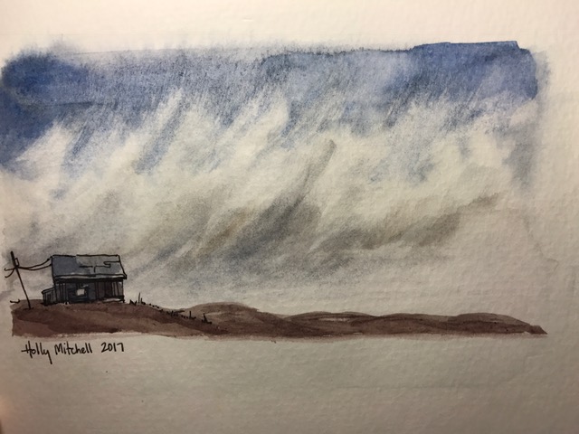
Day 123 (Wed May 3): watercolor, broken window

Another Peter Sheeler tutorial. Done with a free sample of Qor paints I received, and travel brushes, which are actually nail painting brushes. They work really well for this. (love the Qor paints, by the way)FullSizeRender

Peter Sheeler tutorial

Day 116 (Wed April 26) watercolor galaxy sky

Another tutorial, very fun… I can’t find it now on YouTube, and didn’t write the credit name in my journal. 😦 I’ll credit it when I find it. These are fun and quick (-ish). I’m going to do more.

(edited: tutorial by Maria Raczynska. I knew I’d find it!)IMG_0447

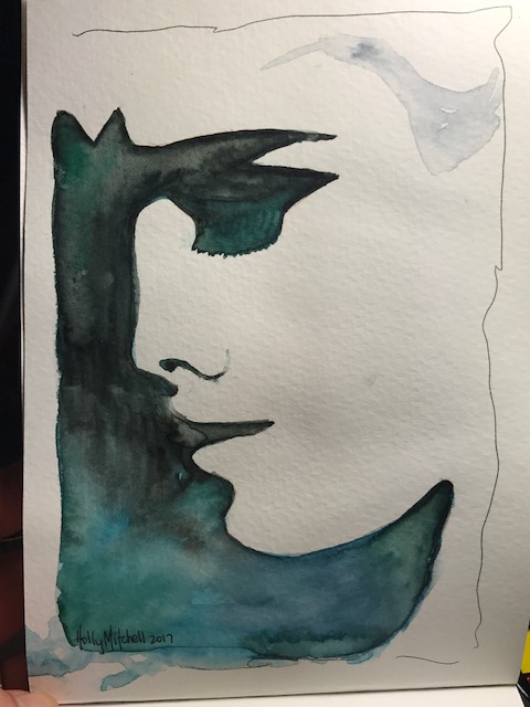
Day 114 (Mon April 24) “easy watercolor face silhouette”

From a tutorial by ElenaRogue on YouTube. This used my Daniel Smith watercolors, in my 400 series Strathmore watercolor journal. (Which is nearly full now!) A fun idea, and nicely uncomplicated.

IMG_0442

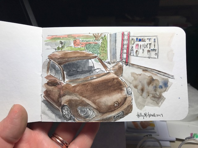
Day 113 (Sun April 23) Hmmmbug!

Our little Beetle in our freshly cleaned garage. Minus the other car. My Beetle likes her alone time. This is using my Daniel Smith watercolors (in my Meeden palette! More about that below) in a new tiny book, a Stillman & Birn beta series mixed media journal, 5×3 inches. This book is small enough to fit in my bag that holds my phone and cards and not much else. I thought it might be TOO small but I liked working in it and really like the weight and feel of the pages. I’ve read good things about this company and think I’ll really love these books. This book is nice… great paper, lays flat for working, very white, heavy pages. Still… I think I’ll go the next size up as well and save this for taking out places.

IMG_0312

Regarding the Meeden palette… I mentioned this one the other day and still adore it. For the price it’s a bargain and I plan to get the larger one, too. But I wanted to mention differences… I purchased the Sennelier 18 half pan set (at a GREAT price, imo, by the way.. shop around a bit. I’ll talk about these paints another day) and they are in a similar tin. Differences… the sennelier tin is a truer white, great for mixing colors on. The sennelier tin keeps paint from beading as you mix it, which is nice. (the meeden will probably work itself out over time, I’d guess…), and the sennelier lid lays flatter, as opposed to the meeden, which has one side that slants up, making it difficult to mix on that side. I can push it down, I just don’t want to break it.

I had said before I didn’t know what the differences were, so I wanted to clear that up here. I still love the meeden and think it’s a tremendous value. Definitely my choice for an empty metal palette, and I plan to buy the larger one as well. The differences are visible and clear but not terribly important.  But if the two palettes were both empty and the same price (which isn’t the case!!) I’d get the Sennelier. It IS nicer.


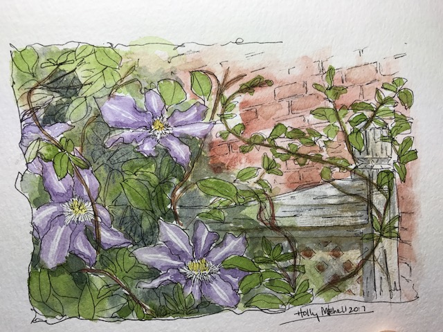
Day 111 (Fri April 21) watercolor clematis vine

Based on a photo I took in the backyard. Using daniel smith paints in my strathmore 400 series watercolor journal (love this little book so much more than I expected to!) with my faithful uniball deluxe micro pen. I don’t love the overall composition as much as I’d hoped, but I like the individual elements… I like the flowers quite well, the brick, and really like the way the fence came out (which I learned from a previous tutorial!)

IMG_0290

I love my daniel smith watercolors, (this sap green being particularly useful today!) BUT, it turns out I don’t love using them wet, from the tubes. I’ve purchased this Meeden metal palette for $13.00 (!!!!!) which I ADORE. And $13 is a steal… includes 24 half pans or 12 full (sized) pans!! I filled the 12 full pans with my daniel smith paints, and let them dry for a couple days, and I just love love love it. It even fits my favorite paint brushes. The only thing… I wish I’d gotten the larger pan! I don’t NEED more colors. But I know I’m getting more. So for a few more dollars I may get the larger one (24 full pans) soon. Heck, I’ll use both, probably. I know I sound like a commercial. I looked hard for a metal palette. I suppose the $60 ones are nicer. But I like this one SO MUCH, I don’t see how I’d care to have the costlier one. Let me know if you try one, or if you have one you like better!

Day 97 (Fri April 7) More light studies

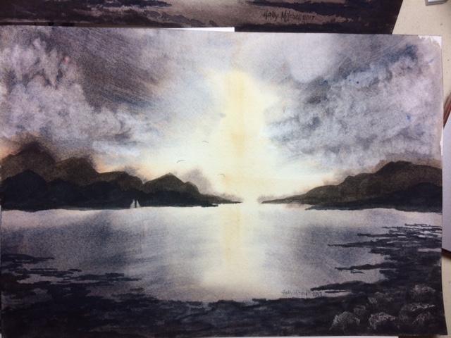
Still following Steven Cronin’s tutorials, here are a couple more.

I tried a cheap acrylic brush for this first one because I didn’t have the hake brush he used, but it absolutely didn’t work. Left stripes everywhere. It is very stiff and bristly feeling and (turns out, after a moment’s research) the hake is very soft.  The mountains are supposed to have three layers so you see distance, but the first layer was too wet and bled too much. The second layer too dark, so the third also too dark. I like the way he lifted a tiny sail out of the paint on the mountains to show boats in front of them. The rocks in the bottom right worked better today that yesterday. But not like his. They were scraped away with a bit of plastic gift card.
FullSizeRender

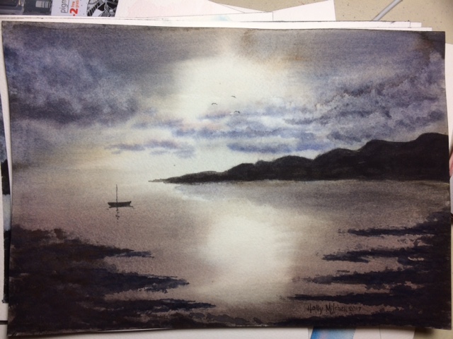
This second tutorial used the same hake brush (!!) which I still didn’t have, but a different technique. He dried the whole painting, then wet the whole thing again, adding another wet layer, dried it again, added another layer. So I learned that if I wet the whole thing evenly I can rework it a bit. I’m happier with the light here, but the red I added to the clouds didn’t want to lift, and my little foregrounds on the right are too symmetrical. Still, it’s a light study, and I learned about light:
FullSizeRender

Using a very limited palette, three colors, on Arches cold pressed block, with Daniel Smith watercolor paints. I like the way dried pans feel better, but I think Daniel Smith tubes might be better quality than any dried pans available.

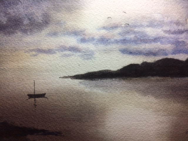
If I crop it this way, I really like it a lot better:
IMG_5013

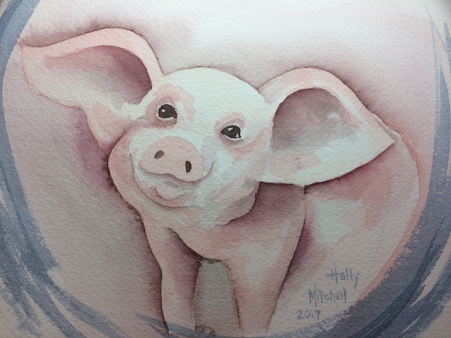
Day 96 (Thurs April 6) a piglet!

I saw a cute little acrylic painting of a piglet in Tuesday Morning the other day, so copied it (sort of) in watercolor. I like him AND he was fun. (her? She? I think he) Okay, he’s a little freaky looking. He can’t help it. Stop judging. Used my Daniel Smith paint set for this, plus Burnt Sienna. If you are just starting out, this makes a really great color palette for a smaller investment than some huge paint sets. Don’t let my odd little piggy keep you  from starting. (I think that blue circle may actually be an M Graham Prussian Blue.  But don’t hold me to that.)

IMG_5025