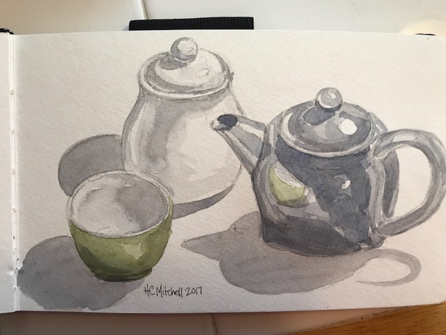
An actual grouping for a change. Daniel Smith, and my beloved Pentalic 5×8 watercolor journal, along with some of my favorite tea items… my tiny cup, my little stainless tea pot, and a ceramic sugar bowl.
A 365 day art project… one drawing a day

An actual grouping for a change. Daniel Smith, and my beloved Pentalic 5×8 watercolor journal, along with some of my favorite tea items… my tiny cup, my little stainless tea pot, and a ceramic sugar bowl.

I decided to try a bit of color on yesterday’s sketch, and wanted to try just one color. I was going to go with indigo first, but something about blue faces put me off. So I went with Daniel Smith’s Bloodstone. This is made from a mineral, no other pigments added. I purchased it expecting a deep eggplant-y purple but it’s a neutral shade, on the red or purple end of the spectrum, and lovely for bringing a loud color down just a touch. It also granulates nicely. If you don’t have this color, in my opinion it’s a really nice one to add. Right now I use it more often than any other neutral. The result:


I’m pretty happy with it. And I loved working with layers of just one color.
Canson mixed media journal, Daniel Smith Bloodstone watercolor, uniball micro deluxe pen

I loved their arm-in-armness. These sweet little girls were walking through colonial Williamsburg while we were there Sunday, and I couldn’t help using them in my studies. I caught them just as the littlest twisted around to looked back for her parents.
Done in a VERY small Stillman and Birns watercolor sketchbook with daniel smith watercolor paints. And my favorite uniball deluxe .5 pen.


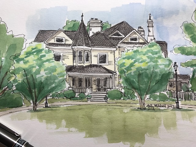
The beautiful old house at the Hampton Roads Winery in Surry. (Technically: Elberon) If you live in Hampton Roads and haven’t been here, it’s a nice, relaxing day. With wine. And goats. Canson mixed media rough 7×10 tablet, daniel smith watercolors, uniball deluxe micro .5 pen.

After doing my Sennelier/ Daniel Smith comparison, I decided to stick with my DS paints for a while, unless I specifically want a more muted look, and here’s what I came up with today.
Shapes copied from a couple of beautiful statues I saw in a Tuesday Morning store the other day, but wasn’t willing to pay for:


An amateur’s assessment:
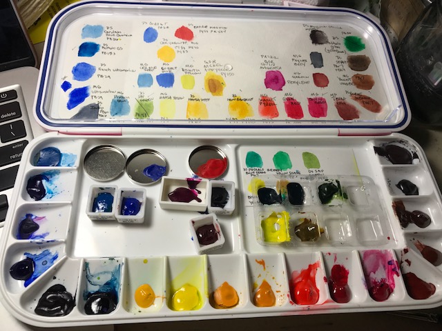
Regarding watercolor paint sets, I use Daniel Smith and M Grahams together right now, from pans I’ve filled myself, because I have different colors from each company. I use them as if they are one brand, and as far as I’ve noticed, both are amazing and work well together, although of the two, I’ve finally decided Daniel Smith is the brand I’ll be building on in future.
I also have my palette of Sennelier pans I’ve been using. I love the palette tray itself, and the paints rewet nicely and feel rich and creamy, like the Smith and Grahams, so I’ve been trying to decide if I like one over the other.
I noticed with my mermaid last week the paint got much lighter when dry, and wondered if that was because I used Sennelier. (I want a few more colors in the Sennelier brand, or another palette tray for the Daniel Smiths, and am trying to decide which investment to make!) So I just doodled a bit after following a tutorial by “Maremi SmallArt” on Youtube. Here are my results, but my conclusions are still vague…
These are the Sennelier, on the left, and Daniel Smith, on the right, while wet:


I rather expected the Sennelier to lighten up. But here they both are dry:


A little lighter, but still vivid. I ran a wet brush across the bottom once they were dry, and look how much paint lifted off the Sennelier colors! This could be useful to know if you WANT to lift an area, or if you want to be sure to keep one…
I tried the following samples to see how large areas of water made them react. On both pages, Sennelier is on the left, DS or M Graham on the right. Both flowed freely but the Sennelier tended seemed to dafe more. Really they are fairly similar.


Here is the tutorial idea I followed. You can see with a lot of water, the Sennelier (left) reacted very differently becoming rather muted, even though they started out quite strong. Also, I had to lead them through the water a bit more than the Daniel Smiths. I tried to keep my paint and water quantities similar. (?) The Daniel Smiths stayed pretty true.


Finally I tried a quick sketchy flowerish thing, using several layers:


I like the way the Daniel Smith (right) responded better, in general. Moved more fluidly without losing its color. Sometimes the Sennelier was TOO fluid, disappearing, sometimes it barely moved at all…
My conclusions? Well, I love them all. If I’m doing something with a lot of water, and I want my colors to bleed nicely but also to stay fairly vivid, I’ll choose Daniel Smith. If I’m doing something less wet, without large wash areas, the Sennelier are very nice to use. (this is a much less costly set that I’ve linked here, with very sufficient colors to get started, I think, but a kind of crap container. A very affordable step into Sennelier.) If I could only choose one brand, I suppose I’d choose Daniel Smith and either of the storage palettes I have, the Martin Mijello 18 well palette, which comes in fuschia or blue,. Or the Meeden tin, seen here. I have to confess, though… there’s something I love about using the Sennelier set. I enjoyed using them so much when I painted my mermaid recently. I don’t see much difference in their overall performance (except less movement) and I think their slightly softer leaning has a place in my watercolor toolbox. (edit: even today I tried to add a shadow to a dry painting and it simply lifted the color beneath away. Rather frustrating. Good paints, but Daniel Smith would be my first choice.)
larger meeden paint palette listed here, with 24 full pans (empty, but full sized)

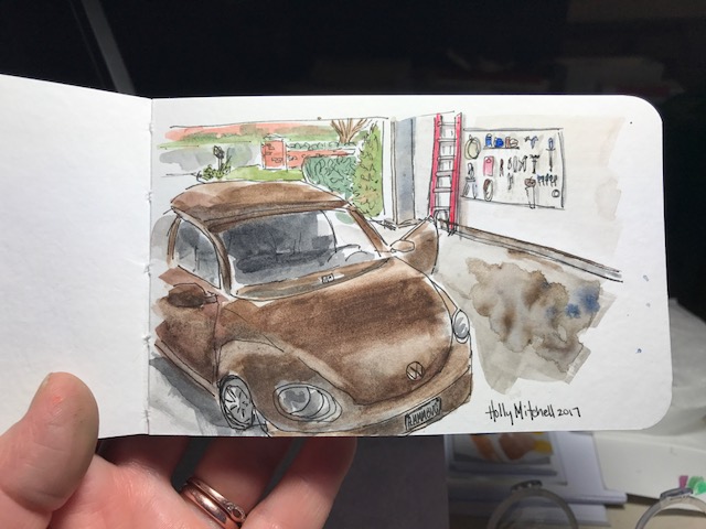
Our little Beetle in our freshly cleaned garage. Minus the other car. My Beetle likes her alone time. This is using my Daniel Smith watercolors (in my Meeden palette! More about that below) in a new tiny book, a Stillman & Birn beta series mixed media journal, 5×3 inches. This book is small enough to fit in my bag that holds my phone and cards and not much else. I thought it might be TOO small but I liked working in it and really like the weight and feel of the pages. I’ve read good things about this company and think I’ll really love these books. This book is nice… great paper, lays flat for working, very white, heavy pages. Still… I think I’ll go the next size up as well and save this for taking out places.
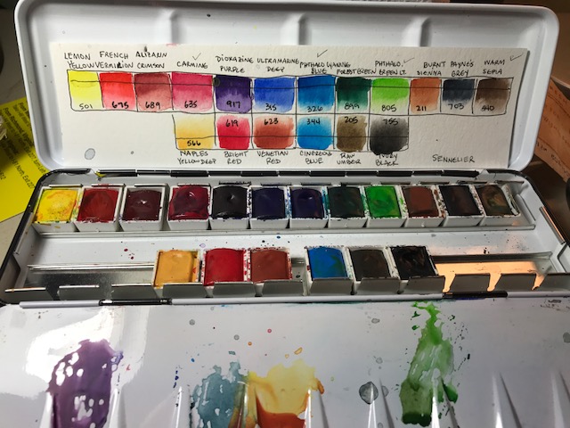
Regarding the Meeden palette… I mentioned this one the other day and still adore it. For the price it’s a bargain and I plan to get the larger one, too. But I wanted to mention differences… I purchased the Sennelier 18 half pan set (at a GREAT price, imo, by the way.. shop around a bit. I’ll talk about these paints another day) and they are in a similar tin. Differences… the sennelier tin is a truer white, great for mixing colors on. The sennelier tin keeps paint from beading as you mix it, which is nice. (the meeden will probably work itself out over time, I’d guess…), and the sennelier lid lays flatter, as opposed to the meeden, which has one side that slants up, making it difficult to mix on that side. I can push it down, I just don’t want to break it.
I had said before I didn’t know what the differences were, so I wanted to clear that up here. I still love the meeden and think it’s a tremendous value. Definitely my choice for an empty metal palette, and I plan to buy the larger one as well. The differences are visible and clear but not terribly important. But if the two palettes were both empty and the same price (which isn’t the case!!) I’d get the Sennelier. It IS nicer.

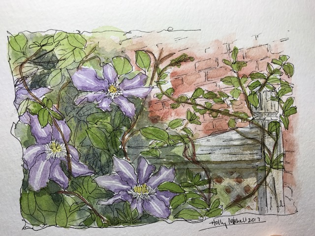
Based on a photo I took in the backyard. Using daniel smith paints in my strathmore 400 series watercolor journal (love this little book so much more than I expected to!) with my faithful uniball deluxe micro pen. I don’t love the overall composition as much as I’d hoped, but I like the individual elements… I like the flowers quite well, the brick, and really like the way the fence came out (which I learned from a previous tutorial!)
I love my daniel smith watercolors, (this sap green being particularly useful today!) BUT, it turns out I don’t love using them wet, from the tubes. I’ve purchased this Meeden metal palette for $13.00 (!!!!!) which I ADORE. And $13 is a steal… includes 24 half pans or 12 full (sized) pans!! I filled the 12 full pans with my daniel smith paints, and let them dry for a couple days, and I just love love love it. It even fits my favorite paint brushes. The only thing… I wish I’d gotten the larger pan! I don’t NEED more colors. But I know I’m getting more. So for a few more dollars I may get the larger one (24 full pans) soon. Heck, I’ll use both, probably. I know I sound like a commercial. I looked hard for a metal palette. I suppose the $60 ones are nicer. But I like this one SO MUCH, I don’t see how I’d care to have the costlier one. Let me know if you try one, or if you have one you like better!

I saw a cute little acrylic painting of a piglet in Tuesday Morning the other day, so copied it (sort of) in watercolor. I like him AND he was fun. (her? She? I think he) Okay, he’s a little freaky looking. He can’t help it. Stop judging. Used my Daniel Smith paint set for this, plus Burnt Sienna. If you are just starting out, this makes a really great color palette for a smaller investment than some huge paint sets. Don’t let my odd little piggy keep you from starting. (I think that blue circle may actually be an M Graham Prussian Blue. But don’t hold me to that.)