Day 266 (Sun Sept 24) ATCs

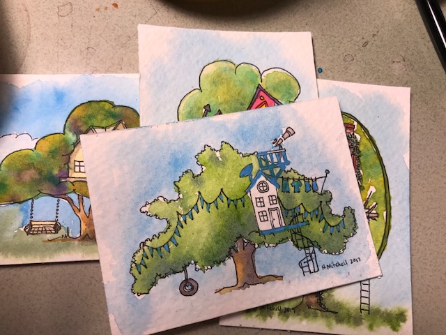
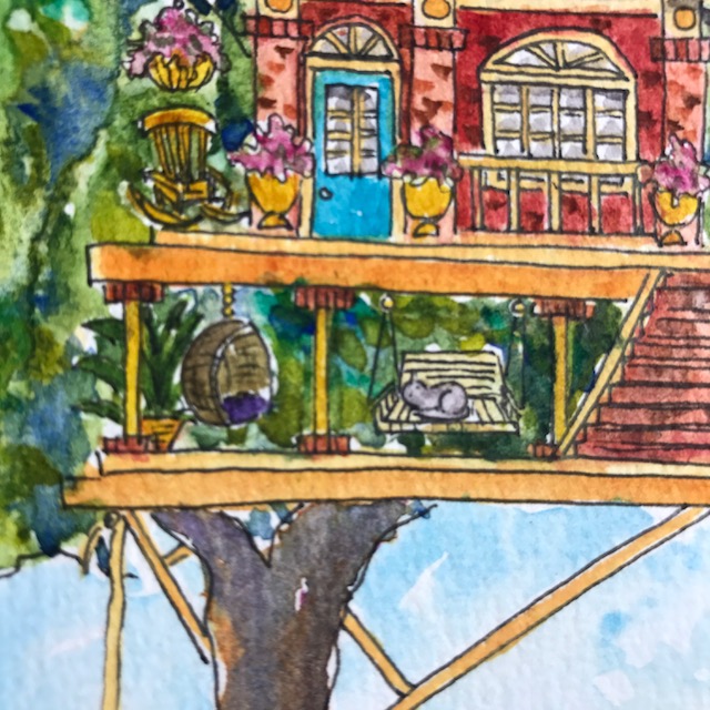
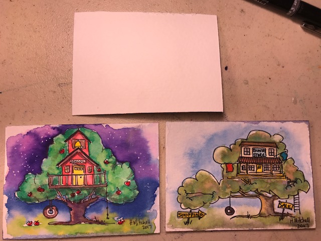
Artist Trading Cards… 2 1/2×3 1/2 inches. Treehouses. The fronts, top and right using daniel smith paints, bottom left using qor…

IMG_6329

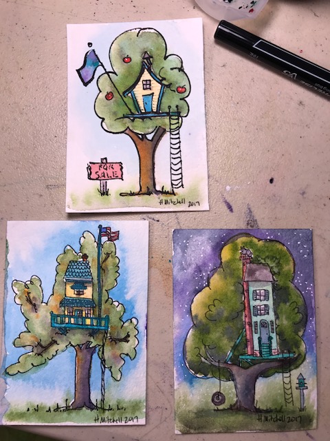
The backs… one unfinished, the school house uses Jane davenport mermaid watercolor markers (they are really a waterbased color in a waterbrush) Vivid colors, difficult for me to control, and they lift off a bit too easily, but quite fun. I think they’d be great for something larger, especially art journal pages, or calligraphy. The country store uses daniel smith.

FullSizeRender

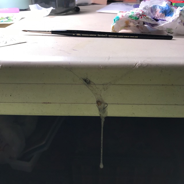
Oh, and about halfway through I found this gift from my newfoundland dog dripping off my table right in front of me. I don’t know how I didn’t get slimed. Don’t get a newfie if you can’t handle the Sloober. He’s not allowed in my studio alone, but he snuck in a bit earlier. Obviously. That Sloober would literally be there in a week if I hadn’t removed it… looking like a thick shiny… dried… disgusting hangy thingy… I tried it once just to see. Ugh.

IMG_6326

Day 247 (Mon Sept 4) finished ATC set

I forgot to finish these, and left the masking fluid on one for several days (it should come off within 24 hours) It still removed easily and did no damage. It is that Molotow masking pen, 2mm… (link here)… and does really well on tiny spaces.

Remember, and ATC (artist trading card) is 2 1/2 ” x 3 1/2 “… a very small space for painting a lot of detail. How many watercolored ATCs do you think are equal to a set of hand knitted or crocheted fingerless gloves?? It’s a swap, and I feel like 4 is not nearly enough.

Day 237 (Fri Aug 25) ATC

An ATC is an Artist’s Trading Card. This one is nothing special, and I made it this morning for a partner on a site I’m in (Swap-bot)… an ATC has only one hard and fast rule: It must be 2 1/2 inches by 3 1/2 inches. You can do pretty much anything you want to them, and on the back the artists generally write their names, location, the date or year, name of piece, and what they used to create the piece. As the name implies, these are always traded, or given, never sold. If created to be sold, they are called ACEO’s (Art Card Originals and Editions). Frequently they involve many layers, and several different media, but they don’t have to. Most collectors have many, many cards from all different artists, not just one or two.

My partner wanted a daisy, so naturally I used ink and watercolor. I drew the back of the daisy, looking up at the sky through it’s petals, (weird, I guess) and added a little dragonfly brad. (Because I had to mail it in a card and thought the ladybug that I preferred was too fat to travel in a flat envelope!) I’m not sure why my light was so odd for the photo with the dragonfly? Careless.

Day 236 (Thurs Aug 24) Middle Sized yellow treehouse

Ok, look how cool the green paint at the bottom acted… it just GREW ITSELF into tall grasses! I think a tiny yellow treehouse next…? [ I have “commissions” for four separate people waiting to be started… why don’t I work on THOSE?? (I think I’m afraid of disappointing myself or the people who asked for them…) ] Read on only if you want info on the colors I used. 🙂

I’m using Qor paints, and also these Daniel Smith watercolors… I love all three of these colors, particularly the Undersea Green. Mixed with just a touch of Daniel Smith’s sap green it is really extraordinary in my opinion, and I love it in those trees. The Undersea Green with just the tiniest touch of Qor Manganese Blue (which I purchased at Jerry’s Artarama in town nearby, because I couldn’t find it on Amazon :), makes the blooming grassy area in this treehouse… I turned the paper upside down and let gravity help. (a little hint… painting on an easel makes a big difference!) And the sky is the Qor Manganese Blue.

The Qor colors bleed and develop into the most interesting patterns.  They are really REALLY fun to use… if you haven’t tried them yet, consider starting with the  Qor High Chroma watercolor set , the colors are fabulous, and the purple in it is what I have enjoyed using in the trees so often. The pink, too, actually. The Green Gold is what I have been starting most of my trees with, adding dots of yellow and blue and even the purple. I watched a video recently suggesting letting colors blend on the page more often than mixing in a palette, and it does give satisfying results. The reddish brown of the tree and chimney are Daniel Smith’s Transparent Red Oxide, which I am enjoying very much, but is quite similar to other colors I already had. (Including the Transparent Pyrrole Orange which comes in the High Chroma set, I think.) The yellow is Daniel Smith Naples Yellow… which I haven’t quite decided about. I think I like it? The Qor and the Daniel Smith Naples Yellow are slightly different colors and I haven’t compared them much yet.

Day 232 (Sun Aug 20) you guessed it… treehouse #3

I could just paint these for months. I’m tempted to fill the rest of this sketcbook with treehouses. I’m going to be opening an etsy store soon, and I think some of these little houses will be made into prints for that store.

IMG_4694

I like house ridiculously large the house is for the tree. I may exaggerate that in another painting.

Did you find the kitty? (okay, he’s BARELY a kitty, no detail… but seriously, he’s very SMALL! I couldn’t even add whiskers!)

IMG_4698