Day 115 (Tues April 25) Cityscape in the foggy night.

I tried this one twice:

I don’t love either result, but did enjoy trying the tutorial by “Mahesh Pendam Art” on youtube. It was fun and relaxing! Buildings are better in the first one, “fog” and reflections better in the second. Supplies: black paint (I used Sennelier), my trusty Strathmore 5×7 watercolor journal, and a white gel pen. The Sennelier paint worked differently than I expected! I think I will like it, though…

Day 114 (Mon April 24) “easy watercolor face silhouette”

From a tutorial by ElenaRogue on YouTube. This used my Daniel Smith watercolors, in my 400 series Strathmore watercolor journal. (Which is nearly full now!) A fun idea, and nicely uncomplicated.

IMG_0442

Day 113 (Sun April 23) Hmmmbug!

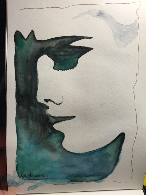
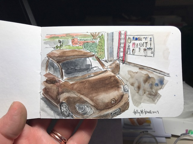
Our little Beetle in our freshly cleaned garage. Minus the other car. My Beetle likes her alone time. This is using my Daniel Smith watercolors (in my Meeden palette! More about that below) in a new tiny book, a Stillman & Birn beta series mixed media journal, 5×3 inches. This book is small enough to fit in my bag that holds my phone and cards and not much else. I thought it might be TOO small but I liked working in it and really like the weight and feel of the pages. I’ve read good things about this company and think I’ll really love these books. This book is nice… great paper, lays flat for working, very white, heavy pages. Still… I think I’ll go the next size up as well and save this for taking out places.

IMG_0312

Regarding the Meeden palette… I mentioned this one the other day and still adore it. For the price it’s a bargain and I plan to get the larger one, too. But I wanted to mention differences… I purchased the Sennelier 18 half pan set (at a GREAT price, imo, by the way.. shop around a bit. I’ll talk about these paints another day) and they are in a similar tin. Differences… the sennelier tin is a truer white, great for mixing colors on. The sennelier tin keeps paint from beading as you mix it, which is nice. (the meeden will probably work itself out over time, I’d guess…), and the sennelier lid lays flatter, as opposed to the meeden, which has one side that slants up, making it difficult to mix on that side. I can push it down, I just don’t want to break it.

I had said before I didn’t know what the differences were, so I wanted to clear that up here. I still love the meeden and think it’s a tremendous value. Definitely my choice for an empty metal palette, and I plan to buy the larger one as well. The differences are visible and clear but not terribly important.  But if the two palettes were both empty and the same price (which isn’t the case!!) I’d get the Sennelier. It IS nicer.


Day 111 (Fri April 21) watercolor clematis vine

Based on a photo I took in the backyard. Using daniel smith paints in my strathmore 400 series watercolor journal (love this little book so much more than I expected to!) with my faithful uniball deluxe micro pen. I don’t love the overall composition as much as I’d hoped, but I like the individual elements… I like the flowers quite well, the brick, and really like the way the fence came out (which I learned from a previous tutorial!)

IMG_0290

I love my daniel smith watercolors, (this sap green being particularly useful today!) BUT, it turns out I don’t love using them wet, from the tubes. I’ve purchased this Meeden metal palette for $13.00 (!!!!!) which I ADORE. And $13 is a steal… includes 24 half pans or 12 full (sized) pans!! I filled the 12 full pans with my daniel smith paints, and let them dry for a couple days, and I just love love love it. It even fits my favorite paint brushes. The only thing… I wish I’d gotten the larger pan! I don’t NEED more colors. But I know I’m getting more. So for a few more dollars I may get the larger one (24 full pans) soon. Heck, I’ll use both, probably. I know I sound like a commercial. I looked hard for a metal palette. I suppose the $60 ones are nicer. But I like this one SO MUCH, I don’t see how I’d care to have the costlier one. Let me know if you try one, or if you have one you like better!

Day 110 (Thurs April 20) mermaid Ellis

With freckles this time. A few extra. So, I took the ruined drawing from yesterday

FullSizeRender

and (since it was ruined anyway) just played with it. I used very shimmery silver and copper paints found here on Amazon (the popular Gansai Tambi paint set) (These paints, by the way, have really large pans, if the tiny half pans of other paint sets intimidate you the way they did me… and the paint is vivid and beautiful. I like the convenience and brightness of my prima better, but I really enjoy these quite a bit, if you are looking for an affordable fun set and you really don’t care whether they are professional grade or not.) When seen in person the shimmery effect of the paint on her skin, hair, crown, and scales is very fun. The shine isn’t apparent in a still photo. The ink smeared dreadfully when touched with water or purple paint, but the shimmery colors (the set only includes 3 or 4 shimmery colors) didn’t let it run quite as much. Sort of a controlled run. In the end I liked the smeared ink and used it, and I’m really happy with my whole mistake. I think she’s adorable.

FullSizeRender

Purple Mermaid Princess Ellis.


Day 109 (Wed April 19)

One of my favorites yet, a simple sketch of Ellis. Sans freckles, I just realized. Uniball Deluxe Micro pen, (the best, most affordable purchase I’ve made this year, if you are looking for a useful drawing tool, check out this link!) and Strathmore 400 watercolor journal.

FullSizeRender

Below I tried it with a japanese brush pen I have. I did not like the look much, although it looked kind of charcoal-isa which is fun… AND it smeared. Ugh. Also it turned out the ink is VERY NOT waterproof. Like, might as well just be black watercolor paint. Water completely re-activates it. But more on that tomorrow.

I considered it a ruined page. Then turned it into something cool. (-ish) Which I will show you tomorrow!! Can you guess what?

FullSizeRender

Day 108 (Tues April 18) Easter sketch

My very own art!! No tutorial. Ellis on an Easter egg hunt. Here, her poor little face got messed up when I inked it. But I figured it out later. There were several things I learned from this one that I’ll do differently next time, so it was a good project!

Day 107 (Mon April 17)

So with the use of a new molotow graphic 2 mm masking pen (linked here!) my masking is much improved!!! I like my “soft” masking tool from Rosemary and Co very much, and I LOVE this masking pen even more. What smooth edges! (still using the Prima Paint set I adore on the 400 Series Strathmore Watercolor Journal. I love this journal.)

compare:

This was done with the Molotow graphix pen. Lovely to work with. Eleven bucks well spent.

IMG_0160

The second is with a ruling pen and my own masking fluid. It was quite difficult to control (although… I did get a VERY cheap ruling pen. And i don’t think it works right.)… it isn’t bad, but not great. And here and there I had to paint the uneven edges a bit.

IMG_0040

This is from the other day using the Grumbacher frisket (masking fluid) and the little tool. You can still see some uneven edges… but my tiny letters were much more controlled with this Rosemary and Co soft tipped tool. (for a DOLLAR. Plus lots of shipping… but if you are buying some brushes anyway, toss one in the cart!!)

FullSizeRender

My vote?? Molotow masking pen. Definitely.

Day 106 (Sun April 16) Happy Easter!

Another K Werner tutorial idea. Messing around with those vivid prima paints again, and the masking fluid and applicator. The applicator actually worked quite well! It WAS double ended, with a silicone tip on each end, but thanks to an incident with Emmett is now SINGLE ended. It came from Rosemary and Co brush company, and was only a dollar or two. They are in the UK so shipping is like $15… but it arrives very quickly fed ex and their brushes are REALLY nice, and relatively inexpensive even with shipping. If you add one to your order (and DO, if you need to use masking fluid) I prefer the small, one so far.

FullSizeRender