Layering Transparent petals (with Jay Lee)

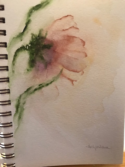
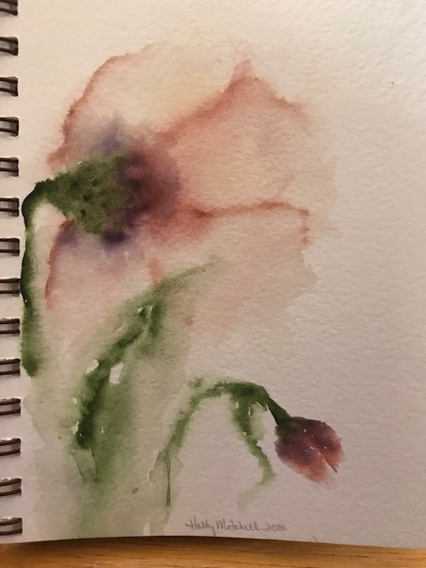
I followed Jay Lee’s youtube livestream tutorial again this morning… don’t go tomorrow, he’s not live-streaming… but try it Sunday or Monday 9am Eastern… you’ll learn a lot.

IMG_1893

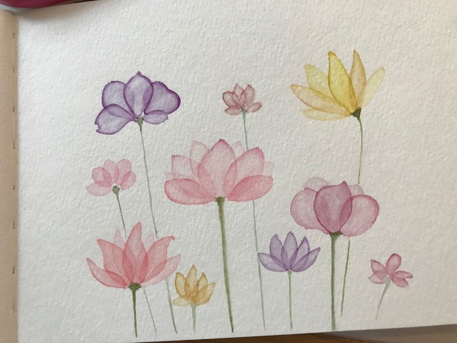
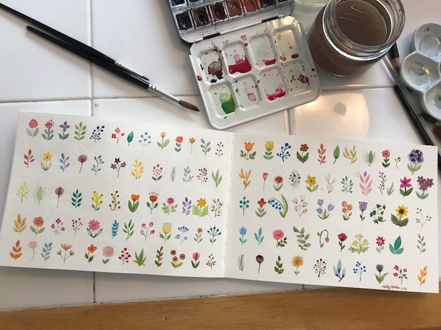
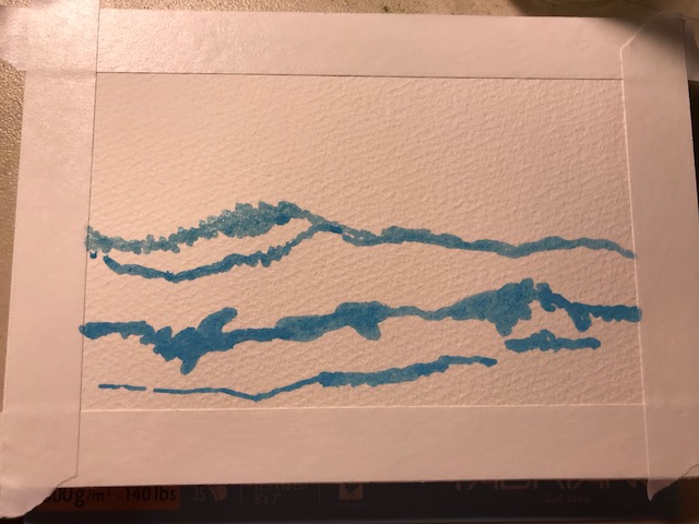
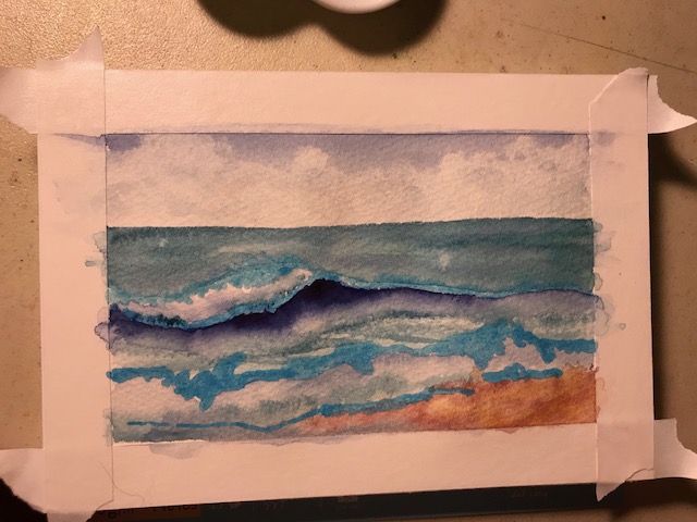
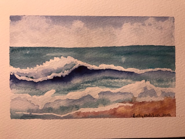
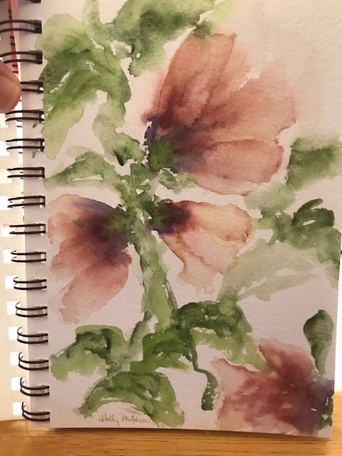
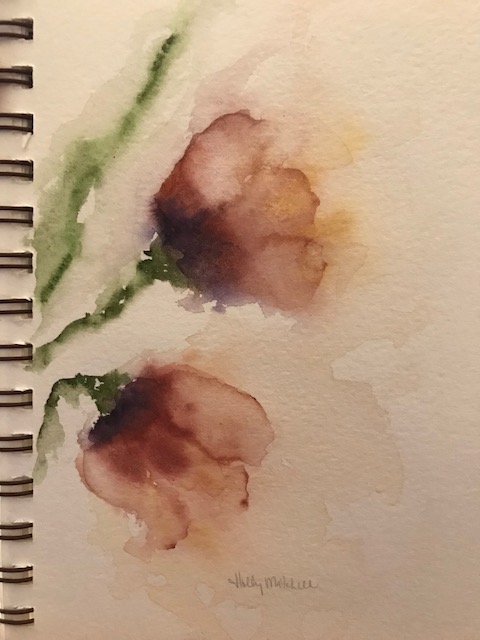
Today we practiced layering transparent petals. So pretty! Basically, you lay the petal down, using a lot of water, then lift the water with your cleaned, dried brush from the middle, being careful not to disturb the edges. Do two or three petals that don’t touch, then lay some petals overlapping those. Practice with different colors… I found some colors gave me better results than others!

IMG_1892

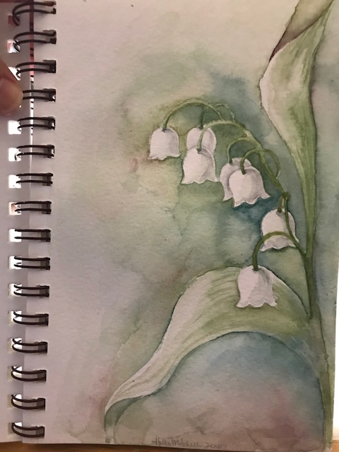
Schmincke paint in a Strathmore 400 series soft cover watercolor journal 8″x5.5″ .  I LOVE this journal. I love the soft cover (can’t explain that), the page size is perfect for me right now (although I may go larger sometime), I love the way my paints work with the paper… It’s my third journal like it, (my newfie, Emmett, ate my first completed Strathmore watercolor journal, but I suppose I’d rather have him than have that journal anyway. I forgave him. The next day.)…  I do intend to get more of these books.

More World Watercolor Month Giveaway Contests!

I told you I’d link the other World Watercolor Month giveaways here as I stumble across them, so here are two more exciting ones.

Click here, to get to Doodlewash’s Sable Brush giveaway… (because every watercolor artist can always use another good sable watercolor brush!) This prize from Cheap Joes is valued at $275… it includes a size 12 Kolinsky sable brush with a leather storage pouch and a spiral bound Kilimanjaro 100% cotton watercolor journal!! (Oh I want to win this one.)


Cheap-Joe-30th-Anniversary-Brush-Main-Image-WWM

Kilimanjaro-Sketchbook-Cheap-Joes


And click HERE for to sign up for the Hahnemuhle paper giveaway. This is $175 worth of watercolor paper, 5 different products, NINE items, so much watercolor fun!!!…. I’m looking forward to trying their paper soon, but it would be a great bonus to try it for FREE… if you win, let us know what you think of the paper! (or even if you don’t win, if you’ve tried it before, let us know how you like it) Please feel free to share this post with friends who may be interested in World Watercolor Month, or in watercolor supplies!

Hahnemühle_World_Watercolor_Month_2018_Grand_Prize_Giveaway

(Thanks, Doodlewash!!)

photos from the doodlewash contest site

Freesia

Today’s live tutorial on Youtube, by Jay Lee, was Freesia. Quick, easy, fun to do. Just complex enough that it was good practice, I learned without feeling frustrated. (Check out his channel Jay Lee Watercolor Painting at 9am eastern every morning to catch a livestream lesson.)


Seashore postcard and haiku

I’m trying Fabriano Artistico 100% cotton 140 lb watercolor paper… this is a 5×7 “block”, meaning the edges of the paper are all glued together. One corner remains open… once a painting is complete, you simply slide a palette knife (or anything) beneath the page and peel it off. Painting on blocked paper provides a firm work surface and prevents the page from warping much even with a heavy application of water. Looking on Amazon, I came up with this link, to the extra white cold pressed Fabriano block… Remember, Amazon prices fluctuate. At $15.95 right now, this is a pretty good price, I think, but I got it a bit cheaper at Jerry’s this weekend while it was on sale, and then with 20% off for a members discount… (if you prefer to try the Fabriano hot press, that’s even less at Amazon right now at $13.05).

IMG_1812

Let me just say WOW. I really like the way it feels. Please don’t judge the Fabriano p[aper by my painting. I actually liked this more than Arches. So far.

I started with tape (unnecessary on a block, except for leaving a white edge) and masking fluid:

IMG_1809

I used EEM (Eventually Everything Mixes) burnt sienna, Daniel Smith Indanthrone Blue , and Daniel Smith Mayan Blue Genuine  , a very green blue… the description says it is a green indigo, but it isn’t dark. I may try the mayan blue dark sometime, now that I’ve seen it exists! These are both lovely colors. Not necessary to a palette, but I can see a lot of times they’ll be used. Daniel Smith really has a LOT of lovely options.

Paint applied:IMG_1810

It could use more definition but I decided to leave it kind of stylized and quit while I was ahead. A quick fun sketch with just three colors!

IMG_1811

I actually painted this for a summer haiku swap. Here are the two haiku (haikus?) I came up with for my partner:

“The ocean murmurs

Ever haunting lullabies

To the sun warmed sand”

And

“If I could, I’d spend

Each passing summer moment

Fingers in the sand.”


Lily of the Valley

As you (may) know, I’ve been following a watercolor artist names Jay Lee for a while now on Youtube. Recently he has begun streaming a live painting session at 9am each morning (Eastern), and the lessons are simple and easy to follow. And relaxing. 🙂

This was one of them:

IMG_1729

(learning to keep white flowers white)

I painted this (while watching Carol Burnette reruns) :

IMG_1734

It wasn’t at all what I had intended, but at least it stopped looking like a cinnamon roll after a while… and I really liked the colors. I used M Graham’s Terra Rosa (pr101), Daniel Smith’s Carbazole Violet (pv23) and Green Apatite Genuine. On cheap Strathmore Visual Journal paper…  I decided to try something else and came up with this:

IMG_1733

Everything was wrong about this except the colors, and the thin fragile looking petals. I added DS Burnt Sienna and Yellow Ochre. I tried again to recreate the fragile petals:

IMG_1732

Much better!!! So let’s try again:

IMG_1731

Interesting. One more try?

IMG_1730

I went to bed after this one, afraid I’d regress if I kept going. Still not what I had pictured, but I like it.