The Vet… And urban sketching set up.

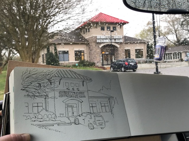
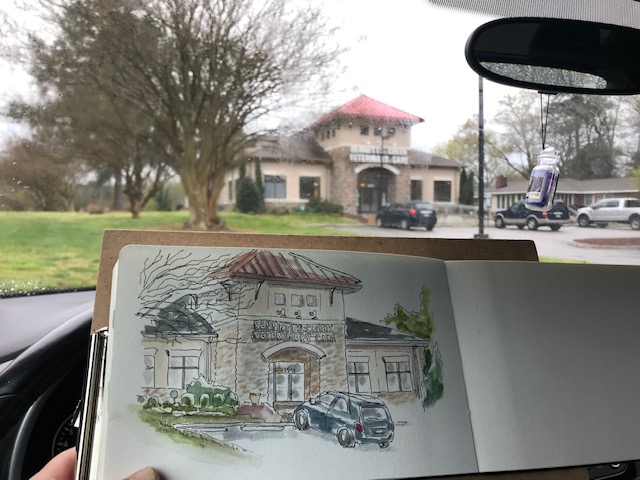
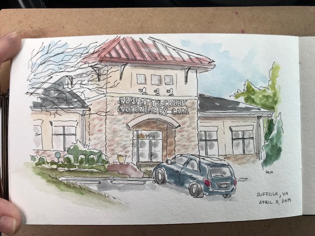
To be honest, Emmett and Clara like going here. They just don’t like getting weighed (!?)

IMG_8015

IMG_8016

IMG_8018

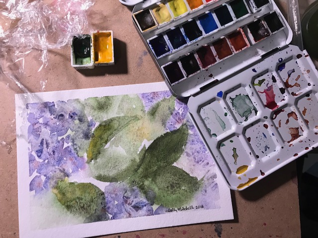
Travel palette I used:

(although I’ve created one I like even more since this sketch, which I will show you soon)

My colors here are all daniel smith: lemon yellow, perylene red, ultramarine (which I rarely use), cerulean blue chromium, phthalo turquoise, green apatite genuine, and lunar red rock. I really enjoy playing with phthalo turquoise and lunar red rock together! And the case is a pill box I found on ebay for about a dollar, using little empty makeup pans with magnets beneath them, for mixing areas. (Wait till you see my next palette, though! Stay tuned!)

I clipped the journal to a dollar tree clipboard for sketching and painting, and attached a heavy magnetic clip to the board, which held the paint palette and a water cup (also with magnets)

and I used this little bag, made for a mini iPad and its cords etc, to carry everything.

IMG_8154

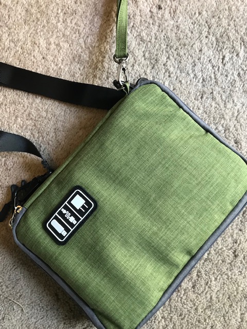
It is $15 right now on Amazon. I love it. I got the next size up, too, which was on sale that day for $9!! I love the color, it holds what I need, and I attached a shoulder strap from another bag to it (it comes with a wrist strap) If it held my clip board too it would be PERFECT. I’m working on that. It has two separate zippered compartments… the front has elastic and pockets, and one larger zippered mesh area. PERFECT for holding my water brushes, pen, ruler, clips, and even a thin palette. The back has a pocket that exactly holds my moleskin or pentalic journal, then two mesh pouches in which I put my two large magnets. Here I show it with the palette and my terry wristband (I use this like a paper towel) but the day I was out painting I actually had those in the front zippered mesh section,  and this bottom pouch held my water cup.

This is NOT a great bag if you want to take a ton of stuff, but it is perfect if you need pen or pencil, eraser, sharpener, travel or water brush, clips, phone or charger, and medium sized journal. The shoulder strap I added from my own collection really makes it convenient.

(Disclosure: I’ve included an Amazon Affiliate link to the bag… if you purchase through the link, it supports this blog, but costs you the same amount.  However always shop around for deals. I generally find my best prices on Amazon and buy many of my supplies through them, however their prices can fluctuate daily.)

(I’m going to add one more link because it is (Currently!) such a good price…this set of 6 Daniel Smith Primatek paints… The primates are made out of minerals ground into paint, and most of those I’ve tried I really love. This set is $23.98 right now… Even at $30+ to me it would be a good deal for 6 -5ml Primatek tubes! It contains Mayan Blue Genuine, Rhodonite Genuine, Hematite Genuine, Jadeite Genuine, Piemontite Genuine, and Amethyst Genuine (which has the sweetest little glittery sparkle to it!) I haven’t tried some of these, but just added Piemontite and Rhodonite to my newest travel palette, I love them so. Good luck, if you try them! Let us know what you think!)

So… what suggestions do you have for an urban sketching kit?

HAPPY FRIDAY! 1/18/19

Hey? Where’d the rest of the week go??

img_5747

Daniel Smith Bloodstone, Uniball Deluxe Pen, Moleskine watercolor journal…

I like the journal, it is well made. But I like the paper in my other journals better. Pretty much ALL of them, really.

img_5743

Seashore postcard and haiku

I’m trying Fabriano Artistico 100% cotton 140 lb watercolor paper… this is a 5×7 “block”, meaning the edges of the paper are all glued together. One corner remains open… once a painting is complete, you simply slide a palette knife (or anything) beneath the page and peel it off. Painting on blocked paper provides a firm work surface and prevents the page from warping much even with a heavy application of water. Looking on Amazon, I came up with this link, to the extra white cold pressed Fabriano block… Remember, Amazon prices fluctuate. At $15.95 right now, this is a pretty good price, I think, but I got it a bit cheaper at Jerry’s this weekend while it was on sale, and then with 20% off for a members discount… (if you prefer to try the Fabriano hot press, that’s even less at Amazon right now at $13.05).

IMG_1812

Let me just say WOW. I really like the way it feels. Please don’t judge the Fabriano p[aper by my painting. I actually liked this more than Arches. So far.

I started with tape (unnecessary on a block, except for leaving a white edge) and masking fluid:

IMG_1809

I used EEM (Eventually Everything Mixes) burnt sienna, Daniel Smith Indanthrone Blue , and Daniel Smith Mayan Blue Genuine  , a very green blue… the description says it is a green indigo, but it isn’t dark. I may try the mayan blue dark sometime, now that I’ve seen it exists! These are both lovely colors. Not necessary to a palette, but I can see a lot of times they’ll be used. Daniel Smith really has a LOT of lovely options.

Paint applied:IMG_1810

It could use more definition but I decided to leave it kind of stylized and quit while I was ahead. A quick fun sketch with just three colors!

IMG_1811

I actually painted this for a summer haiku swap. Here are the two haiku (haikus?) I came up with for my partner:

“The ocean murmurs

Ever haunting lullabies

To the sun warmed sand”

And

“If I could, I’d spend

Each passing summer moment

Fingers in the sand.”


Day 14, 30×30 direct watercolor challenge: hydrangeas

I started with the leaves first… I’m not sure why…

IMG_1498

and added the blossoms afterwards, but wasn’t thrilled with the results. (I even lightened the leaves some and added a bit of texture, after these photos were taken. Which helped a bit but didn’t solve the problem.)

So I tried the blossoms first, then the leaves, and did several layers. And added texture to both leaves and blossoms this time.

IMG_1504

Better, anyway. But lifeless. I’ll keep practicing 🙂 I can see where more varied colors would help, and leaving more white.

Day 10, 30×30: Instructions for painting a watercolor galaxy

I wanted to see how the EEM handmade paints work in galaxy paintings. I used Tia and Burnt Sienna for the centers, and used Daniel Smith’s indigo for the rest.

I started by taping my watercolor paper to a board and taping off the edges. I dipped a small (cheap) paintbrush in dishwashing liquid, wiped off the excess, then dipped it into masking fluid.  The soap protects the bristles… without that step, the masking fluid will ruin the brush. Don’t use a nice brush, as it may ruin it anyway. I then tapped it against my finger to spray tiny droplets of masking fluid across the paper.

(On my first two attempts, the droplets were just a bit too large. I tried again using a very tiny stiffer brush and had better results. A small flat brush or a toothbrush would work as well, if you want to run your finger across it for the spray, but I prefer tapping it against my hand or another brush)

Once the fluid has dried, the next step is to take the brighter color and apply it in the middle of the paper. Drop it in, or apply using small circular motions, making some areas heavier and some lighter. Look how beautifully Tia granulates. Sadly, it is currently sold out, and I’ve just about used my sample up, but I’ll let you know when more is available! Soften the edges a bit with water.

IMG_1431

The tutorial I followed in January by palestblue on youtube suggests using the indigo now to fill in the outer edges of the painting, moving towards the middle, but I started in the middle at the edge of my lighter color. Let the indigo mix with the center color a bit, they will bleed in and around each other. Either way, fill the background, again leaving some areas with more or less paint.

IMG_1434

Then take a little more wet color (the lighter color) and drip it in around the edge of the colored part where it meets the indigo. I only did this step on the third galaxy attempt. It does give a different look, but with or without it, both ways look fine.

IMG_1435

Allow the whole thing to dry for an hour or so, then remove the masking fluid to reveal the stars!! There are so many galaxy tutorials out there… and it seems like everyone does them a little differently. Look around and try several ways.


Masking fluid is my favorite way of getting the stars nice and bright.


Fuzzy Little Bird, courtesy of Iraville on Youtube (May 20, 2018)

I watched THIS youtube video by Iraville, one of my current favorite artists, and tried to copy her cute little bird. I couldn’t find my masking fluid, so had to try it a little differently.

The first one, on the right, used the wrong paints. Don’t use QoR for this. For the second, on the left, I found the proper paints (listed and linked below) , and it was a bit better, but not right. Cute, though. Third try, on the top… still not right. But I see progress. It’s a good, simple technique that I think I can do better, over time, and create my own cute little fuzzies. Also… paper makes a difference.

IMG_0721

By the way, the black here is not actually black (on tries 2 and 3), but Daniel Smith Bloodstone Genuine,  a very granulating paint made from… well, bloodstone, a rock also known as heliotrope. This is a GREAT paint. I’ve linked it above to Amazon, $14.26 for 15 ml, free shipping, for as long as the price lasts. It’s a pretty good price. (It’s about $2 cheaper at Jerry’s Artarama, but you have to pay shipping, making Amazon is a better deal, if you aren’t purchasing several other art supplies as well.) I’ve only really used the color for shadows before, and love it here. It was one of the first colors I found on my own (accidentally) and I hope to find lots of uses for it.

(There’s only one 15 ml of Bloodstone with that seller at Amazon at that price right now…HERE is a 5 ml tube of the same color, currently $6.41, plus $1.99 shipping)

Look at that granulation!

IMG_0722

That bright red tummy you can tell is QoR, with it’s tendrilly edges… You can use any paint, but I liked the Schmincke and Daniel Smith better for this.

To make the birdie, you lightly pencil in the general shape. Then use masking fluid to block the eye, brush water across the page, dot in the red (Schmincke Horadam Cadmium Red Light, 5 ml tube, or half pan.) and the Bloodstone, and let them do their thing. Use a dry-ish brush to clean up the edge when they get too carried away.

Watch the video… she explains it really nicely. And it is a relaxing exercise.


Painting “Loosely” (Radishes)

This idea came from a video from LazyWonderBrush on YouTube. These radishes used Daniel Smith colors, Green Apatite Genuine (one of my favorites… amazing granulation!), Quinacridone red, carbazole violet, and a little Nickel Azo Yellow. All the Amazon links are there… these are basic colors, very useful, so I linked the larger size tubes because they are such a better deal per ounce. (Oh, there was a bit of Sap Green as well… a beautiful ‘convenience’ color)

Those little dots in the leaves come from the genuine green apatite.

IMG_0581

Reflected Trees (Thurs 3/22/18)

This is from the Youtube channel Maremi SmallArt; the tutorial is called “Reflected Forest For Beginners.” Marta offers cute ideas that are fun and simple, using lots of different media… She says she isn’t a watercolorist, but she is naturally creative and has a good eye, and great suggestions. Mostly she reminds me to try, and to have fun.

IMG_9846

Wednesday 3/7/2018 watercolor treehouse

I think I like QoR better for the leaves, because of the way the paints spread and flow. But the daniel smith blue (cerulean blue chromium) and green (green apatite genuine) granulate so prettily on this picture. Really nobody has such beautiful and interesting granulating colors as DS. (I tried to make a taped off border, which worked except the tape tore the page. I even rubbed it on my jeans first so it wouldn’t be so sticky.)

This is for my granddaughter, by request.

Day 236 (Thurs Aug 24) Middle Sized yellow treehouse

Ok, look how cool the green paint at the bottom acted… it just GREW ITSELF into tall grasses! I think a tiny yellow treehouse next…? [ I have “commissions” for four separate people waiting to be started… why don’t I work on THOSE?? (I think I’m afraid of disappointing myself or the people who asked for them…) ] Read on only if you want info on the colors I used. 🙂

I’m using Qor paints, and also these Daniel Smith watercolors… I love all three of these colors, particularly the Undersea Green. Mixed with just a touch of Daniel Smith’s sap green it is really extraordinary in my opinion, and I love it in those trees. The Undersea Green with just the tiniest touch of Qor Manganese Blue (which I purchased at Jerry’s Artarama in town nearby, because I couldn’t find it on Amazon :), makes the blooming grassy area in this treehouse… I turned the paper upside down and let gravity help. (a little hint… painting on an easel makes a big difference!) And the sky is the Qor Manganese Blue.

The Qor colors bleed and develop into the most interesting patterns.  They are really REALLY fun to use… if you haven’t tried them yet, consider starting with the  Qor High Chroma watercolor set , the colors are fabulous, and the purple in it is what I have enjoyed using in the trees so often. The pink, too, actually. The Green Gold is what I have been starting most of my trees with, adding dots of yellow and blue and even the purple. I watched a video recently suggesting letting colors blend on the page more often than mixing in a palette, and it does give satisfying results. The reddish brown of the tree and chimney are Daniel Smith’s Transparent Red Oxide, which I am enjoying very much, but is quite similar to other colors I already had. (Including the Transparent Pyrrole Orange which comes in the High Chroma set, I think.) The yellow is Daniel Smith Naples Yellow… which I haven’t quite decided about. I think I like it? The Qor and the Daniel Smith Naples Yellow are slightly different colors and I haven’t compared them much yet.